| Weekly Outlook in the Stock Market |
| By Price Headley |
Published
11/1/2007
|
Stocks
|
Unrated
|
|
|
|
Weekly Outlook in the Stock Market
NASDAQ Composite
How much is too much? We're probably going to find out today.
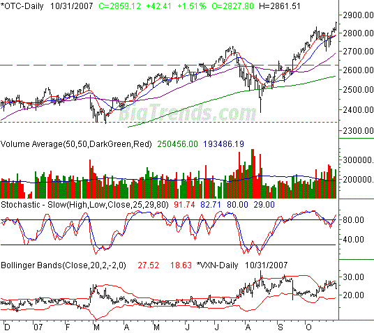
For a while now we've looked at the degree of separation between the NASDAQ and its 200-day moving average line, expressed as a percentage. We recently commented that the 10% move above the 200-day line (green) in July seemed to be about the most divergence the NASDAQ could muster.
As of Wednesday, the NASDAQ is 11.3% past its 200 day line and seems to be really stretching here.
Yes, Federal Reserve, Bernanke, interest rate cuts, all that's true. However, we've found the interest rate dynamic to be more reflective of the market's than the market's future. In other words, we don't necessarily think this easy-credit arena can make stocks go any higher than the already have, at least not right away.
The other factor weighing in is being stochastically overbought (again). We know we frequently talk about getting overbought and staying overbought as a bullish scenario. And technically speaking - in terms of momentum - that's what we have right now. However, we're rarely this stochastically overbought at the same time we're this far above the highly-meaningful 200-day average line.
So, we're going to get a little aggressive here and plan on some bearishness over the next few days. Today's early weakness has nothing to do with the decision (though it helps with our confidence). We generally don't fly into a headwind, but in this case, the risk of being wrong is far less than the reward of being right. We don't see a lot of juice left for the bulls, but a small blip for the chart could turn into an avalanche very quickly.
We believe the ultimate bottom for any downturn could be between 2550 and 2700, or somewhere between the 50-day (purple) and 200-day lines. The 10- and 20-day lines (red and blue) at 2781 also have a shot at providing support, and sustaining the rally. That's a less likely scenario, however.
NASDAQ Composite Chart

S&P 500
In some ways, the S&P 500 is the antithesis of the NASDAQ. It's not over-extended, not stochastically overbought, and really, looks like it could be more bullish than bearish. That's the dilemma; it's hard to accept that the SPX could gain while the NASDAQ loses.
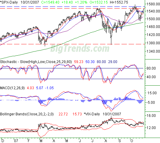
In that light, we're going to add a condition to our generally bearish view on the NASDAQ; it's only pertinent if the S&P 500 slides under the 50-day line (purple) at 1511.
Immediately below that mark, at 1481, is the 200-day line. If it plays a support role, any realized pullback could be short-lived (and maybe a little irrelevant). However, the 200-day line didn't play support in July, so we're not exactly counting on it this time. Nevertheless, the NASDAQ is clearly more vulnerable than the S&P 500 is.
The bulls' trump card is 1555, the red dashed line on the chart. We peaked there in July, and again yesterday, though we traded above that mark last month. We also plotted a line at 1564, the blue dashed line on our chart. That's where we peaked a few times in October. (We're throwing out the high of 1576 on the 11th.). A move above that blue line may inspire another wave of buying.
S&P 500 Chart

Dow Jones Industrial Average
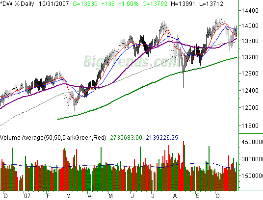
No major commentary today for the Dow; it closely mirrors the SPX's chart, and the analysis is about the same. The bigger trend looks pretty bullish, and we suspect it will remain that way. In the short run though, all stocks are hitting a headwind.
The only thing we want to point out here is how well the 200-day line (green) has framed the lower edge of the bullish zone. It's at 13,188 now. A dip back to there is likely, but support once there is equally likely.
Dow Jones Industrial Average Chart

Price Headley is the founder and chief analyst of BigTrends.com.
|