|
Weekly Outlook in the Stock Market
NASDAQ Composite
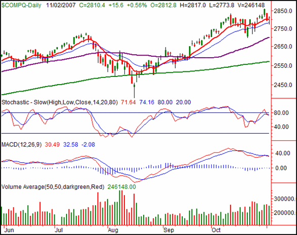
The NASDAQ Composite pulled itself up from another day in the red on Friday, closing 0.56% better than Thursday's close, up 15.6 points. For the week, it was the only index to make a gain, 0.22%, or 6.2 points. Though the composite is way overbought now, we actually saw a handful of bullish clues on Friday.
Those bullish clues are (1) support at the 20-day average line (blue), and (2) the strong open and closing level we saw on Friday. Until that 20-day average line at 2782 is broken on a closing basis, the bulls will technically remain in control.
The problem is the same story we've been telling for several days now; the NASDAQ is ridiculously overbought, and weakening. We're essentially stochastically overbought again. And our MACD lines are actually bearish despite a bullish week. Given that the MACD tool often provides warnings before they become evident in trading levels, consider this an official notification. But still, the 20-day line is the key.
If this is indeed the beginning of a market retreat, the NASDAQ has the most to lose. It's miles above the 200-day average line (or 9.3% above it, in trader's terms), and it's a rarity to see the NASDAQ maintain that degree of separation between it and the 200-day line. We'll refer you back to July for an idea of the kind of bearish problems it can create.
NASDAQ Composite Chart - Daily

S&P 500
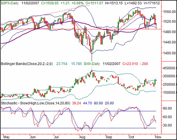
The S&P 500 barely managed to recoup Friday's intra-day losses, closing 0.08% higher, thanks to a 1.21% gain. On a weekly basis, it still closed 25.63 points under the previous week's close, a loss of 1.67%. We saw a handful of bullish hints here too, though not enough to make an all-out bullish argument.
What's bullish? Support at 1490, for starters. That was pretty much Friday's low, but also the low from two weeks ago. In fact, it was also the low from June. The fact that the bulls held the line there speaks volumes. You can also see the shape of the bar from Friday is a hammer shape, an open and close near the high for the day, and another hint of an upside move.
On top of that, we saw an upside-down hammer for the VIX as it briefly traded above the upper Bollinger band, and then pulled back under it. With all that room to go under the lower band, that leaves a lot of room for the SPX to move upward.
That's not a bullish call though. What we need to see from here is a close back above 1528, where the 10- and 20-day lines are (approximately), to serve as a confirmation.
In the meantime, a close under 1490 would be a bearish sign. That should coincide with the VIX making a higher close above its upper band line.
S&P 500 Chart - Daily

Dow Jones Industrial Average
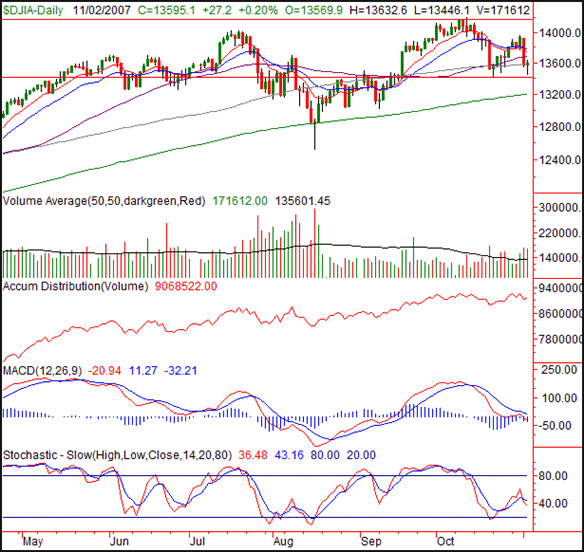
The Dow Jones Industrial Average closed 27.2 points (+0.2%) higher on Friday, ending the week at 13,595.1. That was still a 211.6 point loss for the week, though, 1.53% below the prior Friday's close. The index is at a key inflection point, though which side the chips will fall on is a coin toss at this point.
The Dow has a lot of the same qualities as the S&P 500 does, a hammer bar on Friday, with horizontal support around 13,410. However, some things (realities) are far more apparent on the Dow's chart than anywhere else. Mainly, we're talking about evidence of bearish momentum.
Look at the MACD lines. They're still falling. Moreover, they're both on the verge of crossing under the zero line. That's a bigger-picture sign of bearishness. Now look at the stochastic lines. The %K line (red) is back under the %D line (blue), which is also bearish. Check out the volume trend. We're seeing more distribution than accumulation now. The point is, don't get too enamored with Friday's rebound; the bigger trend is still to the downside.
The only way to negate this bullish posture would be a close above 13,745, which is about where the 10- and 20-day averages are (sound familiar?).
As for the next bearish milestone, this gets a little tricky, or at least pointless. Yes, a move under 13,410 would be bearish, but to what end? The next likely support level would be the 200-day average (green), but it's at 13,198, just a few points under 13,410. For that reason, we suggest using a close under the 200-day line as your next bearish trigger. We traded under the 200-day line briefly in August, but we haven't closed under it since mid-2006.
Dow Jones Industrial Average Chart - Daily

Price Headley is the founder and chief analyst of BigTrends.com.
|