| Weekly Outlook in the Stock Market |
| By Price Headley |
Published
12/31/2007
|
Stocks
|
Unrated
|
|
|
|
Weekly Outlook in the Stock Market
NASDAQ Composite
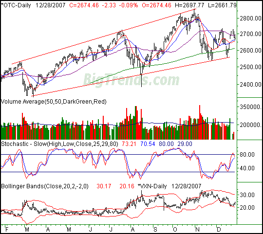
The NASDAQ's 2.33 point loss on Friday (-0.09%) left it at 2674.46. For the week, we saw a 17.53 point (-0.65%) dip. The headache lies in the fact that we (one again) closed under the 50 day line, yet above the 20 day line. We're also right back where we were in early November, telling us the market is having a tough time buying in now. Most of this week's analysis is on the other two charts, but we have a couple of things to mention about the NASDAQ.
Were it any other time of year except the very end of it, we'd interpret this chart as bearish in the short-term. We closed back under the 50-day line, and the VXN is on the rise. It's not that the time of year would prevent further selling; it's just that trading can get skewed around here. The tome could change completely once we're officially in 2008. Just be leery.
The other things we want to re-mention are the bigger-picture trend lines (red, on our chart). If things get worse as of Wednesday, the intermediate-term line in the sand is at 2559.
NASDAQ Composite - Daily

S&P 500
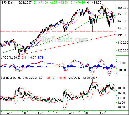
The S&P 500 led the way on Friday with its 0.15% gain - a 2.25 point move. That was still a 0.4% loss for the week though; the index closed 5.95 points under the prior week's close. Based on what we see, both the bulls and bears could make good arguments as of right now. However, the bears would win the debate.
The highs keep getting lower. On the other hand, the lows keep getting higher. The end result is a wedge or triangle, an idea we discuss in-depth for the Dow's chart below. For the SPX, we'll stick to other things, like the VIX.
In a nutshell, the VIX has started to trend higher after pushing off of its lower Bollinger band last week. The market validated the rise in the VIX with a tumble of its own. The one thing that makes that reality even more troubling for the bulls/exciting for the bears is how all of the key short-term and intermediate-term averages (10-, 20-, and 50-day) are now under the 200-day moving average line (green) for the first time on months. Yes, the last time we saw it in mid-2006 was right before a huge rally. However, the S&P 500 is far more extended now than it was then, something evident only on a longer-term chart.
As evidence of that idea, the rising support line (thin, red, solid) played a role in the mid-2006 rebound, but went as far back as late 2004. Obviously that line isn't even close to being a factor now.
Want another worry? Try this on for size: does the chart from April of 2007 through now look a little head-and-shoulderish? The pattern is not complete yet, but when we zoom out as far as we did on the chart below, it's clear the market has been in a stalemate for a while. That won't last forever, though.
Sit tight. The market hasn't been great for investors, and increasingly tough for traders. The traders may be in the verge of better days, though buy-and-hold investors are probably getting a little antsy.
Support is at 1435, and 1472. Resistance is at 1493, and falling.
S&P 500 - Daily

Dow Jones Industrial Average
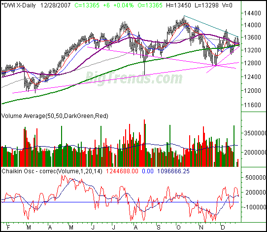
The Dow managed to squeeze out a 6-point gain on Friday, up 0.04%. Let's just call it a break-even. On a weekly basis, the blue-chip index closed 86 points (-0.64%) lower and right at the 200-day moving average line. You know what though? None of that is as meaningful as something else that has become quite evident on the Dow's chart. In short, the stage looks set for some major volatility - and perhaps some more sustained swings.
You'll see a lot of lines on this week's chart. The pink ones are support and the green one is resistance.
The support lines appear to be all over the map, and they are. We're not going to dive into the details of each one (because it would take forever), but each one means something in its own way. We just wanted to highlight each of them because they each represent another level of potential rebound. This is increasingly important because the falling resistance line may drive the Dow right under each of them.
What's so interesting about this chart - and so compelling - is just how close all of the key moving averages are to each other. The span from the highest to the lowest is only about 120 points. Moreover, the short-term 'wedge' shape for the closest support and resistance lines has those moving average lines almost in the dead center of its pointy end.
So what? Here's the so what. Periods of low volatility are followed by periods of high volatility. The last few weeks may have felt volatile, but they weren't - that was just choppy. With the wind-up getting more taut every day, the more explosive the move will be. And, it should be soon.
As of right now it's still not clear which way that explosion will be, but with 2008 starting next week, that could be the catalyst. We're certainly ripe. That's where the support and resistance lines come in. It'll be interesting.
Dow Jones Industrial Average - Daily

Price Headley is the founder and chief analyst of BigTrends.com.
|