| Index Charts Pushing the Envelope |
| By Price Headley |
Published
01/17/2008
|
Stocks
|
Unrated
|
|
|
|
Index Charts Pushing the Envelope
Some of our readers may remember a tool we tinkered with a few months ago (and even before that) designed to spot scenarios where an index was 'too far away' from a long-term moving average line, too far away for its own good anyway. The general consensus was that most indices tended to move back towards the 200-day moving average line when it got around 8% above it or below it. Not only is this an interesting theory, but it may have immediate ramifications for you and I over the next few days.
Though most of our work was done to spot potential tops (before pullbacks), the last several days have me wondering if the same premise could or should be applied when trying to spot bottoms. So, we did the brilliant thing; we tested it.
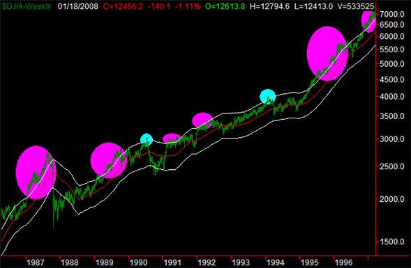
Before we get to the bearish potential application, maybe a quick 'proof of concept' is in order. On the next two charts we've actually plotted an 8% envelope (white) for the Dow Jones Industrial Average, centered around the 200-day moving average (red). In other words, the white lines are 8% above or below the red line. The assumption is pretty simple: the index may be able to get as far as the 8% boundary, but probably not much farther. And, once it does get there, a reversal is likely.
And does the idea hold water? Mostly, though not always. On both charts, instances where the idea 'worked' and we saw a pullback are highlighted in blue. Instances where the idea didn't work and we saw the Dow just keep pushing higher (and into the envelope) are marked in pink. Take a look, and then keep reading.
Dow Jones Industrials (Weekly) With 8% Envelope, 1986 thru 1997
Dow Jones Industrials (Weekly) With 8% Envelope, 1997 thru 2008
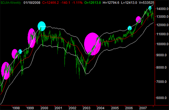
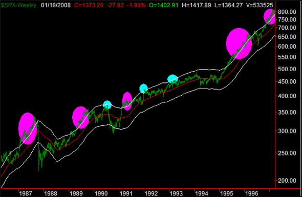
Based on the size and number of pink highlights, you might think the theory is better off forgotten. However, it worked well enough for us to stay interested. Plus, it seems to work better for other indices, and over a longer period of time. (Remember, the bullishness of the last two and a half decades has been highly unusual.)
Just as an example, take a look at the same chart for the S&P 500.
S&P 500 (Weekly) With 8% Envelope, 1986 thru 1997
S&P 500 (Weekly) With 8% Envelope, 1997 thru 2008
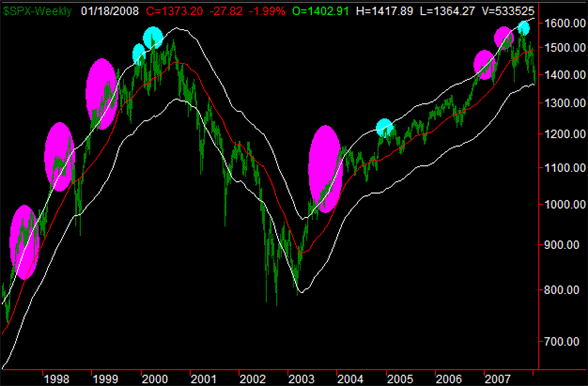
In other words, we see enough merit to keep considering the tool and what it's telling us. When it's wrong, it's really wrong (which could be a bullish signal in itself). And when it's right? Well, that's good too.
So what about on the bearish side of the equation? Actually, our hypothesis was that we'd actually have more luck spotting bottoms and their reversals than we would in finding tops and their reversals. After all, the market is designed to go up on a permanent basis. The pullbacks are supposed to be only temporary.
Before we jumped to any conclusion though, we needed to test the hypothesis. This is what we saw, again for the S&P 500.
S&P 500 (Weekly) With 8% Envelope, 1975 thru 1986

S&P 500 (Weekly) With 8% Envelope, 1986 thru 1997

S&P 500 (Weekly) With 8% Envelope, 1997 thru 2008
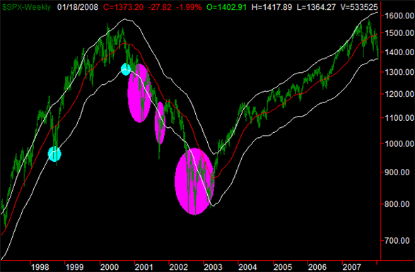
Once again it wasn't perfect, but worked more than enough of the time to keep watching it.
Price Headley is the founder and chief analyst of BigTrends.com.
|