| Weekly Outlook in the Stock Market |
| By Price Headley |
Published
01/27/2008
|
Stocks
|
Unrated
|
|
|
|
Weekly Outlook in the Stock Market
NASDAQ Composite
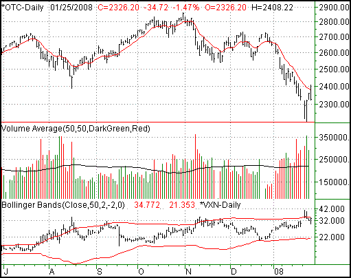
The NASDAQ couldn't keep the buying spirit alive on Friday, losing 1.47%, or 34.72 points. The close at 2326.2 was 13.82 points below the previous week's close (-0.59%); the NASDAQ was the only major index to close in the red for the week. On the other hand, it was also the most impressive when it came to pushing off its intra-week lows.
Today was the 18th straight day the NASDAQ closed under its 10-day moving average line (red), an oddity in itself. However, it's not like it didn't take a shot. For a few moments we traded above it, even as high as 2408.22. But, the bulls had no staying power; we closed well under it, again. However, we still have to lean mostly on the bullish side of the fence here. Why? Read on.
Take a look at Tuesday's and Wednesday's bars. They're very tall, and they're mirror images of each other. From our point of view that's a long-tailed reversal, not unlike the one we saw back on August 16. Granted, we only saw about two day's worth of follow-through and ended the week on a bit of a sour note. However, one day does not make or break a trend (bearish or bullish). The fact that volume was lower behind Friday's selloff suggests it wasn't a fear-based mass exodus.
As long as 2202 holds up as support - and that leaves a lot of room a pullback, we think the composite is still due for gains.
NASDAQ Composite - Daily Chart

S&P 500
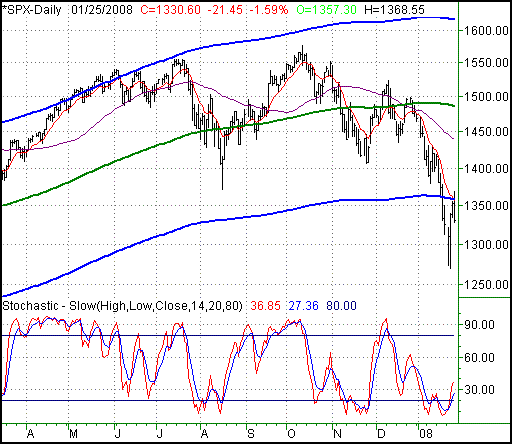
The S&P 500 fell to 1330.60 on Friday, a 21.45 point (-1.59%) selloff right after a huge bounce. For the week, the large-cap index still managed to close 0.41%/5.40 points higher.
In last Tuesday's TrendWatch we explored the potential usefulness of moving average envelopes as spots to expect a reversal. Our illustration focused exclusively on the Dow. The moving average parameters were simple: plot the 'envelope' 8% above and below the 200-day simple moving average line.
Today we'll be rounding out the discussion using the SPX as an example. The same parameters apply - more than 8% above or below the S&P 500's 200 day moving average is 'too much', and not likely to be sustained. The envelope is marked by blue lines on our chart; the 200-day line is green.
As we scoured though 57 years worth of data, we came to the same basic conclusion; the S&P 500, currently 10.5% under the 200-day line, is well past its normal movement limits. That's basically true even for bear markets (which still offer up bullish bounces). We only found three legitimate instances where the index worked its way this far below the 200-day line and then kept falling.
So, there are two basic ways to interpret that reality. The first is, we're entering a bear market, and now's the rare instance. Or second, you can assume as we do that the market will correct itself.
Bear in mind (no pun intended) this has nothing to do with a recession (which we're actually already in), and little to do with a bear market. This is strictly a study of the tolerable pace and size of move for an index.
By the way, we actually have a stochastic buy signal as of Thursday. As with the NASDAQ though, the short-term key will be getting back above the 10-day average at 1356, as well as back above the lower envelope line at the same level.
S&P 500 - Daily Chart

Dow Jones Industrial Average
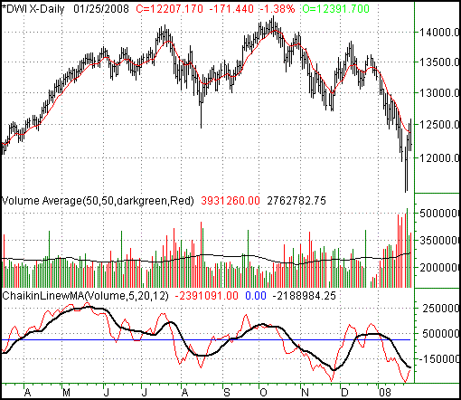
Losing 171.44 points on Friday (-1.38%) left the Dow at 12,207.17 for the week. That was still 107.87 points higher (+0.89%) than the prior week's close though, giving the Dow the top honors for the shortened trading week.
Same story for the Dow, so no need to repeat it - it needs to get and stay above the 10-day line at 12,364 if this rally is to gather any more steam. On the flipside, a move under last week's low of 11,530 could be real trouble, as investors panic. The odds say the Fed is going to be friendly this coming week though, so we feel stocks are going to get plenty of external help.
The one thing we're watching here (again) is volume. You may recall that we couldn't successfully 'systematize' a Chaikin line for the Dow, though we still feel it - and its moving average (black) tell the true story of the underlying momentum, which is volume. The Chaikin line itself (red) is bullish in that it's rising. If we can get the 'trend' line also pointed higher, it would be much easier to say that bullish volume was falling in place. Check in with our next update for more on that front, but it looks like we're on the verge of volume tipping in the bullish direction.
Dow Jones Industrial Average - Daily Chart

Price Headley is the founder and chief analyst of BigTrends.com.
|