| The Race Is On |
| By Price Headley |
Published
01/29/2008
|
Stocks
|
Unrated
|
|
|
|
The Race Is On
Since we've pretty much dissected the living daylights out of U.S. index charts, I'm guessing many of you are probably as happy as I am to be taking a look at something else - even if only for today. (Don't worry - we'll get back U.S. markets soon, as things have gone from interesting to exciting in the last few days.)
The data we're going to be looking at is the relative performance of foreign stock markets. We're using the iShares ETF regional funds as our underlying instruments, as they tend to be very good proxies for what's going on overseas.
The charts we'll specifically be looking at are not stock chart themselves, but percentage change charts. We've looked at them before - it's a great way to get a quick 'apples to apples' feel for how one region is doing relative to another.
The dimension we'll be adding today is different timeframes. I want to see of there's anything we need to know about long-term trends, short-term trends, and in-between.
You'll see 20 different pieces of data scrunched on the chart. Don't' worry though; we're not going to analyze all 20 ETFs. We're just interested in the ones that are, well, interesting.
Let's start with a macro view first. What's been leading or lagging consistently for a while now?
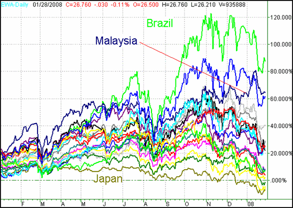
Since September of 2006, Brazil (EWZ) has lead the way. It's ebbed and flowed with all stocks, but has rallied farther and fallen less. That's the green line on the chart, the one that's been above all the others for most of the past year. It's up 86% for the timeframe in question.
Dragging the bottom is Japan (EWJ), in dark brown. Though I've really liked the potential 'undervalued' theme here, that strategy has only been theory so far.
Percentage Change of Major International ETFs, since January 1, 2007

The one thing I think worth highlighting here for the long-term is the ETF that's currently 'second' - Malaysia (EWM). It was actually leading the race in mid-2007, and looks like it's making a comeback.
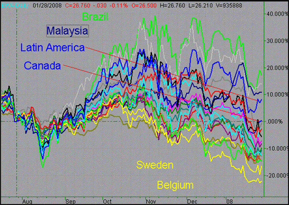
So what's the picture look like when we zoom in to a six-month view? Surprisingly different.
For starters, Sweden (EWD) and Belgium (EWK) are dragging the bottom. (Both are yellow on the chart - sorry). Brazil is still the leader, but looks much less impressive here, almost like it's already peaked and is content to give it all back now.
You know what looks good on this intermediate-term chart? Latin America (ILF) and Canada (EWC). Malaysia is holding its ground, but doesn't seem to have any new life. (Sorry - Latin America and Canada are both royal blue on this chart as well.)
Percentage Change of Major International ETFs, since July 16, 2007

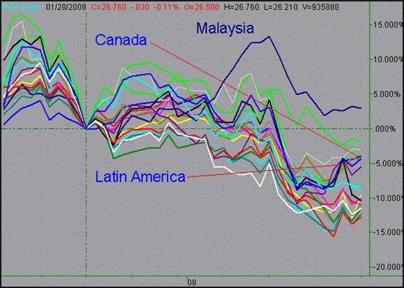
And what about the last few weeks? Let's see how things are shaping up since the short-term bottom from December 17. Though we started to climb out of the rut, we ended up slipping further into it. Were there exceptions though?
Percentage Change of Major International ETFs, since December 17, 2007

Great, but what are you supposed to do with all the data? Well, what we did can actually tell you quite a bit about where you want to be or not be (not everything has to be about an individual chart, ya' know.) However, you may also be able to spot emerging trends from this chart. If you start with a region (or a sector) first, you can often fund trading ideas before the media starts talking about them.
All that being said, later this week we're going to publish a performance grid of all the major iShares ETFs. That will have the details about which areas are getting hot, staying hot, getting cold, or staying cold.
Price Headley is the founder and chief analyst of BigTrends.com.
|