| Mapping the Stock Market after Friday's Plunge |
| By Price Headley |
Published
03/1/2008
|
Stocks
|
Unrated
|
|
|
|
Mapping the Stock Market after Friday's Plunge
I don't recall the last time I saw this much red on my computer screen. No sectors, and practically no stocks, were in positive territory Friday. Is it really as bad as it seems?
We've got a lot of charts to cover as we work an answering that question. They are the VIX, the Arms Index, the bizarre lack of new lows, and key support lines for the indices. Not that we'll have final answers today, but we'll at least have a map so we can find our way to one.
Indices Find Support
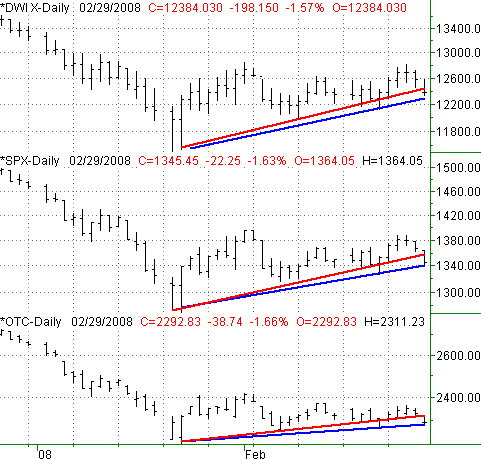
We thought we had the key support lines pegged. These lines are plotted in red on the chart below. Instead, the market had its own ideas of where near-term support should be. Those lines are plotted in blue, and only became obvious support after hitting today's lows. You'll see these new support lines incorporate the lows from February 22, which we didn't use initially.
Indices, with old (red) and new (blue) support lines

These new lines may not be the ultimate rebound point, but they're the most relevant ones we have right now.
The VIX
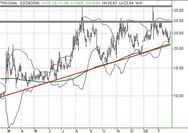
Speaking of support, the VIX has defined a key support line of its own (red), one that goes back to early 2007. We can also see support at the 200-day line (green) in more recent weeks. Had these lines not been such precise support on the chart, we may not have expected it so much. But, the odds favored a revisit of both those lines, right around 21.20.
Clearly we didn't get it -- at least not yet. Maybe the 20-day Bollinger band is indeed the reversal point to watch out for. Still, this is an interesting chart that we think still has more of a story to play out.
CBOE Volatility Index (VIX) - Daily

In the meantime, check out the two horizontal resistance lines around 30 and 37. Both are potential turning points for any VIX rally. When you take a step back, you'll also see this is a wedge shape. It is on pace to close up sometime in the summer. However, it will probably be shattered before that. Either way, it could really start to move once one of those boundaries gives way.
Arms Index
Want proof you could be justified with both bullish and bearish opinions? Let's revisit the Arms Index (also known as TRIN) for the NYSE.
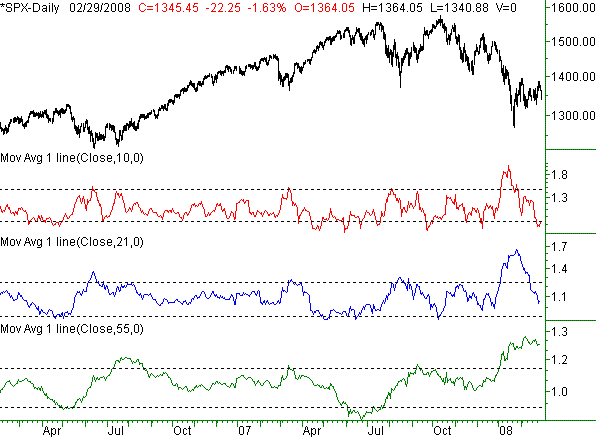
Let's plot Richard Arms' suggested moving average lengths of his TRIN data: 10-day, 21-day, and 55-day averages. Respectively, those are short-term, intermediate-term, and long-term indicators. Note that the actual TRIN data doesn't appear here; we're only interested in the moving averages. For each length, we've plotted the "too high" and "too low" levels with a dashed line. "Too low" is bullish, while "'too high" is bearish.
The point is that the current pullback shouldn't be a shock. The 10-day line (red) said we were due. It should only be a short-term move though, maybe even ending today. In the bigger picture, the 55-day TRIN average (green) says we still have a big gain to make before we get back to nominal levels. The blue 21-day line is neutral at this point.
S&P 500 versus Key TRIN Average Lengths

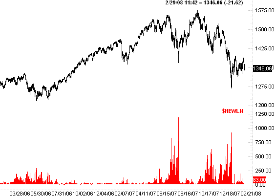
You'd think considering we're just a few points what was a multi-year low for the market that we'd have tons of stocks hitting new lows. However, as close to being within striking distance, somehow we're not seeing it. Take a look.
S&P 500 versus new NYSE lows

This is one of the reasons I'm not looking for a significant amount of near-term downside. If you look at the three major dips within the last eight months, you'll see new lows were climbing as the selling was processed. We've not seen a significant number of new lows since January 23 -- the short-term bottom. If stocks were in major trouble, we'd be seeing at least a few more new lows than this.
Price Headley is the founder and chief analyst of BigTrends.com.
|