| A Mid-Week Look at the Market |
| By Price Headley |
Published
04/9/2008
|
Stocks
|
Unrated
|
|
|
|
A Mid-Week Look at the Market
S&P 500
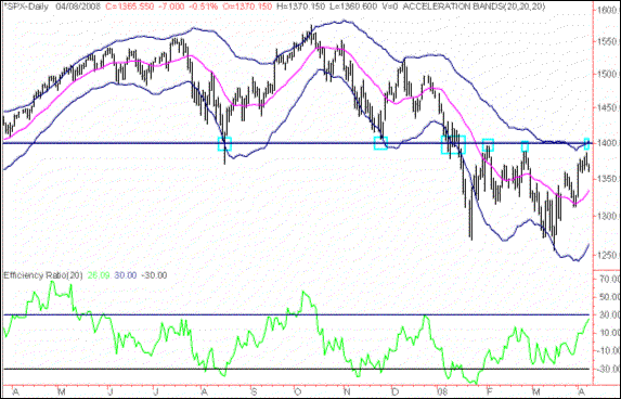
On the S&P 500 Index chart, I see the 1400 level as being very important over the past eight months or so, denoted by the small blue rectangles and horizontal line. As you can see, it previously was nice support, and now it has become fairly strong resistance. I would expect significant pressure if the S&P 500 approaches this level. In addition, it is a nice round number and strike price, and the market often fixates on large round numbers as key levels for various indices, so it can become a self-fulfilling prophecy in a way.
On the positive side, a break above 1400, combined with a break above the top of Acceleration Bands, and combined with high readings in the Efficiency Ratio and Percent R, would set the stage for the kind of bullish re-test of which we are fond.
S&P 500 Index with Acceleration Bands and Efficiency Ratio

NASDAQ Composite
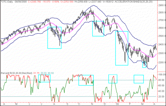
On the NASDAQ daily chart, I see that breakdowns below the bottom of the Acceleration Bands have been a good short-term bearish indicator recently. This is a more direct, obvious move than the re-tests of which we specialize in. A move below the bottom Acceleration Band has led to nice 2-to-4 week downturns in the NASDAQ three times in the past nine months. However, there was a false signal given in early-March when the index broke below the band for one day and reversed (the far right blue rectangle).
If you examine the Percent R indicator on the bottom, you will see that the three successful breakdowns of the band were preceded by very high readings in the Percent R (above 80). But the fourth false, reading was not preceded by a big upwards move in the Percent R, so, in effect, the market was not overbought enough to confirm the signal. This above 80 reading in Percent R can be used as an "overbought" indicator, and it worked here after a bearish breakdown of the bands was seen.
On a side note, we often use Percent R it in a contrarian/different fashion to this analysis, looking for a re-test move in Percent R. The bottom line on this chart to me is that a break below the bottom of Acceleration Bands that is preceded by Percent R readings above 80 will be a good bearish short-term indicator for the NASDAQ Composite.
NASDAQ Composite

VIX and Dow Jones Industrial Average
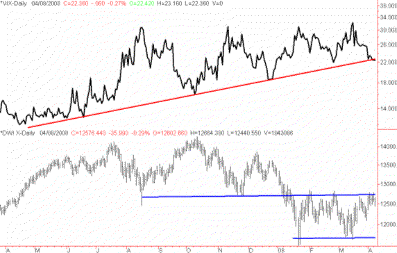
As you may know, we tend to the view the VIX as a contrarian indicator. Large quick extreme spikes upwards in the VIX tend to denote extreme periods of fear/panic that often precede a bullish market move, while a slow move downwards often shows complacency, especially when the market is not in a strong bullish mode. This chart shows that while the VIX has generally been trending upwards over the past year, it looks to have reached a key area vis-a-vis its natural trendline of support. A strong confirmed break below this VIX trendline would be a bearish indication to me, if it is not confirmed by strong moves higher in the major indices.
If you examine the Daily Dow Jones Industrial Average chart in the bottom sub-graph, the DJIA has been in a fairly obvious trading range since the beginning of 2008 and faces resistance overhead. So, there is really no reason for the VIX to break strongly lower, other than the normal summer slowdowns in Volume and Volatility that occurs in the stock market when many traders and money managers go on vacation. In short, a bearish-neutral choppy trading range in the overall market is not a normal or "healthy" precursor to a complacent decline in option pricing volatilities.
The book is somewhat still out on this one though, as I could be wrong and a further decline in the VIX could be followed by a summer upwards breakout in the major indices.
CBOE Volatility Index w/ Dow Jones Industrial Average

Price Headley is the founder and chief analyst of BigTrends.com.
|