| A Mid-Week Look At The Market |
| By Price Headley |
Published
05/7/2008
|
Stocks
|
Unrated
|
|
|
|
A Mid-Week Look At The Market
DJIA, S&P 500, NASDAQ 100 Update
What time-length chart is best to judge the overall markets? Intra-day, hourly, daily, wWeekly, or monthly? Each presents a different picture, sometimes drastically different. And timing the broad market indices through the use of charts is one of the hardest things to accurately do, in my personal experience.
To some degree, I would use a chart whose time corresponds to trading style/duration. If you are a longer-term buy-and-hold or mutual fund type investor, monthly and weekly multi-year charts are the way to go. If you are a day/swing type trader or usually exit trades within a couple weeks, I would say daily, hourly, 15-minute and even 1-minute charts are useful. For 2-weeks to several month trades, I prefer daily and weekly charts.
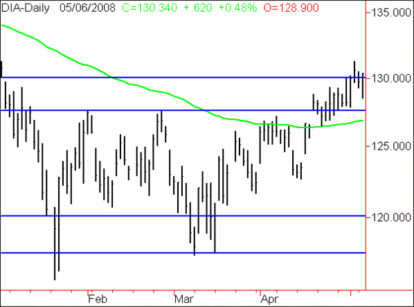
DJIA/DIAMONDS Daily Chart

On a 4-month compressed daily view of the Dow Jones Industrial Average above (here symbolized by the ETF DIA), it looks to me like we are breaking towards the top of its secondary resistance level, around the key 13,000 area. The DJIA has basically been rangebound between 12,000 and 12,750 in the past few months, with breakouts of that range contained by secondary levels of 11,750 and 13,000.
We are hovering around the top of the secondary resistance level and also sitting at a nice round number. I would not expect a strong quick breakout above this resistance. Rather, I would expect any further rally to be preceded by a sideways consolidation around 13,000 and/or a correction to lower levels. The 100-day exponential moving average, currently around 12,700 and rising, should contain any pullbacks.
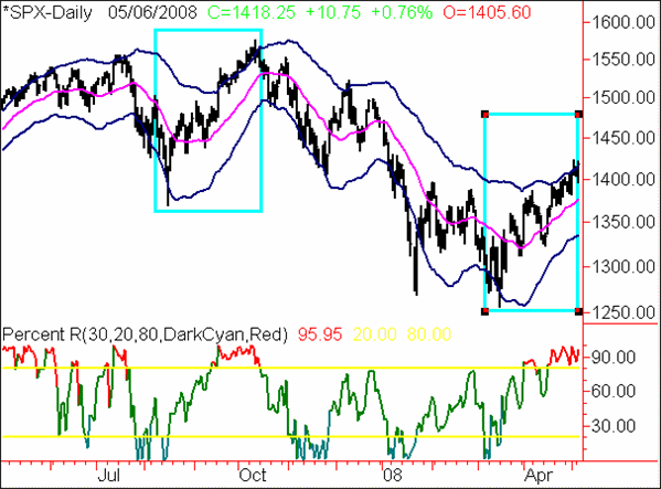
S&P 500 Index Daily Chart

The S&P 500 Index (*SPX) has been on a recent rally on a compressed 1-year daily chart above, but in my view, the current upmove is similar to the mid-2007 move that preceded a long decline. See the highlighted rectangles. In addition, while the Percent R reading during the current move is very strong, it was also similarly strong during the 2007 move. A break below the key 80 level on Percent R on this chart that does not swiftly retest above it, would be a bearish signal in my view.
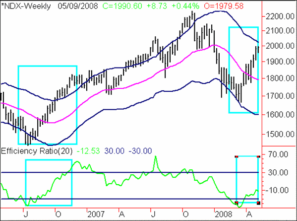
NASDAQ 100 Index Weekly Chart

On the weekly chart above, encompassing about two years of data, the NASDAQ 100 Index is showing a rally similar to the strong rally of mid-2006. This chart looks to me like the rally may have further to go, perhaps several months. Particularly, the Efficiency Ratio readings at the bottom of the graph show a similar rebound from lows, but have only reached about half the upward strength as they did in 2006 to this point. Continued strength in the Efficiency Ratio would be very positive for the longer term trend, in my view. Conversely, a stallout/reversal in the Efficiency Ratio and other technical oscillators would point to a likely correction/consolidation in the NASDAQ.
Price Headley is the founder and chief analyst of BigTrends.com.
|