Just two weeks ago, the market was well into a decent downtrend. The short-term moving averages were acting as resistance, pushing all stocks lower each time they were tested. It's only been in the last week and a half that all this buying was jump started. The question is, is it real? It sure seems bullish, but can the last two days just be due to a little volatility? As a test, we'll be looking beyond the momentum that may be visible on a price chart. Instead, we're going to be looking at the quality of the trend. The measure of quality will come in terms of breadth, and depth.
This analysis is actually one we've done before, but also one worth doing on an ongoing basis. How does one measure the quality of a market trend? Mainly you want to get a feel for the conviction behind the move. Are there just a few stocks moving higher, but they're moving so high that it feels like the whole market is rallying? Or, are all stocks headed up? Likewise, are there a growing number of buyers, or is it just the fact that there are no sellers right now to keep the bulls humble? Fortunately, there's an effective and systematic way of determining both.
To illustrate our technique here, we'll be using some data from the New York Stock Exchange. The NASDAQ and the Amex produce the data too, but we've found the NYSE data to be smooth and more consistent. It's actually pretty straight-forward information that we need about the NYSE stocks. First, we want to know the number of advancing issues and declining issues, on a daily basis. And second, we want to know the trade volume of the advancers and the decliners, again on a daily basis. Between the two data sets, we can find out a lot about the quality of the trend.
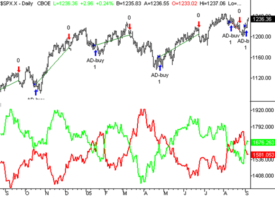
First, let's take a look at the advancing issue/declining issue data. On a day-by-day basis, this information is too erratic to effectively use. To smooth this info into a useful form, we'll calculate a moving average of the number of advancers, and then do the same for the decliners. (Note that this is not volume data - this is the portion of the 3300 NYSE-traded stocks that went up or down.) Of course, we'll then plot these averages on a chart. In our previous explanations we used a 14 day moving average of each piece of data - the advancers and the decliners. However, we've tweaked both of those numbers into a proprietary system that we can't divulge. However, it doesn't matter - the concept is all you really need to understand.
In the lower portion of the graphic, we've overlaid the moving average of the advancers (in green) and the moving average of the decliners (in red). Note that the actual advance/decline figures aren't shown at all - just the moving averages. Doing this overlay really lets us compare 'apples to apples'. And what do we see? The advancers are making a sharp divergence from the decliners. In other words, the vast majority of the 3300 NYSE issues are truly headed higher, so the trend quality on this front is pretty good. But the question is, is this worth knowing? Take a look at previous crossovers. There are a few fakeouts, but the ones that weren't fakeouts usually spotted very big moves. (The 'buys' are marked with blue arrows, and the 'sells' are marked with red ones. The lines between the arrows trace the beginning and end of the trade)
S&P 500 with moving averages of NYSE advancers (green) and decliners (red)

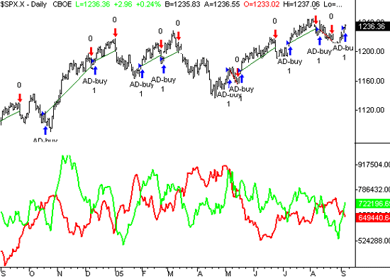
Is there anything worth seeing in the volume data? You bet. In contrast to the analysis above, with the volume data we're not interested in how many of the 3300 issues went higher or lower. Instead, we want to know the total trade volume for all the advancers, and the same for all the decliners. After all, volume is one of the few clues that can really tell you whether the buyers are serious or not. Like above, the actual daily volume data is too erratic to use by itself. To put it into a useful format, we'll again plot moving averages. Not surprisingly, the chart below resembles the chart above. It's a sign that the trade volume is consistent with the advance/decline trend. Are there fakouts like above? Absolutely. But also like above, when the crossover signal is right, it's usually right in a very big way.
S&P 500 with moving averages of NYSE up volume (green) and down volume (red)

Anyway, it's just another way of looking at things. I like these kinds of models because they send very clear signals, and don't leave much room for all the 'ifs' and doubts that come with analyzing a bar chart alone. Plus, I've found that the volume and advance/decline data is actually a leading indicator, by a few days. The bigger picture buy signals are already in place, as we saw above, but you still have to pick good entry spots and avoid buying at the high points. Patience is the key.
Price Headley is the founder and chief analyst of BigTrends.com.