| July's Rampant Inflation Paints Fed Into A Corner |
| By Price Headley |
Published
08/15/2008
|
Currency , Futures , Options , Stocks
|
Unrated
|
|
|
|
July's Rampant Inflation Paints Fed Into A Corner
Let's see, with inflation growing the fastest it has in 17 years last month -- a whopping 0.8% -- the twelve month inflation rate is now 5.6%. We've not seen annual inflation like that since 1991. Wow. The Fed really should do something, like raise rates, but the lesser-told yield curve story may have them trapped between a rock and a hard place. More on that below.
The culprits were the usual suspects - energy and food.
Of course, the immediate discussion following the announcement was centered around whether or not this would finally prompt the Federal Reserve to do something about it. That got me thinking. Does the Fed have any kind of discernible track record when it comes to fighting inflation?
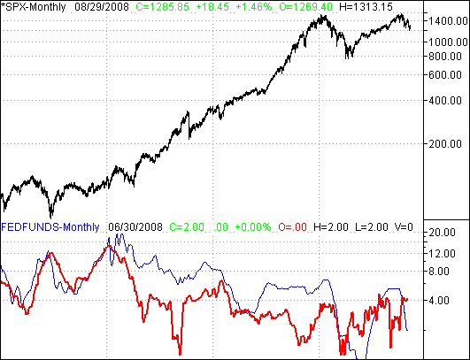
First of all, I confess that I have access to too much data. I 'm a junkie in that regard, largely because I like to see things and test relationships for myself. If you happen to be the beneficiary of my addiction, so be it. Anyway, the chart below shows us what we need to know.
The upper data is just the S&P 500. I want to see just how 'bad' inflation is for the market, and to what extent, if any, a higher Federal Reserve arte can harm it.
The lower portion of the chart overlays historical annual inflation rates with the Fed Funds rate. Though the two shouldn't match perfectly, there should be a discernible correlation of some sort. Inflation is in red, and the Fed's rate is in blue.
Fed Funds Rate Versus Inflation

One thing about this chart immediately sticks out to me is that the Federal Reserve's interest rate has historically been higher than, or at least no less than, inflation. Beginning in 2002 though (right about when the bull market started), things changed.
I don't know if that's by design, or coincidence. Regardless though, long-term, it seems to work. It makes me curious as to what's so radically different now the Fed sees fit to break tradition. In their defense, maybe they do see something. I have to be honest though; this recession/contraction really isn't all that different than any others. They all 'feel' different at the time, but fundamentally, they're the same.
Likewise, I'm not saying the Fed needs to push interest rates above inflation just for the heck of it. I'll repeat something though. That condition seems to have been successful before. I don't think it's a one-fix formula, but it couldn't hurt.
The argument against higher rates is simply that it will push the economy, the lending market, and the real estate market all over a cliff. If that's the worry, I have some bad news for you. All three are already on their death bed. You can't kill something twice. What have we got to lose at this point?
On a semi-related note, all this interest rate chatter got me thinking about the yield curve (the difference between short-term rates and long-term interest rates). I'll throw in that chart as well.
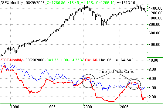
I like to compare the 10-year bond yield to the 3-month T-Bill yield. It seems to be the most common yield curve comparison.
On the chart below, the S&P 500 appears at the top, and overlaid on the lower part, the 10-year yield is in blue (thin), while the 3-month yield is in red (thick). With the former at 3.9% and the latter at 1.7%, the yield curve is modestly positive. However, I think this may be part of the Fed's worry.
Yield Curve

There's some room for short-term rates to go higher. However, look what happened the last time the Fed tried to raise rates in 2004. Short-term rates crept up, but long-term rates stayed pretty much flat. That's not the Fed's fault entirely, but it's still not something they want to get in a hurry to work their way towards again, in case the result is the same.
Of course, the fear of an inverted yield curve is clear. The last two inversions did indeed jump-start a bear market.
So, here's the dilemma. The Fed probably doesn't want to push short-term rates above long-term rates, but long-term (10-year) rates thus far have been pretty stagnant at 4%. At the same time, annual inflation is now topping 4% to 5%. To control inflation, they'll have to push rates more than just a little higher. They may have to push them into another inverted yield curve.
I wish I had some sort of advice for them, but I don't. They have to rob Peter to pay Paul. It's not an impossible situation, but a tough one.
The only thing I wanted to pass along to you today was an explanation of what's rally going on behind the scenes. Most of the media just went hog-wild spreading the gloom-and-doom of inflation, without describing the whole scenario.
Price Headley is the founder and chief analyst of BigTrends.com.
|