| January 2009 Looks Like January 2001 |
| By Price Headley |
Published
01/16/2009
|
Currency , Futures , Options , Stocks
|
Unrated
|
|
|
|
January 2009 Looks Like January 2001
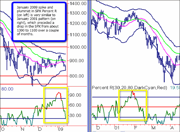
There was a recent spike in Daily Percent R on the S&P 500 Index (SPX) above the 80 level, reaching as high as 98, followed by the quick plummet to below 20 that was unusual in its swiftness, and also faked out many traders who saw further upside potential. This pattern is unusual in my experience, so I looked back at the Daily SPX charts going back to 2000 to find a similarities. The closest pattern I found was from January 2001, which is not good news for the short-term bullish case.
The first chart below shows the side-by-side Percent R readings from January 2009 (on the left) and January 2001 (on the right). You can see the similar quick spikes up in Percent R followed by the sharp move down. The move in January 2001 preceded the S&P dropping about 200 points over the next couple of months (15% to 20%).
2009 vs 2001 Percent R Chart

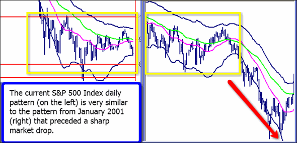
In addition to the Percent R similarity, there also is a basic similarity in the recent SPX chart versus the January 2001 chart. If you examine the chart below, you can see the underlying downtrend which led to a test of the Bottom Acceleration Band, followed by a move to the Top Acceleration Band, then a quick drop back to the Bottom Band. The left side of the chart is where stand as of last night's close on the SPX. The right side of the chart is the subsequent move in 2001 The move bottomed out in March/April 2001.
2009 vs 2001 SPX Daily Chart with Acceleration Bands

The Bottom Line
Are we definitely going to have a further market leg down, similar to 2001, breaking below our previous support at 800 and 750? Not necessarily. Every situation is different, and we do have potential support from the Bottom Acceleration Band here, as well as fear entering the market seen in spikes in the VIX and CBOE Put/Call Ratio. However, there are many similarities in these charts that lead me to ascertain the chance of a continued plunge is fairly high.
Price Headley is the founder and chief analyst of BigTrends.com.
|