| Corcoran Technical Trading Patterns For March 20 |
| By Clive Corcoran |
Published
03/20/2009
|
Stocks
|
Unrated
|
|
|
|
Corcoran Technical Trading Patterns For March 20
Today, I shall be looking at three rather remarkable charts which show correlations between the movements in some key asset classes and I want to tie this into a discussion about the primary reason behind the FOMC's decision this week to begin Quantitative Easing. In a nutshell, the Federal Reserve is petrified of a deflationary spiral and the charts below will, hopefully, illustrate why they are right to be worried.
Many have commented on the "lost decade" in Japan and this is usually thought to have coincided with the 1990's but in fact the case could be made that Japan has lurched from one bout of recession to another for the last 20 years after the spectacular blow off achieved with the Nikkei 225 almost touching 40,000 at the end of 1989.
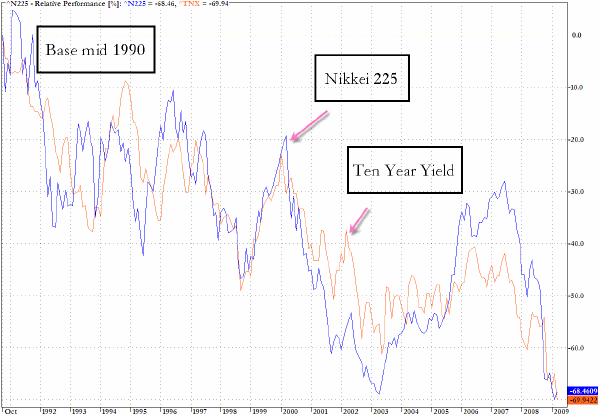
What is often not realized is just how closely correlated are the movements of the Nikkei 225 and the yield on the US 10-Year Treasury Note. If we select mid-1990 as the base for a comparison and plot the percentage changes in both, the correlation is quite astonishing as the chart below shows. Not only has the trajectory taken by each been one of very high correlation but also the terminal point on the right hand side of the chart is uncannily coincidental. The base period that has been chosen is mid 1990 so as to avoid the final blow off of the Nikkei 225 but even setting the base a little further back does not really change the picture significantly.
What is potentially alarming for the US policy makers is the possibility that US asset prices could deflate in a very similar manner to that seen in the world's second largest economy Japan. Japanese equities are now back to levels seen more than 20 years ago and that nation's asset bubble of the late 1980's has been entirely eradicated.
A convincing case can be made that the Nikkei 225 has been in a bear market ever since. It is this asset deflation on such an extraordinary scale that should keep central bankers, especially in the US and UK, alert to the possibility that a deflationary spiral is extremely vicious and hard to arrest.
In any observed correlation there is no requirement or implication for a causal relationship as what is being measured is a co-movement of changes.
The underlying or independent variable in this correlation would almost certainly be the yield on the US 10-year and to fully explore the relationship between the two would go beyond the scope of this article. What can be said is that the income being paid out in the form of US Treasury coupons has been in a similar downward trend to Japanese equities throughout the entire period and represents the other side of true asset deflation which is that capital has been increasingly incapable of generating sustainable (non speculative) cash flows as a return to investors. In other words the US Treasury has been able to benefit from the most troublesome aspect of an ongoing and structural asset deflation scenario which is the gradual disappearance of reliable and long lived income streams from the employment of capital. The bubbles in the US market since the mid 90's have produced temporary illusions of asset inflation but now that these have been pierced the true returns to an over abundance of global capital have been revealed as truly elusive.

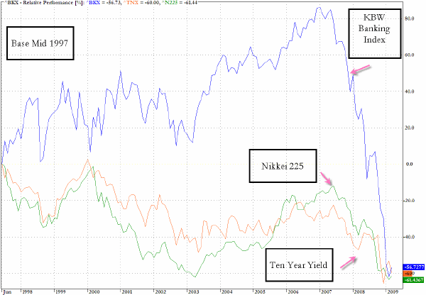
In the next chart the unusually high correlation between the movements in the yield on US Treasury Notes and the Nikkei is illustrated even more strikingly by inserting another key asset class into the mix - US Banking stocks, as represented by the KBW Banking Index (KBW).
Look again to the right hand side and the terminal percentage position is again quite extraordinary. A different base period was selected because the Banking Index did not exist in the early 90's and the base selected of mid 1997 corresponds to the Asian banking crisis which many feel marked a key turning point in the development of a more sophisticated and accident prone financial economy.
One could make the case that the entire bubble that is seen in the KBW during the ten year period from 1997 to 2007 - based on leveraged Anglo Saxon financial engineering techniques - has effectively now been deflated and the current position of the banks in relation to the Nikkei and the ten year yields reflects the sober assessment that the balance sheets of the US banking sector have effectively been brought back down to earth after a period of mass delusion as to the value of the assets (primarily real estate) that persisted from the dot com era and through the Greenspan easy money era.
The take away from this chart could be somewhat reassuring in the sense that the worst may now be fully priced in to US banks. There are other indications that the sector is grasping for a bottom and the coincidental terminal point with the other two key variables lends some credence to this notion. However the key variable in the equation - the yields on the 10 year Treasury - could still bring all three variables depicted down to even lower levels.

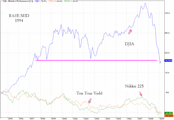
The third chart retains the two underlying variables for continuity in reference points - the ten year yield and the Nikkei 225 - but added on the chart below is the Dow Jones Industrials Average (DJIA). The base period chosen is mid 1994 which preceded the large run up in the Nasdaq and tech stocks of the 1990’s and which takes us back far enough to gain a perspective on some key levels for the DJIA.
As can be seen from the chart the DJIA has recently come down to levels not seen since 1997 and as the recent dip below the horizontal line suggests this index is currently living dangerously. If the index was to break down below the 1996/7 levels there is more than a theoretical possibility that US equities in general could have substantially further to drop. Not to the same extent as the Banking Index which has converged with the deflation variables but certainly another 20% below the early March levels is a distinct possibility.
What can alleviate this troublesome scenario - in a word inflation and a kick start to the single most worrisome asset class in the whole equation - US residential and commercial real estate prices.
For some thoughts on this matter I shall quote from another article that I wrote yesterday on the reasoning behind the QE move from the Fed this week.
The best way to consider the timing of the QE policy is that it is tied pragmatically to the US real estate market and that the Fed is being encouraged by, and hoping to germinate, anecdotal evidence that the bottom may be in sight and that this is a good time to be providing maximum support to the mortgage origination and re-financing market.
Not just in the US but in many parts of the world, central bankers are now becoming desperate to try to ignite some spark under their property markets. Much more so than even supporting equity markets, central banks know that the most damaging form of wealth destruction (and the evaporation of consumer confidence) is evidenced by the perception that property values remain in free fall.
Will the QE inspired reduction in mortgage rates spark some life into the US property market?
It is highly unlikely on its own to do so because the Fed and other central banks appear to be overlooking the fact that only macro increases in income levels will be able to drive a sustainable recovery path. Residential and commercial property prices/rents are still not genuinely affordable, and will not become so while final demand and levels of employment are declining and, notwithstanding even both of those changing direction, it can be further argued not until the median value of a family home has reverted to a more historically sustainable alignment with median family income.

Clive Corcoran is the publisher of TradeWithForm.com, which provides daily analysis and commentary on the US stock market. He specializes in market neutral investing and and is currently working on a book about the benefits of trading with long/short strategies, which is scheduled for publication later this year.
Disclaimer
The purpose of this article is to offer you the chance to review the trading methodology, risk reduction strategies and portfolio construction techniques described at tradewithform.com. There is no guarantee that the trading strategies advocated will be profitable. Moreover, there is a risk that following these strategies will lead to loss of capital. Past results are no guarantee of future results. Trading stocks and CFD's can yield large rewards, but also has large potential risks. Trading with leverage can be especially risky. You should be fully aware of the risks of trading in the capital markets. You are strongly advised not to trade with capital.
|