| A Look At The Force Index |
| By Price Headley |
Published
04/19/2009
|
Currency , Futures , Options , Stocks
|
Unrated
|
|
|
|
A Look At The Force Index
One of the many indicators available to a technical analyst is the Force Index. This indicator was created by Dr. Alexander Elder and uses a stock's price change and trading volume to gauge the strength of bulls and bears. The logic behind this is that by combining stock movement and volume, this indicator attempts to measure the "force" of a trend.
This oscillator focuses on at stock's directional price change, the extent of the price change, and a stock's trading volume. The Force Index is usually coupled with a moving average in order to appraise the muscle of optimists and pessimists. The moving average of preference is a 13-day moving average, as it is longer term than the three-day moving average and is therefore a stronger indicator.
So, what kind of calculation goes into the force index? The oscillator is determined by taking a stock's close from the previous day and subtracting it from the current day's close. This result is then multiplied by the current day's volume. If the current day's closing price is higher than the previous day's close, the force will be positive, and negative if the current day's close is lower than a day before.
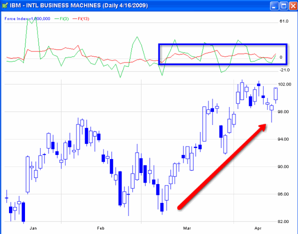
The chart below shows IBM (IBM) with the Force Index readings at top. The green line is the three-day moving average of the Index and the red line is the 13-day moving average. The zero (0) area is basically the horizontal center of action, as the lines oscillate around the 0 level, often referred to as the centerline.
The general accepted concept is that If the moving average moves north of the centerline, the bulls are in charge. If the move is south of the centerline the bears are in charge. Notice that the 13-day moving average (the red line) is much less choppy (volatile) than the three-day line.
There are different ways to analyze and utilize an indicator like this (and traders are encouraged to experiment and come up with new techniques and methods). But one thing you can see in the following chart is that the 13 unit smoothed out red line crossed above 0 when the stock turned around in March and has held above that level since then. Pullbacks towards 0 have been buying opportunities within the uptrend.
IBM Daily Chart

On the SPY Daily Chart below, you can see re-test crosses of the key 0 level on the smoothed out 13 unit line have been significant recently. There was a failed bullish test above 0 in February that preceded the big market downmove, and a failed bearish test below 0 in March that preceded recent strength. Re-tests and confirmations are an important factor to consider when creating, modifying, and utilizing trading systems and indicators.
SPY Daily Chart

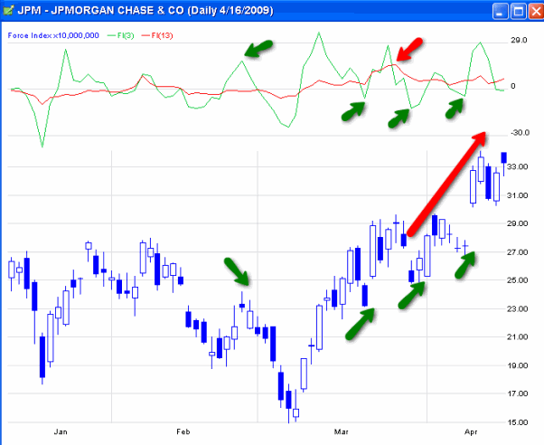
On the JPM Daily Chart below, you can see that the shorter-term 3 unit average can be used as a supplement to the longer-term 13 unit average. Peaks in the green line (while the underlying trend is bearish) have marked good selling points, while pullbacks in the current uptrend have marked positive short-term entry points. A recent peak in the red line 13 unit showed the underlying strength of the uptrend, as pullbacks have been followed by moves higher.
JPM Daily Chart

As with many technical indicators, the Force Index has a variety of methods and techniques in which it can utilized -- but the logical basis of movement combined with volume certainly has merit. And there is always room for enterprising traders to experiment with different settings, optimizations, rules, etc in order to create more effective signals and systems from this indicator.
Price Headley is the founder and chief analyst of BigTrends.com.
|