| Corcoran Technical Trading Patterns For May 1 |
| By Clive Corcoran |
Published
05/1/2009
|
Stocks
|
Unrated
|
|
|
|
Corcoran Technical Trading Patterns For May 1
Today’s discussion about the S&P 500 (SPX) was the focus of an article entitled A rising wedge pattern and the market folklore about Sell in May and go away that I posted at my blogsite yesterday and was partly inspired by a fellow technical analyst whose work I much respect.
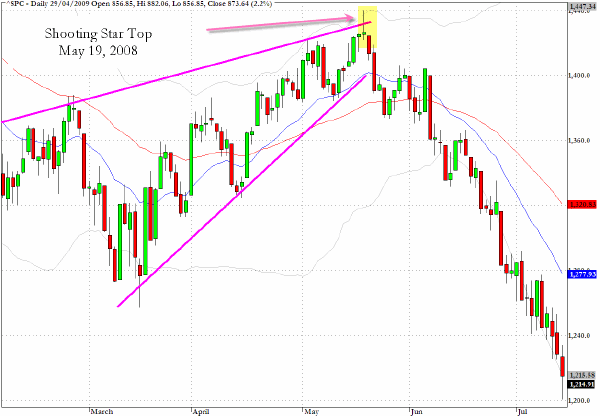
The chart below really needs to be considered in relation to the chart directly below it as well as it provides a comparison between the current pattern on the S&P 500 and the pattern for exactly the same period one year ago. Let’s begin by looking at the pattern below from one year ago.
There are four key points to make on this chart:
1. There is a distinctive rising wedge pattern from early March 2008 up to the top in mid-May 2008
2. The actual top is highlighted as the major reversal pattern of a shooting star to a multi-period high that failed.
3. The actual failure date was May 19, 2008.
4. The index dropped by 15% over the next two months.
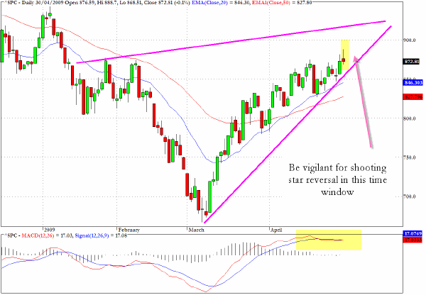
In conjunction with the chart from above, the S&P 500 chart following yesterday’s action has a striking similarity with another rising wedge pattern.
I have provided a continuation of the wedge pattern up through the May time window and would suggest that we should be especially vigilant during this period for another failure or major reversal candlestick pattern. I have also shown the MACD chart which is pointing towards a tailing off in momentum.
It could even be suggested that yesterday’s failure to close above 875 with shooting star pattern may have been the trigger.
Perhaps more tantalizing is the possibility that we extend further upwards towards the 935 area which was seen in January 2009, and which would take us probably into the mid-May time frame, and an almost identical chart configuration to that seen exactly one year ago.
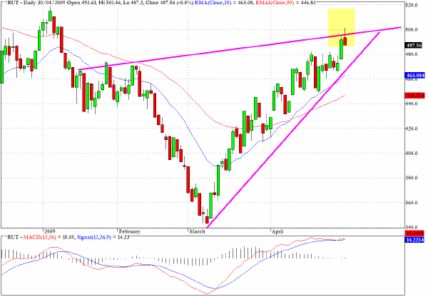
The Russell 2000 (RUT) peeked above the 500 level yesterday and also registered a shooting star pattern.
Looking more closely at the rising wedge projection imposed on the chart, the tapering is more acute on this index, suggesting that a possible breakdown might be more imminent than my reasoning on the S&P 500 chart.
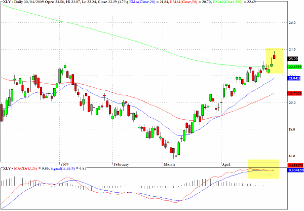
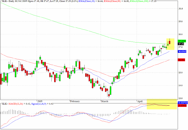
As if to add further emphasis to my concerns that we may be approaching an intermediate term top, there are two sector charts worth considering as well.
The consumer discretionary stocks, as tracked by XLY, have performed remarkably well since early March and this is one of the few sectors which has broken above its 200-day EMA.
However, the MACD chart is suggesting that the momentum mania is definitely peaking.
The other significant sector fund which has peeked above the 200-day EMA is XLK, which tracks the technology sector, and I think very similar arguments could be offered here as were made for XLY.
Clive Corcoran is the publisher of TradeWithForm.com, which provides daily analysis and commentary on the US stock market.
|