| Corcoran Technical Trading Patterns For April 13 |
| By Clive Corcoran |
Published
04/13/2010
|
Stocks
|
Unrated
|
|
|
|
Corcoran Technical Trading Patterns For April 13
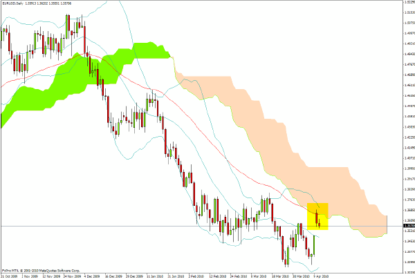
The sizable gap up in EUR/USD which took place in Monday’s Asian trading ran into resistance almost exactly where it might have been expected as illustrated on the Ichimoku daily chart.
The EZ states may have muddied the waters enough with their commitment to support Greece only when the situation becomes critical enough that default would send shudders through global capital markets, but the technical pattern for the euro is still one where the preferred stance is to sell rallies.
For readers of this commentary that are not able to tune into the UK media coverage of the upcoming election, it is hard to describe the surreal manner in which politicians appear to be like the story of Nero who supposedly was busy playing his fiddle while Rome burned. Just one comment that I would wish to pass along as to the reason why I believe that the outlook for UK gilts and sterling remains bleak.
Much has been made by the Treasury spinmeisters of the fact that the UK’s issuance of gilts has one big benefit in comparison to many other nations, which is that UK public debt has longer maturities than is the case for its G8 counterparts.
From the point of view of (say) a pension fund holding that debt, the longer the duration of a fixed income instrument the more sensitive it is to interest rate risk. If held to maturity the price in the secondary market is less of an issue but in a higher inflation and higher interest rate environment there could be a sizable loss of the "real" value of the income stream from the coupons. If the fund wanted to swap its old bonds for newer ones with higher coupons, this would definitely require institutional investors to incur capital losses on the long duration bonds that they wanted to sell. (To over-simplify matters, duration has some similarities with high beta - it’s a positive in a rising stock market or for bonds when interest rates are headed down, but becomes decidedly more negative when stocks fall or when interest rates are increasing).
Each increase in the required yield to maturity for a gilt with approximately six year duration would mean a loss in the secondary market value of the bond of six percent.
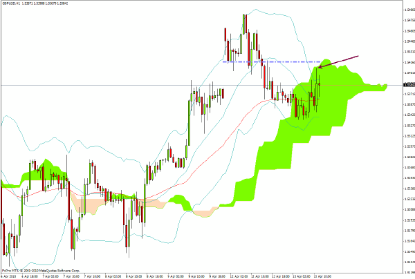
GBP/USD faces a stiff challenge at the level indicated on the chart and I would be targeting a return to the $1.51 area in coming sessions as the possibility of political gridlock issues, along with the spectacle of how much each political party is promising to give away in tax breaks/benefits to voters, begins to make gilt investors even more nervous than they are already.
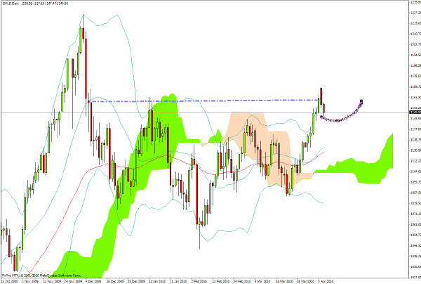
In my last commentary before taking a few days away I noted that gold needed to decisively close above $1155 to confirm a resumption of the bullish case. The metal did that but has now retreated back below $1150 as this is being written.
The most likely pattern of price development would be the path annotated on the chart which would be yet another in a series of fractal formations that have characterized the chart over several months. It will, however, be important to watch whether the $1125 is violated on a closing basis in coming days.
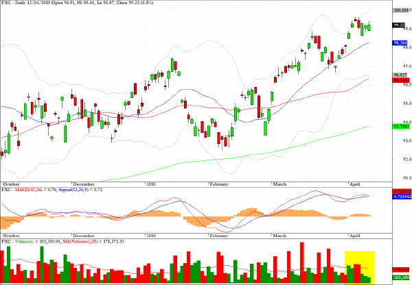
All of the remaining charts featured below indicate - to a greater or lesser degree - signs of momentum divergences.
The first is for FXC which, unlike the spot rate quoted as USD/CAD - moves downwards when the Canadian dollar weakens - which is what I am expecting with a target of 0.97 on this chart in the intermediate term.
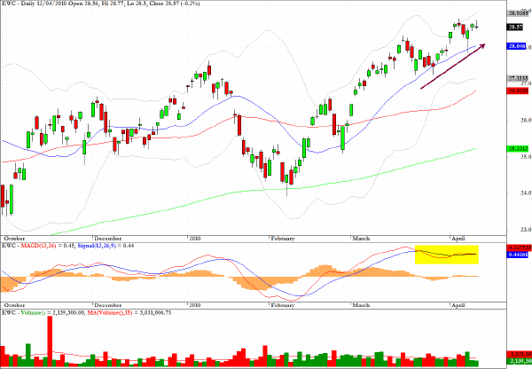
The daily chart for EWC, a sector fund for Canadian equities which tracks the MSCI Canada Index, has quite noticeable dissipating momentum and negative divergences.
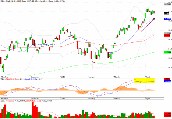
Another candidate for some consolidation, or for a pause that will refresh (to put it most positively which is becoming increasingly de rigueur in the current climate) is for EZA which tracks South African equities.
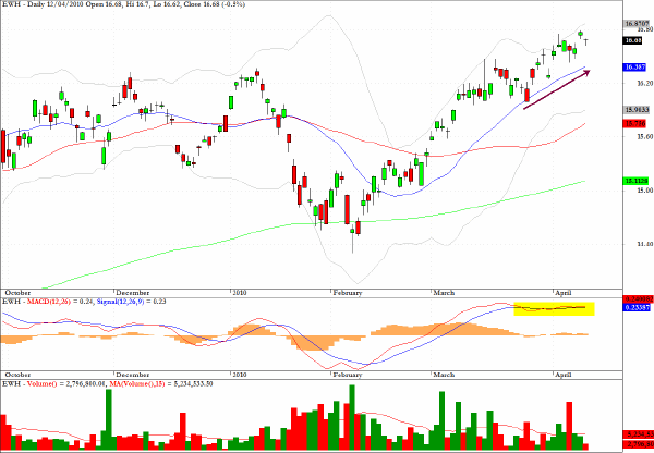
EWH, which is a useful ETF providing exposure to the Hong Kong market, shows that momentum has peaked following the recent steep run-up in prices.
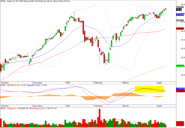
The chart for HYG, which provides exposure to the high yield sector, is starting to remind me of the Road Runner cartoons where Wile Coyote fails to notice not only that he has run out of road but that there is a yawning chasm below.
Clive Corcoran is the publisher of TradeWithForm.com, which provides daily analysis and commentary on the US stock market.
|