On Tuesday we took brief looks at a handful of different ideas. The format was well received, so today we'll do the same thing. There's a volume chart we want to look at, and we'll take a look at the latest U.S. dollar charts, although the outlook hasn't changed there. And finally, we'll take a look at the imbalance between breadth and depth that is setting up a very brief period of weakness on the horizon.
Volume Trend Shifts
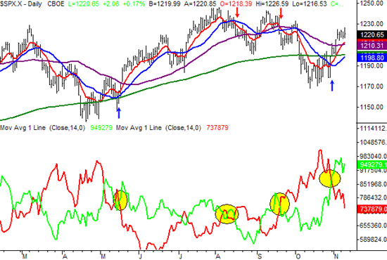
Our first chart is the "volume chart" we make from time to time. In a nutshell, this chart (see the lower half) compares a moving average of the NYSE's bullish (up) volume, in green, to the NYSE's bearish (down) volume, in red. The idea is to spot the points when the volume tide (i.e. trend) shifts. The easiest way to spot such shifts is just to look for crosses of the moving averages. That's why we plot one on top of the other. As you can see, it's a pretty good tool - the last four major crosses are highlighted, and all we're pretty accurate. So, we at least want to acknowledge that the volume tide turned bullish a few days ago.
But the real story here is not the crossover; it's the fact that both of the moving average lines have drifted higher. How's that possible? Remember, the averages of both bearish and bullish volume can increase simultaneously, if the total volume is increasing. The summer months were traded thinly, as they usually are. But now, as the year is coming to an end, the total volume (bullish and bearish) is ramping up. The significance is just that more players means longer, stronger trends. We'll welcome the change from the lethargic mode we were stuck in just a few months ago. In the meantime, the chart says the bigger picture is bullish. (Note that we'll be at odds with ourselves below, as we explore what should be a source of bearish pressure.)
S&P 500 with moving averages of bullish/bearish volume

Euro Versus the Dollar
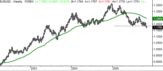
A couple of weeks ago we reiterated the fact that the dollar was getting stronger against the euro (or the euro was getting weaker against the dollar -- take your pick). That hasn't changed, but at the time, we were concerned that the euro/dollar chart had found strong support right at the 1.187 mark. As long as that line held, the dollar's recovery would be on hold. Well, as of this week, that support has been broken. We've seen the euro/dollar exchange as low as 1.1708, so it looks like the sawbuck is back on the road to recovery.
Euro/Dollar Exchange Rate - Weekly

NYSE Trading Index (TRIN)
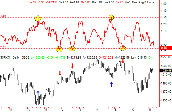
Most readers will know that we trade the most when markets and indicators are at "extremes." Well, the NYSE TRIN Index is at one of those bearish extremes right now. For that reason, we have to believe that we're due for at least a small correction. You'll see why on the chart below.
Specifically, the ratio of advancers and decliners on the big board are out of whack with the ratio of advancing volume and declining volume. Generally speaking, the two should be holding at about the same proportions in a "normal" environment. When they're not, usually a correction of that condition is just around the corner.
So what does this "extreme" look like when plotted on a chart? See the image below. However, understand that the TRIN plot (in red, on top) you see is only the moving average of the daily TRIN data. The actual TRIN data is too erratic to plot - or use - in spotting overbought and oversold markets. When this moving average hits its own extreme levels, as marked by the dashed lines, a reversal can be expected. In five of the prior instances of extreme readings, four of them did indeed lead to a reversal. We're concerned in the short run now because the moving average line is telling us that the TRIN trend is at such low levels, something has to give soon. Odds are that it will be some of the market gains we just reaped. Just food for thought, Keep in mind that this is a very short-term indication.
NYSE Trading Index (TRIN) S&P 500 - Daily

Price Headley is the founder and chief analyst of BigTrends.com.