| Corcoran Technical Trading Patterns For August 9 |
| By Clive Corcoran |
Published
08/9/2010
|
Stocks
|
Unrated
|
|
|
|
Corcoran Technical Trading Patterns For August 9
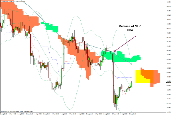
The 60-minute chart for USD/JPY strikingly depicts the reaction of the Japanese currency following the release of the NFP data on Friday at 8:30 Eastern time. All of the yen crosses saw abrupt changes as the yen surged against the dollar and all other currencies. During the course of the session several of the currencies regained much of the initial losses, including the euro and the Australian dollar, but the US currency remained relatively weak.
The action since shows a gradual retracement but as highlighted there is expected resistance from the cloud formation and the 86 level should pose difficulties.
Some of the charts today have been simplified for usage in a television broadcast which I will be recording for Cantos TV in which I'll discuss the unusually strong co-movement of Treasury yields and the Japanese yen - as yields move down so, inexorably, the yen moves up.
From an equity perspective it remains to be seen whether the divergences can continue with the Treasury complex and the yen discounting severe deflation and anemic growth at best whereas the S&P 500 is still priced on the basis of a fairly typical recovery from the 2008/9 recession.
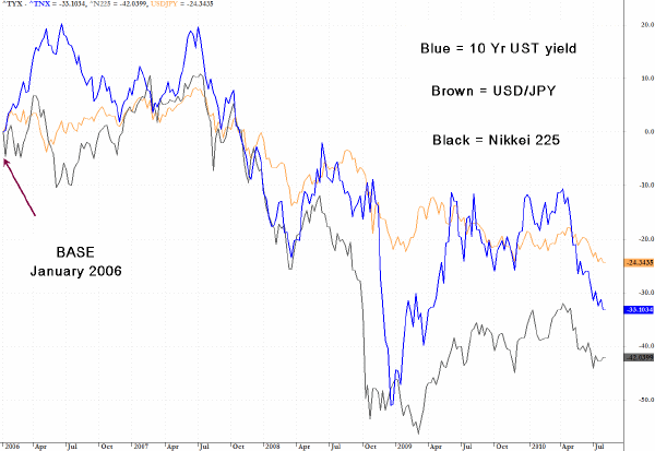
One of the charts which I'll be showing on a slot for Cantos TV this week shows the relative performance of the following separate items, using January 2006 as a base:
1. The yield on the 10-Year US Treasury
2. The performance of USD/JPY - the exchange rate between the US dollar and Japanese yen
3. The performance of the Nikkei 225
Particularly noteworthy are the remarkably similar trajectories taken by the dollar against the yen and the decline in the yield on the benchmark US Treasury. The Nikkei 225 tracks them both well and has been taking its cues from the Treasury yield for most of the last 20 years. As yields have fallen from 8% plus at the time of the Nikkei’s collapse, starting in 1990 and which has been a persistent phenomenon since, to below 3% today, so the Nikkei has fallen by about 75%. It is debatable as to the direction of any causation (if any) or whether it is just a very curious correlation. I do not believe that it is just a curious coincidence but digging into that would take us a lot longe than I have today.
The Japanese market has lived with deflation during much of this period, and for those who believe that the bond markets are a leading indicator for the remaining capital markets the prospects for a severe deflationary episode in the US has to be taken seriously.
The ten-year JGB currently yields about 1% so theoretically at least the yield on the US equivalent could still have plenty of scope for further decline which would produce nice capital gains for those US bondholders who have bought bonds with coupons in the 3-4% range, but would it be so good for holders of US (and emerging market) equities?
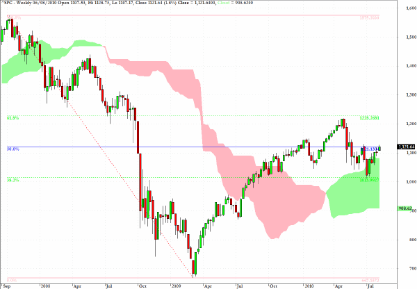
The S&P 500 index came to rest on Friday almost exactly at the 50% level between the October 2007 intraday high of 1576 and the March 2009 low of 666.
The 38 and 62% retracement levels have also been annotated on the chart, and it is quite uncanny that the region between 1228 and 1013 almost defines the range seen since the beginning of the year.
As noted here recently, during thin trading conditions of August the most likely reaction to an aggressive attack by short sellers would be a concerted effort to test their resolve by proprietary trading desks and proably to squeeze the market higher.
It is September that should pose a more serious threat to a retesting of the lower boundaries of the range again.
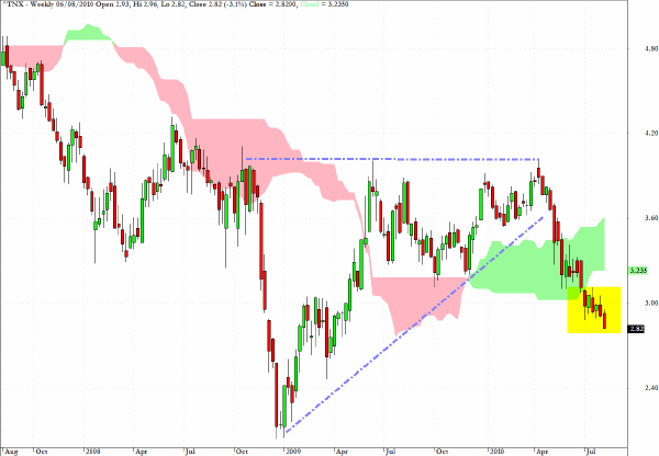
The weekly chart of the yield on the Ten-Year US Treasury Note shows that after the drop below the trendline at the end of April - probably the single most important warning for the so-called "Flash Crash" of May 6 - the trend has accentuated to the downside.
One of the more noteworthy developments in Friday’s trading was the fact that the yield on the Two-Year Treasury actually dropped below 0.5% for the first time in history.
With so many institutional investors voting to hide out in Treasuries, one can only wonder at the Herculean task which is currently being performed by those investors and algorithms supporting equities.
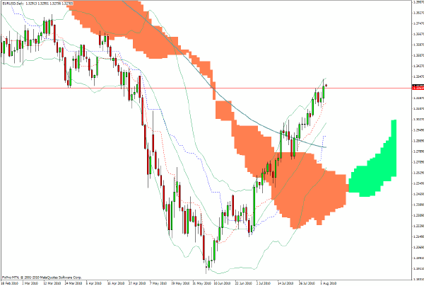
The daily chart for EUR/USD shows that euro has moved back to levels seen before the onset of the acute sovereign debt scare and I would suggest that the easy money may have been made on the currency’s rebound from the distressed levels seen at the end of the May.
Longer term I would suspect that there is more bad news to come from the PIIGS nations and that the current nonchalance regarding the EZ’s structural problems is largely due to the fact that most European policy makers are away from the microphones during their summer break.
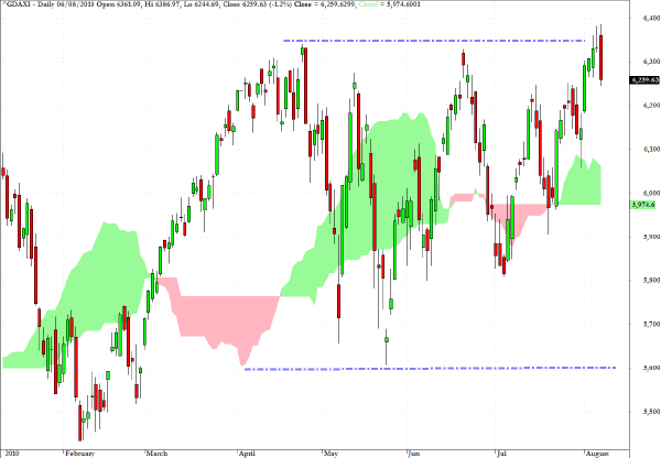
The daily chart for Germany’s DAX shows a fairly clear trading range which has been in place since the recovery from the early February sell-off.
One of the most notable features of this chart is the manner in which the two plunges in May were so quickly reversed and in each case the index headed straight back to the top of the range.
If there is to be an impetus to break through the top of the range - and Friday’s action showed that this market remains very sensitive to US data - then there could, during August, be an attempt to make it to the 6600 level. However, there was a lot of previous congestion between 6400 and 6600 in 2008 and upward progress could prove to be erratic and subject to sudden setbacks.
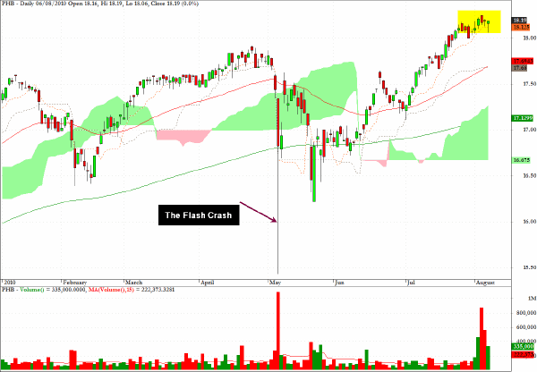
PHB, which is one of several ETF’s which provide exposure to the corporate high yield sector, has marched higher without any serious corrective behavior since the so called Flash Crash.
However, the recent increases in volume, also associated with down days (hence the large red spikes on the volume chart) suggests that those seeking out high yields with blithe disregard to a weak economic outlook may be living a little recklessly.
Clive Corcoran is the publisher of TradeWithForm.com, which provides daily analysis and commentary on the US stock market.
|