| Corcoran Technical Trading Patterns For December 13 |
| By Clive Corcoran |
Published
12/13/2010
|
Stocks
|
Unrated
|
|
|
|
Corcoran Technical Trading Patterns For December 13
Some of the chart formats today will be slightly unorthodox so that I can incorporate a different perspective on some key asset classes which I will be presenting later today on a pre-recorded television slot which will be broadcast on Cantos Charts and Reuters Insider.
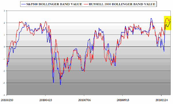
The first chart is designed to show both the daily closes over the last several months of the Russell 2000 and the S&P 500 situated within their Bollinger Bands. In other words, a 50-day simple moving average has been taken for both indices and the standard deviations calculated. The distance from the SMA is indicated by the left hand scale which indicates the number of standard deviations above or below the moving averages.
According to probability theory based on a normal distribution (which is actually seriously flawed in relation to time series data for financial assets - but that’s another story) the likelihood of price being above the level which is two standard deviations (or sigmas) from the average is only about 2.5%. This is because 95% of observations are likely to fall within plus or minus two standard deviations, and since this is symmetrical at both ends of the scaling the probability of being above 2 sigmas is equal to half of five percent.
As can be seen from the chart both indices are now above 2 sigmas and the Russell 2000 (red line) has been for several sessions. The suggestion - especially when looking at previous instances on the chart when this has happened - is that a near-term top for both indices is increasingly probable.
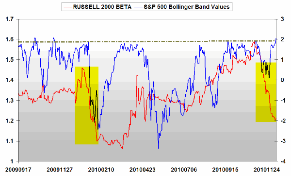
The next chart shows two lines with two different vertical axes.
On the left hand vertical axis can be seen the beta value of the Russell 2000 with respect to the S&P 500. Essentially this measures the extent to which changes in the micro cap index tend to amplify the changes in the broader market index...it is not the same as volatility but rather measures the way that the two indices exhibit co-movement. A reading of 1 for beta means that they essentially move in sync with each other whereas a reading of 1.50, for example, would show that for whatever change the S&P 500 reveals - either up or down - the Russell 2000 will show a change of 50% more than that of the broad market benchmark.
On the right hand axis is the S&P 500 plotted according to the Bollinger bands as discussed above. As before it can be seen that the close on Friday put the S&P 500 index above 2 sigmas which has not happened for about a year.
Most importantly the beta value is declining quite rapidly on the right hand side, i.e. most recently, which suggests that the Russell 2000 is currently below its norm in "out-performing" the S&P500. Given that both indices are reaching extreme levels the suggestion is that, when there is a correction, the best strategy would be a pairs trade of equal dollar values with a long component of SPY and a short component of IWM assuming that the beta will increase to more normal levels and the IWM will be "losing faster" than its SPY counterpart.
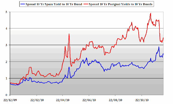
I have recently focused on the serious problems within the Eurozone and wanted to show two charts which need to be watched in coming weeks relating to the bond spreads for two critical countries which represent potentially large problems for the EZ with systemic implications.
The chart below shows the spread between the 10-year Spanish bond and the equivalent bund (blue line) and the spread between the Portuguese 10-year and the bund (red line).
The problems of Portugal have received a lot of attention from traders in FX and the euro government bond markets, but it is the recent upward moves by the Spanish bond that are more concerning. Last week the Spanish 10-year was yielding more than 5.5% - and almost touched a 300 bps spread against the bund. The suggestion is that the Spanish/German spread will be very much in focus, especially when the main bond market trading desks re-open for normal business in 2011.
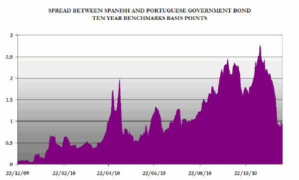
The chart below reveals the spread in basis points between the Spanish ten-year government benchmark bond and the Portuguese equivalent.
The spread needs to be considered in relation to the previous chart as in itself it is relatively uninformative. They key takeaway is that if both Spanish and Portuguese bonds are rising with respect to the underlying EZ benchmark rate which is effectively the yield on the ten-year German bund, and the spread between the Spanish and Portuguese bonds is narrowing (declining) then the perceived creditworthiness of Spain within the EZ is deteriorating.
As previously discussed, while the markets may have already discounted a bailout for Portugal the EFSF system is not equipped to handle a bailout for Spain and the ramifications for the euro currency and the already fragile euro bond markets would be quite staggering if Spain needs to be rescued...indeed it is unclear exactly how that could be accomplished.
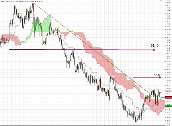
USD/JPY has cleared above cloud resistance on the daily chart and the basing pattern revealed suggests that an initial target of 85.80 is feasible, perhaps before the end of 2010, with a longer-term target during Q1, 2011 of 89.10.
Needless to say, I believe there are favorable trading opportunities ahead on the long side for most of the yen crosses - in particular CHF/JPY and CAD/JPY.
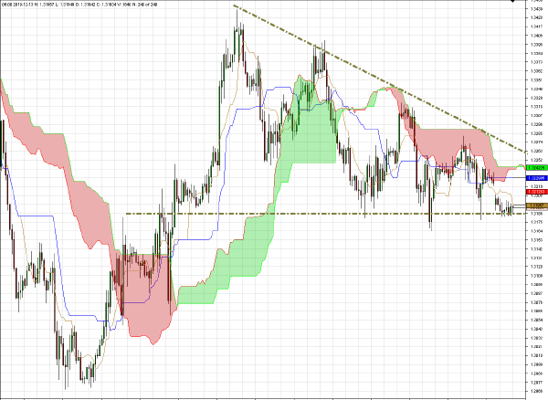
EUR/USD on the hourly chart is now showing the characteristics of a descending wedge pattern which could be the precursor to a selloff if and when there is a break below base of the pattern at around $1.3150.
A decisive break above the descending trendline through the highs on this hourly chart, which I deem to be less probable, would suggest a possible attempt to re-visit the $1.3480 level.
Short-term scalping with a focus on selling rallies is still the preferred stance for coming sessions.
Clive Corcoran is the publisher of TradeWithForm.com, which provides daily analysis and commentary on the US stock market.
|