NASDAQ Commentary
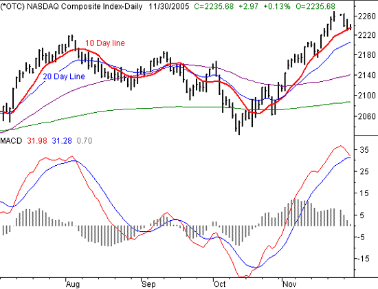
The NASDAQ may have finally run out of steam, after reaching as high as 2269.30 last week before pulling back to its current level of 2241.8. It was a good run while it lasted.....with five weeks of solid gains. But as with all trends, nothing lasts forever. So then the question becomes one of how long this pause will last. And just as importantly, how vulnerable are we?
We're going to focus in on the 10 day moving average (red) today, as it appears to be the critical pivot on our chart. Yesterday's low of 2232.54 was pretty much where the 10 day line was at the time, but there was clearly a support aspect to the line. Today we've already traded under the 10 day average (at 2236.27) by hitting a low of 2231.94, but we can still see that there is some support for the NASDAQ in this area. So, that will be our next critical sign - a close under the 10 day average. If we make a close under the 10 day line at 2236, that should be sufficient inspiration to the sellers to keep at it, and should equally discourage any buyers. Keep in mind, though, that it's the end-of-day close we're interested in. Check back at 4 p.m. EST.
That said, based on the fact that the composite had been so overbought for so long (and that the rally went unchecked for most of the last five weeks), we still anticipate a little more selling to correct the situation. Therefore, we want to look at the next likely landing point - the 20 day average (blue ) at 2206. That would only be about another 25 points of downside movement, yet it would be more than enough of a dip to release all the pressures than have been building from a red-hot rally that began in mid-October. That's the answer to the 'vulnerability' question we posed above. We'll rethink things once we get to that point. And speaking of........
Based on the MACD lines (on the verge of a bearish cross), a small pullback could develop into a big one fairly easily, as we saw over the last few months. All of those bearish MACD crosses took a rather big toll on stocks. But now, we're not in the same environment. For starters, the NASDAQ has managed to break out of its rut by moving to new 52-week highs, ushering in a new mentality for investors and traders. And second, we're still in the middle of the most bullish period for the year. If there was ever a time that a downtrend would be quickly quelled (with or without good reason), then this is it. From that bigger picture perspective, we still think any selloff will be minimal, and we still expect to see a very positive December.
NASDAQ Chart - Daily

S&P 500 Commentary
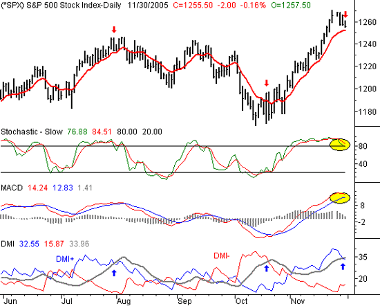
For the first time in a long time, the S&P 500 has made four consecutively lower highs. That's just a testament to the consistency of the downtrend that started when the index peaked at 1240.65 last week. Yet, for the strictest of disciplined traders, the S&P 500 has yet to give any of the classic sell signals. That leaves trapped somewhere between what we expect to happen, and what the charts are actually doing. In this case, though, we're still looking for more downside before its all over......but not a lot more.
Plotted on our chart are three of the core technical analysis tools - stochastics, MACD, and Directional Movement Index (DMI) lines. In all three cases, we're only on the verge of technical sell signals. Those near-signals are highlighted in yellow for all but the DMI tool; we have a little bit of a different take on that indicator.
Traditionally, crosses of the two DMI lines are the 'signal', while recrosses undo the prior signal and switch the bias to the other direction. And as you can see, when the DMI+ line (blue) crossed the DMI- line (red), things did indeed get bullish. The opposite applies as well for a cross of DMI- over DMI+, so all in all it's a pretty good tool. But as you can see, the two DMI lines are nowhere near a cross. This is where we have a unique application of the ADX line (gray). While the traditional use of this tool is great for spotting the beginning of reversals, it can be slow in getting you out of a trend. Why? Because a bullish entry signal isn't always an effective bearish exit signal.....if you're waiting to only trade when the two DMI lines cross, you're frequently giving back a lot of profits. For our DMI-based exits, we look at crosses of a DMI line and the ADX line. When the top-positioned DMI line falls under the ADX line, that's usually the actual end of that particular trend. Confused? Don't be - this is all illustrated on the chart.
The blue arrows on the DMI chart point out the major crosses of a DMI line and the ADX line after a major entry signal (both bullish or bearish). The red arrows above the price chart correspond to those DMI/ADX crosses. As you can see, although that wasn't necessarily the entry signal for the next trend, this was a far better exit signal of the trend at the time.
That's also why we're leaning towards bearishness right now, even without a DMI-based bearish crossover. Like we saw in late July, this is what the end of an uptrend usually looks like.
S&P 500 Chart - Daily

Dow Jones Industrials Commentary
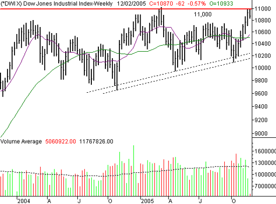
The Dow's problem became clear this week (and last week) when we took yet another swing at 11,000, and whiffed. The Dow had just enough gas to get to that mark, but it looks like that was the sell trigger for most of the market. That's partially based on the fact that we topped out here in March, and not enough people had confidence that we could really make new highs for all three indexes. But it's also got a lot to do with the psychology of big round numbers.....they're not easily crossed (in either direction). Whatever the reason, 11,000 is the line in the sand. And so far, we'd have to say that we're not going to get past it with ease.
Rather, we're looking for a brief period of consolidation, and maybe even a little more pullback, before breaking that barrier. The 200 and 50 day lines are both right around 10,500, which would be a healthy dip. But, on this weekly chart, it's also clear that the longer-term trend is a bullish one. We'd be using any dip as a buying opportunity.
Dow Jones Industrials Chart - Weekly

Price Headley is the founder and chief analyst of BigTrends.com.