| Actual Employment Numbers Are Weak |
| By Price Headley |
Published
05/23/2011
|
Currency , Futures , Options , Stocks
|
Unrated
|
|
|
|
Actual Employment Numbers Are Weak
For the third week in a row, stocks lost ground. It wasn’t a big loss, but after three straight weeks of them, questions have to be asked. We’ll ask them all below, right after we take a bigger-picture look at recent and upcoming economic data.
Economic Calendar
Last week was a big one on the real estate front, but not a good one. Starts fell from 585K to 523K, and permits fell from 5574K to 551K; both were well short of expectations. Existing home sales also fell, from 5.09 million to 5.05 million -- well beneath the forecasted rate of 5.23 million.
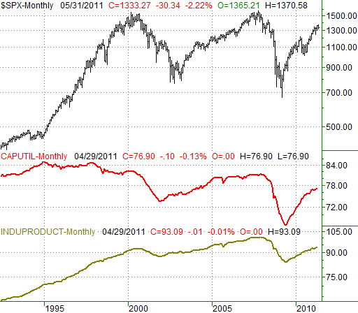
Factories, however, appeared to remain busy. Capacity utilization stands at 76.9% as of the end of last month, which is just a tad under the prior month’s 77.0%. Industrial production growth was flat last month, but the productivity index (not cited on the calendar below, but plotted on our chart) is still hovering at multi-year highs. Though no ‘growth’ is evident, just maintaining output levels can still led to the stability needed to foster broad economic growth. Take a look.
Capacity Utilization and Industrial Productivity Index
On the joblessness front, we’re seeing what appears to be tepid improvement, via a diminishing number of new and continuing unemployment claims. The former fell from 438K to 409K last week, while the latter fell from 3.792 million to 3.711 million.
That said, there’s an employment number you rarely (if ever) hear, the actual number of working Americans. That number isn’t getting better. As of the end of April, 139.6 million U.S. workers are actually employed. That’s about the same number of employed workers we saw in the middle of 2009, and the improvement since the middle of last year has almost been immeasurable. How can this happen while claims figures are dropping? Simple – those claims figures don’t include the unemployed who have (1) seen their benefits expire, (2) have stopped filing claims, and (3) are employed, but underemployed.
Take a look at the chart of the actual number of working Americans.
Employed U.S. Workers

And as always, the economic details for the prior and coming week….
Economic Calendar
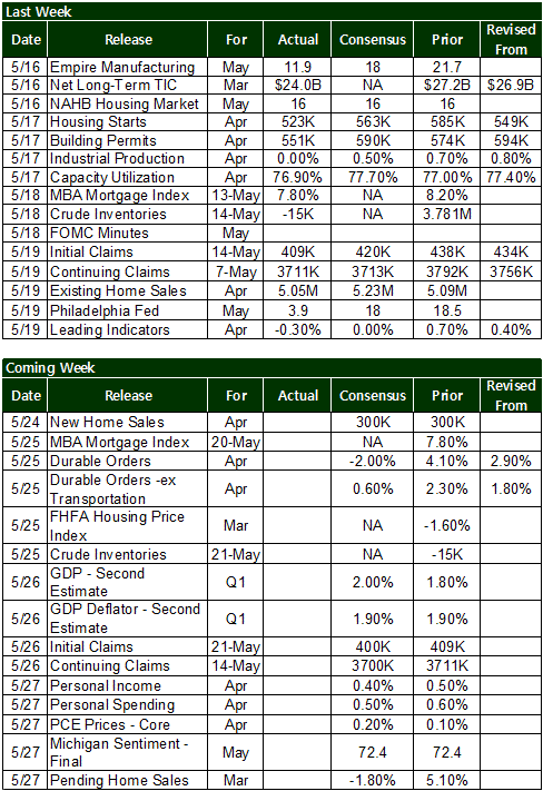
The coming week will be relatively busy, but not everything is hard-hitting. Here are the biggies to watch out for.
* Tuesday: The real estate picture ill be rounded out with new homes sales levels for April. Look for an annualized rate of 300K per year.
* Wednesday: More real estate data… the FHFA Housing Price Index, which is a broad barometer for all home value changes.
* Thursday: New and ingoing unemployment claims, as usual. Look for slight drops for both.
* Friday: How sock or healthy is the consumer? Changes in income levels and spending levels will tell the tale. Income is expected to be up 0.4%, and right back to our old ‘spend more than we make’ ways, consumer spending is expected to have increased by 0.5% for April.
* Friday: Pending home sales put the final touches on the most recent real estate update; the pros are expecting a 1.8% dip for March.
S&P 500 Index
All told, the S&P 500 (SPX) (SPY) gave up 4.5 point (-0.33%) last week to end Friday’s session at 1333.27. Had it not been for Friday’s 10.3% loss though, the market would have ended the week with a gainn not that Friday’s something we can just delete from the scoreboard.
As for what’s next though, that’s a little less clear, but there are only a couple of likely paths.
Just for the record, if Friday’s dip really is the current direction of things and we’re pointed lower – as it appears we are – then the SPX has just made its second lower highs after making a second lower low (framed by pink lines). Ergo, a downtrend is in place. That’s undeniable. The question is where it might stop falling, and reverse.
While it’s not happened yet, a floor that could do the trick is immediately below -- the 50-day moving average line (purple) at 1326. Just a tad under that level is the 100-day line (gray), at 1313. If either or both of those lines fail to stop the bleeding, odds are good the S&P 500 will be paying a visit to the lower 50-day Bollinger band at 1278. What happens after that is anyone’s guess.
The other possibility here is a bullish one, beginning with a break back above that upper purple/resistance line, which by default would coincide a move back above the 20-day moving average line (blue). If that happens, then the upper Bollinger band at 1372 becomes the new target.
In the meantime we’re in limbo, although we have to acknowledge the bears are currently in control. As such, we have to give the greater odds to the bears right now, though we wouldn’t be digging in too deep on either side of the fence.
Notice how the heavier volume days were all pullbacks, while the two rallies -- Wednesday and Thursday -- were on light volume.
SPX & VIX Daily HC
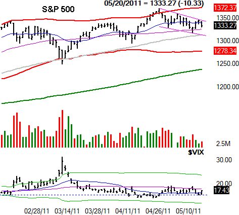
What about the CBOE Volatility Index (VIX) (VXX) (VXZ) in all this? Remember, last week was expiration week, which can skew the VIX and make it somewhat misleading. Or in this case, the VIX was oddly unscrewed (it closed on Friday about where it closed the prior week). That containment, however, is still a form of skew. We want to see how it starts to move in Monday and Tuesday before coming to any conclusions.
In the bigger picture though, the VIX is still uncomfortably low, meaning confidence/complacency is dangerously high; these bulls will need some sort of attitude adjustment sooner than later. A couple of closes above the VIX’s 50-day average line at 18.0 will start that process.
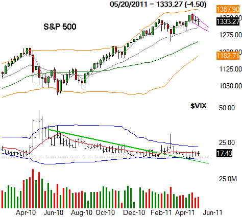
Since we usually add it, we’ll once again insert a weekly chart of the S&P 500 to out the daily one in perspective. What’s becoming clearer here is that the broad bullishness is losing momentum, and the bears keep testing that 100-day line.
SPX & VIX Weekly Chart
Sector Performance
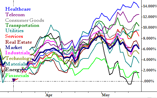
Things were shaken and stirred last week on the sector front. Healthcare (XLV) is still out in front, but Telecom (XTL) is quietly sneaking up -- a complete turnaround from telecom’s dismal performance through most of last year.
At the bearish end of the spectrum, Financials (XLF) have officially gone from bad to worse. Notice, however, that there were few places to hide last week.
Sector Performance, since March 16
Price Headley is the founder and chief analyst of BigTrends.com.
|
|