Back in October we took our first look at some new highs/new lows data. It became of interest at the time, as the number of New York Stock Exchange 'new lows' topped 300. Why did that matter? Because it was a huge number of new lows......too many, to be specific. We saw it as a sign of a market bottom. So did it work out? Definitely! You may recall that heading into October, the market was looking pretty bearish, and just got worse as October wore on. So in mid-October, it was hard to think that anything could be bullish. But on October 12, the NYSE saw 324 stocks hit new lows. As the chart showed then, that was very unusual.....and an omen. That did indeed signal a market bottom. (Note that we also saw a very low number of new highs then.)
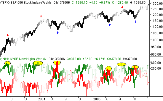
So what's that got to do with now? Well, after seeing how accurate that sign was, we started paying more attention to it. We may be seeing the exact opposite scenario now......a bearish one, due to an unusual number of new highs. On Monday, the NYSE saw 379 stocks make new highs. We saw 357 new highs on Friday. The thing is, we haven't seen readings that high since July, which come right in front of a prolonged downtrend. At the same time, there were 13 new lows on Monday. That's an incredibly low number......one we haven't seen since July, again, before the downturn.
The analysis is simple......we're starting to enter a market dynamic that is so bullish, it's unhealthy. Is this an omen of a downturn? There's never a guarantee, as we saw this kind of data all the time in the very late 90's/ But, this isn't the late 90's, and stocks aren't caught up in an infallible bullishness.
Take a look at the weekly chart below. The new highs are plotted in green, and overlaid on the new highs in red. It's clear that when the new highs and lows are at extremes, a reversal is usually in the works. And it works equally well in both directions! When the highs or lows hit a peak (highlighted), a major shift in market momentum is on the way (arrows). Obviously last week's bars are at such an extreme differential. The two readings could be farther apart, but not a whole lot farther. This should eventually (sooner than later) catch up with the market and pull it back down again.
S&P 500 with new NYSE highs/lows - Weekly

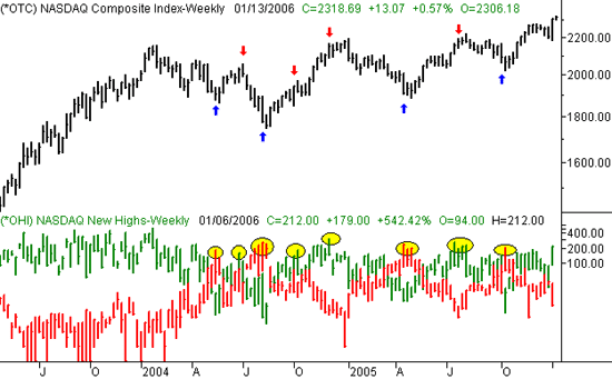
So what does the NASDAQ's new high/new low scenario look like? About the same.....last week's NASDAQ new high peak of 212 was very unusual. Paired with last Friday's 'new low' reading of 14, the NASDAQ is at a very vulnerable point. Oddly, the NASDAQ new high/low data is even more reliable as a reversal indicator than the NYSE data is. All the major high/low peaks are highlighted, and the accompanying reversal is marked with an arrow. This set of data works too well to ignore it now, so we're not going to. Something's got to give soon, and we anticipate that it will be stocks.....by falling back.
NASDAQ Composite with NASDAQ's new highs/lows - Weekly

Anyway, it's just an idea. But based on its success rate, we have to give it its due attention. We'll continue to monitor it over the next few days, but quite frankly, we're already at the extremes where the market's tone changes. Yes, the NASDAQ has been bullish to the point of being bizarre, but that's fairly typical of a top.....think of it as a last gasp. We shall see.
Price Headley is the founder and chief analyst of BigTrends.com.