Well, March is officially here, and none too soon. Over the last three months, stocks have really gone nowhere, so I'm hopeful that the new calendar month will also bring some renewed interest in trading. We don't even really care if it's a bullish or bearish environment, since both environments can be profitable. We just want to start seeing some movement......any movement.
Just for some perspective:
- The Dow Jones Industrials closed at 11,053 yesterday. They were at 10,932 on November 25th.
- The NASDAQ closed at 2314 yesterday. It was at 2318 on January 9th.
- The S&P 500 closed at 1291 yesterday. It was at 1290 on January 9th.
And if you look back even further into late last year, the gains are just plain uninspiring. The market just can't get anything going.
Are we complaining? Nah. That's jus the nature of the market. Periods of high volatility are followed by periods of low volatility. That's the way it's always been, and always will be. It's just up to the trader to make the best of both scenarios, and maximize profits when the big opportunities arise.
So how do you know when the market is really moving versus just treading water? There are plenty of ways to get an idea of that. We use the CBOE Volatility Index (VIX) primarily as a fear and sentiment gauge, but it also does its job of forecasting volatility. Or you could use breadth and depth data to really test the undercurrent of the market. But one of the easiest methods that anybody can utilize is a very simple tool called the Average Directional Index (or ADX) line, which is just part of a two-pronged Directional Movement Index (or DMI) analysis.
If you're familiar with DMI or ADX, then great. If you're not familiar with it, don't worry - it's a pretty easy concept.
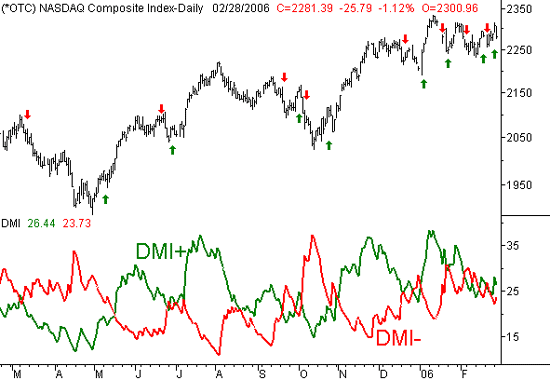
A Directional Movement Index (let's just call it DMI for short) analysis is just a set of two lines plotted on the same chart. One of the lines plots the day to day changes in the highs (not the closing price) for any given stock or index. That line is usually just called DMI+. The second line simply plots the day-to-day change in the lows for an index or individual equity. Most traders refer to this line as DMI-. The idea is that bullish pressure will be marked by a rising DMI+ line, since each day we see slightly higher highs. Conversely, if the DMI- line is rising, it means we're seeing lower lows, which is obviously a sign of bearish pressure. [That's a critical point. The DMI- line does not move lower when things turn bearish.....it rises as the underlying stock chart weakens, which may take some getting used to.] If you're confused, don't be. A quick look at the chart below will clarify everything.
On our chart, the DMI+ line is the green one, and the DMI- line is red. The arrows marked on the NASDAQ Composite chart (top) indicate the points when we saw a major cross of the two DMI lines. Sure there were a couple of fakeouts, but by and large, this is a pretty good tool to spot new trends, whether bullish or bearish.
NASDAQ Composite, with DMI lines

But wouldn't it have been nice to not get faked out a few times in September and October? For that matter, wouldn't it have been nice to not get faked out in January and February? We saw several crosses of the DMI lines in both periods, but the signals were mostly errant.
Well, there's a way. The Average Directional Index (or ADX) line can help you determine the spots where the DMI tool is meaningful, and where it's not.
The chart below is the same as the one above, except this time we've added the ADX line to the DMI analysis. But first.....
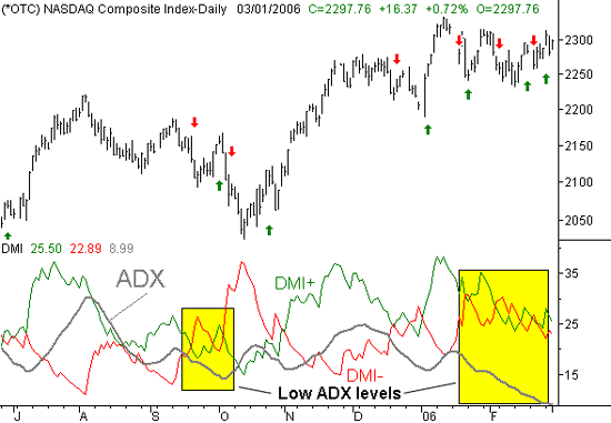
The ADX line is simply the average of the difference between the two DMI lines. Think of it as an indication of the strength of the trend. In fact, the ADX line isn't even able to be bearish or bullish by itself, so don't even think of 'up' or 'down' as good or bad for stocks. It can only indicate the degree of difference between the DMI+ and DMI-lines. If the two DMI lines are widely diverged (or at least diverging), then it can only be because the stock or index is really moving, which is the environment trader's want. During this time, the DMI line will be rising. If instead, the two DMI lines are basically occupying the same space, it can only be because there really aren't any significant changes in the highs are lows. That, of course, is a neutral market scenario, and tough for traders to tolerate. And by the way, if that seems like a familiar scenario, it should - that's what we've been dealing with for over two months now. That's also why we wanted to look at this tool right now; it's very relevant to those who may be getting impatient.
In any case, take a look at the chart below, and see if you spot the major difference with the ADX line when the market choppy, and not trending in any direction.
NASDAQ Composite, with DMI and ADX lines

See the difference?
When the ADX line was high, or rising, the DMI crossover signals worked very well, whether it was a bullish or bearish signal. In the two highlighted periods when the ADX line was already very low or falling, the DMI signals were mostly errant. By only taking the trades where the trend was strong - as signaled by a high and/or rising ADX line - you would have been far better off.
The point is, there are only a few real opportunities in any given trading year. By focusing in on the best ones and not trying to squeeze blood out of a turnip, you'll find that your bottom line will greatly improve. This is particularly important right now, with the ADX about as low as we've ever seen it. The recent environment has been sideways, and therefore tough to trade. We foresee that changing in the near future, but you can bet we'll be keeping an eye on the ADX line to determine whether or not any new trend has enough strength to follow-through.
Price Headley is the founder and chief analyst of BigTrends.com.