NASDAQ Commentary
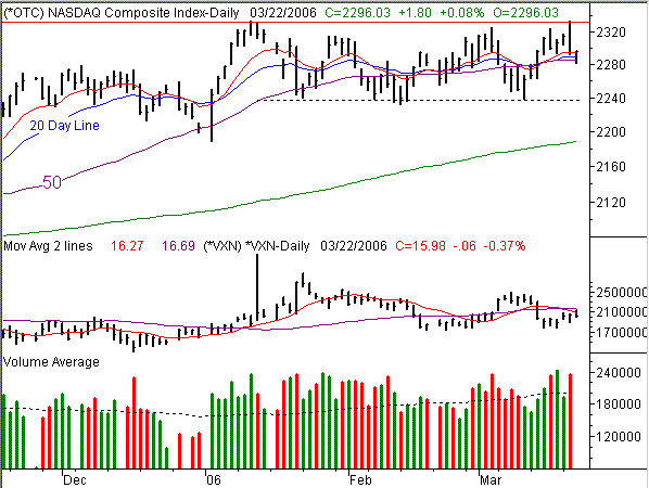
No surprises here today. The NASDAQ Composite hit 2333 yesterday, then started a pretty large pullback that left the index at 2294.23. Today hasn't resulted in much net change, but the lower low and the much lower high doesn't exactly set a bullish stage. In fact, it would be fair to say that the composite is stuck right in the middle of things. That leaves us still sidelined.
"Range bound" is a term we're becoming pretty familiar with, especially after topping out at 2333 yesterday. That was also where we topped out in mid-January, and to see such a drastic intra-day reversal yesterday, we have to think that a lot of traders were just waiting to re-reach that mark, and bail out. With that many itchy trigger fingers ready to sell (volume was very high on Tuesday), the 2333 mark just became very important.
In the meantime, however, we're contending with the intertwined 10, 20, and 50 day averages. They span from 2284 to 2294. With today's trading range of 2282.38 to 2296.07, you don't have to do a lot of math to figure out that the market is at a pivotal point.
But under all of that is the rest of the story. The lower edge of the range is still at 2240, close to where the NASDAQ has bottomed three times since January. Seeing how the index has made a habit out of it, we're looking for a retest of 2240 again, despite the fact that the composite is on top of the key average lines at the current time.
After that is still a question mark. In general, we think the fact that the NASDAQ's loss of its leadership position is a bearish omen. Plus, the VXN is still treading at ridiculously low levels. But, the trading range has been very strong. Only a break under 2240 would really make us think that the bigger trend is turning negative. Likewise, only a break above 2333 would impress us in a bullish way.
NASDAQ Chart - Daily

S&P 500 Commentary
The S&P 500 is up a little bit today, but nothing to get overly excited about after yesterday's eight point slip. Then again, the 10 day average was quick to provide a recovery point, and the bigger trend still shows this index pointed higher, even if in a zig-zag manner. So in that regard, we still have no choice but to remain bullish until we have a reason not to.
The problem (for us, anyway) is what we also know to be true about the recent SPX chart. Going back to December of last year, the S&P 500 has developed a fairly consistent pattern of rallies to new highs, then a small pullback to the rising support line just under the 10 and 20 day moving averages. It's currently at 1273, and rising a little every day. Seeing a complete stochastic sell signal now tells us that we're likely to get a repeat, the way we did the last two times we were stochastically overbought. That means the SPX could end up somewhere around 1275 once it's all said and done.
On a partially related note, we also saw resistance defined right at 1310 over the prior four days. Were it not so consistent, we wouldn't have thought much of it. But to see it four straight days in such a tight space tells us that there's some significance to it. We'll set our resistance line there.
From a bigger-picture point of view, we see a chart that's getting tired. Plus, we're entering the weakest time of year. That points us to a slow drift lower in the coming weeks, especially seeing how uninspired the buyers have become. However, only a break under the support line we mentioned would actually move our official stance in that direction.
S&P 500 Chart

Dow Jones Industrial Average Commentary
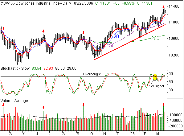
There really isn't a lot to add here for the Dow Jones Industrials Average. It continues to be the oddball of the three major indices, in that it actually broke above all of its potential resistance points (in all timeframes). Each one of those breakouts was technically bullish, but like the whole market, there's just a painful lack of upside follow through.
In fact, that lack of follow through on high-volume breakouts prompted us to take a look at some recent major accumulation days. There have been four high volume rallies for Dow stocks since this time last year, with the most recent occurring on the 17th of this month. Those are all marked with red arrows on the volume portion of the chart (bottom). The corresponding point on the Dow chart is also marked with a red arrow. In the last three instances of what could be considered a blowoff top (although that's not exactly what these were), the Dow spent the next several days headed lower. We have to wonder of Friday's surge - even if option expiration induced - flushed out all the buyers, and left none behind. The market's inability to build on a very positive week last week suggests this is the case. However, the jury is still out in the grand scheme of things.
The Dow is still finding support at the 10 day line, and the Dow stocks happen to be today's top performers. On the other hand, the Dow can't keep the whole market afloat. If the NASDAQ and the S&P 500 continue to deteriorate, we'll still look for the Dow to retest that longer-term support line currently at 10,925. Like we've been describing, we're mostly caught in the middle, so patience is still in order.
Dow Jones Industrial Average Chart

Price Headley is the founder and chief analyst of BigTrends.com.