NASDAQ Commentary
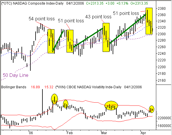
In our Weekly Market Outlook, we discussed how the 10 day moving average line was going to be the last bastion of hope for the bulls. If it broke, we'd have to get bearish (short term). Well, in simplest terms, that ship sailed on Tuesday, when the NASDAQ gave up 22 points to close at 2310.35.....22 points lower than Monday's close, bringing the three-day total loss to 51 points. So are we bearish? Almost any other time we would be, but between then and now, the equation has gotten a lot more complicated, and we've gotten a lot more bullish as a result.
In simplest terms, the selling over the prior three trading days may have been painful for the bulls, but not new. Between last Thursday's close of 2361 and yesterday's close at 2310, the composite gave up 51 points....and it wasn't exactly on light volume. But guess what? That's nothing that traders haven't recovered from more than once this year. In fact, the last three times the NASDAQ took similar losses in a very short period of time, the index at least made a full recovery, if not more. Those four big three-day tumbles are highlighted (yellow) on our chart. Clearly the first three weren't a disaster for stocks, even though they appeared as if they were at the time. The thick green line shows that gains made between the close of that three day selloff and the high close finally hit before the next big selloff.
That, paired with the fact that the CBOE NASDAQ Volatility Index (VXN) jumped from 15.63 to 17.04 over the same three day period, has us thinking that this is a short-term bottom. That 9.0 percent surge for the VXN drove it right up into its upper Bollinger Band (20 day), where it typically signals a peak in fear (and has trouble moving any higher). In fact, the VXN is already starting to point lower, as the NASDAQ Composite works to turn its modest gains into bigger ones. The VXN 'buy' signal will be complete with a lower high, and a close back under the upper Bollinger Band, which is currently at 16.90.
What about the 10 and 20 day lines? Yes, we crossed under them. In some environments that's a short-term sell signal, and we will use it as such in the future. But here's a reality about the 10 day moving average.....since the beginning of 2006, we've crossed above it six times, and now crossed under it six times. Of those twelve crosses, only one of them really signaled a decent trend - the most recent bullish cross, from March 22nd and 23rd. The ten before that were more errant than helpful. For that reason, we're focusing much more on the 50 day moving average line, which has been slightly more meaningful. This isn't overly apparent with the NASDAQ, but is a critical factor for the S&P 500 as well as the Dow.
NASDAQ Chart

S&P 500 Commentary
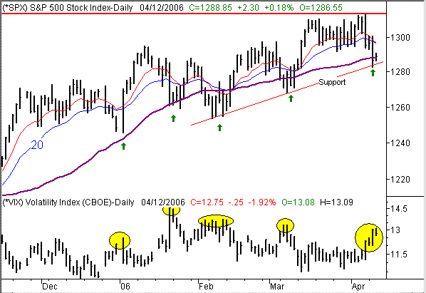
The same basic analysis applies to the S&P 500 chart - the previous three trading sessions were just a little too bearish for a bull market to tolerate. We think the buyers are poised to step in and scoop up the pieces. In fact, as of this morning, they already are.
The one unique difference with the S&P 500 is that there's a straight short-term support line in play. We had originally drawn that line between the low hit on January 3rd and the low hit on March the 8th (which pretty much included the lows from early February). After yesterday, though, this lien has been redrawn slightly; it now incorporates yesterday's low of 1282.95. This is a little better fit than the previous one, and has much more meaning since it's more precise than the previous one.
As you can tell, that's where the SPX is finding support today. However, the 'where' it's finding support isn't even as bullish as the 'when' it's finding support. Take a look at the CBOE Volatility Index (VIX) in the lower portion of the chart. Between Thursday's close and yesterday's close, the VIX rallied from 11.45 to 13.00. That 13.5 increase in a three day span indicates a major surge in fear, and stocks accommodated that mentality by falling.....precipitously. But today, the VIX has sent most of the day in the red (currently at 12.75), while the S&P 500 has spent most of the day in the black (currently at 1288.95). Based on the fact that the S&P 500 is at a key support line at the same time the VXN is coming off of a peak, we have to think that the sellers are done for a while, and the market is gearing up for a short-term bounce.
By the way, the S&P 500 has hit higher highs (new 52-week highs at that) for six straight months now. That doesn't happen unless you're in a bigger bull trend. And that trend is largely what we're banking on when we get short-term dips. Unless that support line breaks, we'll have to give the benefit of the doubt to the bulls.
S&P 500 Chart

Dow Jones Industrial Average Commentary
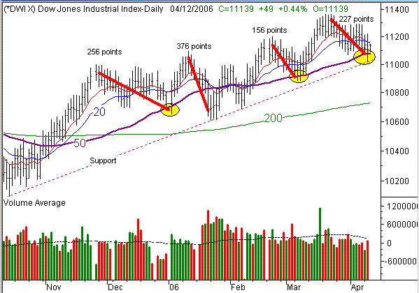
The Dow Jones Industrial Average has probably been the biggest disappointment over the last month or so. While the other two indices kept knocking on the door of new highs, the Dow kept pulling back from its March 22nd close of 11,317. But like the NASDAQ, that kind of dip was nothing unusual, or nothing new. That's why we leaned towards longer-term bullishness for the Dow, even when it was weak, and that's why we're still doing so.
Just for some perspective on the long-term/short-term issue, we went back several months and calculated what has been a typical pullback for these blue-chip stocks. Since late November, there have been four significant corrections for the Dow. These are marked with thick red lines on the chart, from the high close to the low close. The point loss is listed for each of the four; the average point loss for those four corrections was 254 points, which means the most recent correction of 227 points was nothing too significant, given that the Dow survived the last three to keep on moving to new multi-year highs.
So, the bulls really have no reason to be alarmed yet. In fact, they may have a reason to celebrate. Tuesday's low of 11,018 brushed a very long-term support line, then the late-day strength carried the index back above the 50 day line to a close of 11,090. Today, the 50 day average (at 11,081) is still acting as support, as it has several times in recent weeks (highlighted). The point is, there are a lot of bullish setups on our chart, despite the fact that the Dow Jones Industrial Average is under the 10 and 20 day moving average lines. As such, we remain bullish here. Only a break under that support line would convince us to be bearish.
Dow Jones Industrial Average Chart

Price Headley is the founder and chief analyst of BigTrends.com.