Last Friday's 140+ point rally in the Dow not only produces one of the strongest upward days for the year in this index, but it also happens to cross a key long-term technical measure. This single-day move brings into play the Dow's all-time high over the very short-term. With only less than 200 points to go, the Dow can be at all-time highs at any moment. If and when this occurs, this is going to be significant news that is certain to make waves in the mainstream media worldwide, and among the general public.
The Dow printed its all-time high in January of 2000, quite ironically, just less than 2 weeks after the widely-anticipated "turn of the millennium." As we can all recall, Y2k was accompanied by a great amount of public anxiety over whether the Y2K bug would devastate the financial system. In hindsight, it was just another demonstration of how perception can skew our impression of reality. But just when we thought all was okay, little did most know that the all-time high that the Dow printed at the time would remain in place for well over 6 years. Little did most know that the Dow would thereafter lose almost 40% of its value over the next 2 �,½ years.
Fast forward to 2002: the Dow prints its 'bear market low' point in October of 2002 at a value of 7,197. The S&P500 has lost 50% of its value, and the NASDAQ has been crushed, as the NDX loses 84%. Only one year has gone by since the World Trade Center event, the US was on the verge of war and Wall Street was feeling the heat as scandals continued to make the headlines: from Enron to Martha Stewart and Imclone, to WorldCom. Once again, little did most know that this would be the environment where the markets would stage a steady climb over the next 4 years, and that is still continuing to this day.
The Dow is now less than 200 points right back to its all-time high. To those of you that know history very well, this journey of never-ending surprises is not new to the Dow, as it has been this way for over 100 years. Let's not forget that this is a market that has survived 2 world wars, presidential assassinations, all kinds of public unrest and financial disasters. But given the current condition of the broader S&P500 as well as the (relatively) "new" speculative measure of the markets: the NASDAQ, any move into all-time high territory in the Dow will bring into question whether this "bellwether" measure of US Equities still serves as the legitimate 'all-around' measure or whether we are all just watching this as a "sentimental favorite." Certainly, a move to all-time high in the Dow after over 6 years will be cause for much public fanfare, but is it really representing the true health of our US stocks? The S&P500 is still 15% in the red, and the Naz is so far back that even a 50% recovery of its damage is still out of the question even for the Intermediate-term. Only time will tell.
Let's take a look at the charts beginning with a broader view and then zooming down to Intraday levels:
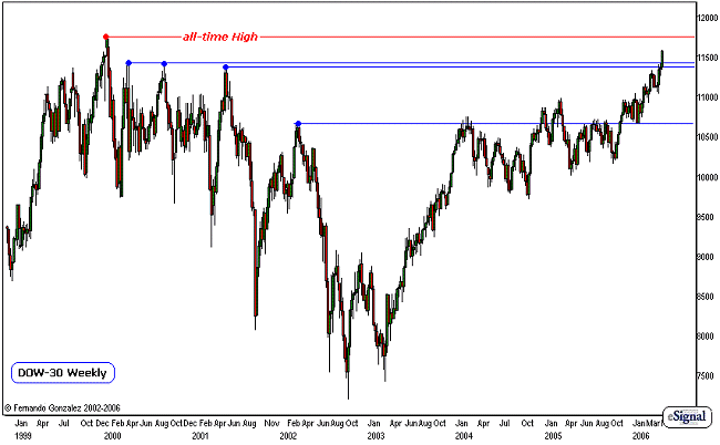
Chart Notations:
- The Weekly Chart of the Dow going back to 1999 addresses all time-frames
- The blue lines mark all the critical high-points during the Dow's decline from the all-time-High to its low-point in 2002.
- Over the years, the Dow has steadily climbed back, and last Friday's action creates both a Daily and Weekly close above the last of these critical high-points. The Dow has now crossed the "final" technical frontier, and technically speaking, there is nothing but empty space left between current levels and the all-time high.
- There is less than 200 points to go, and an all-time high can be printed at any moment.
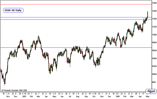
Chart Notations:
- The Daily chart of the Dow above zooms-in on our previous chart
- Here we just see the detail of the Dow's path as it crosses each 'frontier' on the way up. The blue lines, as in the previous chart, mark the critical highs in the weekly and monthly charts. The red line is the all-time high, and this chart scale gives us a good impression of its proximity.
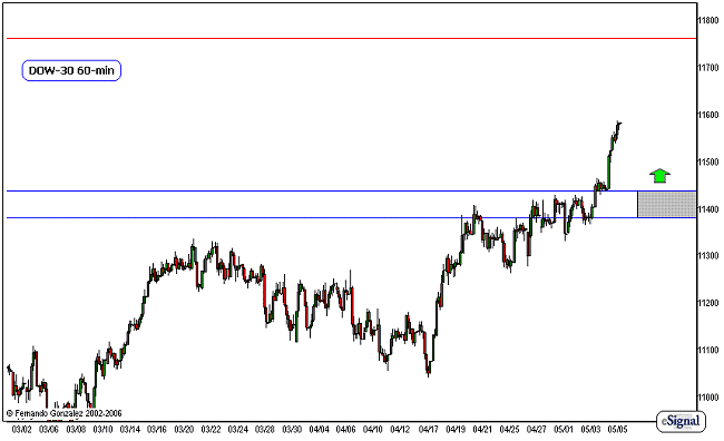
Chart Notations:
- The hourly chart of the Dow above addresses the short-term
- As in the prior charts, the blue lines are the critical highs from the past, while the red line is the all-time high.
- The gray area marks a short-term neutral zone, and the all-time high is in play so long as the market is trading above the neutral zone. We look for the market to keep pushing towards there and then make a re-assessment once the target is hit. Our re-assessment, as always will depend upon the speed of the market.
Fernando Gonzalez is in his 10th year as an active trader, technical analyst and content contributor to the active trading community and a long list of popular financial media. Online Trading Academy trading knowledge...your most valuable form of capital.


 Free Festival of Traders Videos