In the markets, as in life, "change" is the only thing that remains the same. As we will discuss below, the charts are beginning to show some of the clues of change in the markets. As most know, the market has been stuck in a slow and grinding environment for several months now, dominated by narrow, sluggish trading. While this has been just fine for US Investors in general, as both the Dow and S&P 500 have done little else but creep upward for months, short-term trading has been very tough, to say the least.
The best environment for short-term trading is one that is robust with volatility but consistent enough to sustain trend. The market over the last several months has been consistent alright, but lifeless. This is best evidenced by the NASDAQ (through the NDX), the index which I feel best measures the market's "appetite for risk." As most know by now, the Nasdaq has been completely trapped in a very narrow range for several months. The charts however, as we will see below, are beginning to show signs of change, and a greater degree of volatility is about to enter the markets. These are good signs for active traders, as that robustness is just what we need to really capitalize.
Before we get to the heart of our discussion this week, let's begin by looking first at the Dow, to follow-up on last week's discussion:
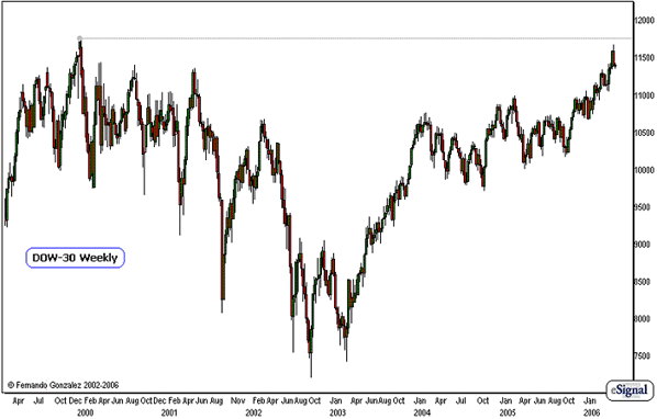
Chart Notations
- We have above the weekly chart of the Dow, going back to 1999, just before this most-widely watched stock index hit its all-time-high
- Early trading last week brought the Dow to within 90 points, or less than 1% of its all-time high (ATH), which was printed more than 6 years ago.
- This attempt to take the Dow to the ATH was a complete bust, as Thursday and Friday's trading saw a lack of bids in the markets enough to tank US Equities into one of the fastest declines this market has seen in several months.
- While this chart really has no predictive value for immediate reversal of the trend, we have this chart up more for perspective than anything else: to illustrate the market's proximity to the all-time high, the path it has taken, and the shape of the overall trend. The sell-off late last week was very fast indeed, however the shape of the chart here suggests that for now, this attempt to take the Dow to the ATH (an event that is very good for "business" in the US Equity Markets) is not quite a complete bust as it may have seemed last week, if seen from this perspective. It is very likely that they will try again over the course of the short-term (3 months or less)... after all, the intermediate-term trend still remains clearly up.
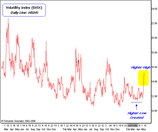
Chart Notations
- Above is the daily chart of the VIX Index. The Volatility Index or "VIX" as it is popularly known, is put together by the Chicago Board Options Exchange (CBOE) and serves as an important basis for measuring the equity market's level of volatility. A declining VIX suggests a reduction in volatility and contraction of trading ranges, while a rising VIX suggests the opposite.
- Our chart above is a daily line chart based upon actual Intraday high points on the VIX. The VIX has been declining for a number of years now since the market bottomed in 2002.
- While the trend still remains clearly down (suggesting a rising market with low degree of volatility, which is exactly what we have seen over the last several months) what we have here is the first sign of trend reversal based upon pure price behavior: the market has created a base that has served as a higher-low point (dotted blue line), that immediately precedes the creation of a higher-high point (yellow).
- What this tells us is that the market has put in an early sign of "change" in the level of volatility, which may be accompanied by a trend reversal in stocks themselves. While this is very interesting and exciting for short-term traders for the remainder of 2006, this may serve as an early warning for some very serious problems for long-term Bulls.
- It is far too early or even appropriate to "call tops" (in stocks, or "bottoms" in the VIX) based upon this evidence, but it is there to serve as a sign to prepare for some very interesting changes coming in the landscape of US equity trading.
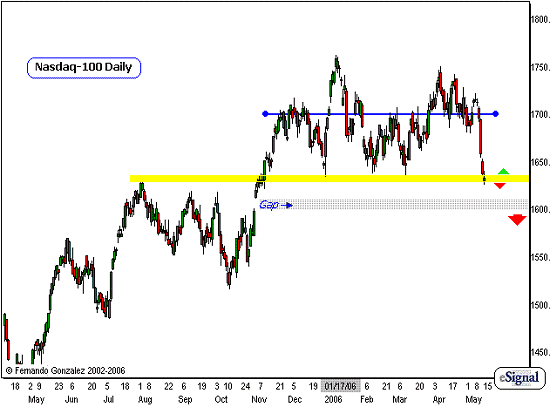
Chart Notations
- Our daily chart of the Nasdaq (NDX) above addresses the short- and intermediate-term markets. I draw the blue line across the 1700 area in the NDX to indicate the "middle" of trading range this market has been trapped-in since November.
- While the market has extended to + or - 50 points beyond the line, the Nasdaq has really spent most of its time just oscillating inside an even narrower range.
- Now this new chart action highlights the significance of what occurred last Thursday and Friday. The speed and violence of the move was very surprising to most, myself included. Being surprised is alright, and as traders we should always prepare for surprises, but it's really how we play it that counts. We act upon what we have planned for and anticipated, while we stay away if the market is doing something that was beyond our expectations, we re-evaluate, create a new set of plans, and then carry out those plans.
- Last week's violent decline brings this market immediately down to the bottom of its 6-month range. Because of the momentum and speed, it is very likely that the market will continue to drift lower towards the support points we have marked, at least towards the grey area, which represents a gap left open from last October - this remains in play so long as the market is trading below the yellow zone.
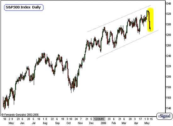
Chart Notations
Above is the daily chart of the S&P 500 and here we address the short- and intermediate-term markets as well. The S&P 500 has a stronger trend than the Nasdaq, as you can see the slow grinding move to higher-highs has been very consistent over the last 6 months.
This grinding upward environment falls within quite a well-defined channel (gray lines). However, because of the indication of the VIX, in the Nasdaq, combined with speed of the recent decline (yellow) it is very likely that we have seen the last of this consistent channel-behavior.
As mentioned earlier, while I feel it is not appropriate to "call tops," I am looking for the market to resolve downward at some point in time, after a series of directional fakes or decoys. For now, it is extremely important to note that we must begin the process of adjustment and preparation for change, as the market has gotten us accustomed to a very consistent type of behavior for the last six months. As we know, getting too accustomed to one type of behavior is a very dangerous matter for us active traders, because we must always be one our toes and ready for change particularly when the markets show us the proper signs.
Fernando Gonzalez is in his 10th year as an active trader, technical analyst and content contributor to the active trading community and a long list of popular financial media. Online Trading Academy trading knowledge...your most valuable form of capital.


 Free Festival of Traders Videos