Change continues in the US Equities as the markets declined further in the red on a sell-off that began just about two weeks ago. The decline has been attributed by most to "inflation fears" but to those of you who know the markets (and media) very well, these inflation fears are nothing new. As we know, the Fed has been repeatedly and periodically increasing rates over the course of the last few years on account of inflation worries. Yet, we have seen little else but a rising market throughout. Suddenly we have a relatively violent sell-off and we know better than to attribute this behavior to inflation fears exclusively.
Perhaps we may come up with more than a few reasons of why the markets declined, but to those of us that analyze the markets primarily based on the progress of trends in the charts, the sell-off was no more complex than a reaction to simple resistance. We shall see this on the charts below. Most may not have seen it, but it really is only a matter of looking up to the higher level of hierarchy in Time Frames.
So let's take a look at the charts beginning with a long-range time horizon to identify resistance, and then zoom-in later to the smaller time frames:
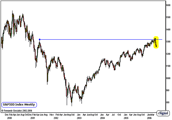
Chart Notations:
- The weekly chart of the S&P 500 going back to 2000 addresses the intermediate and long-term timeframe
- The S&P 500, the top barometer of the all US equities, has been rising steadily for almost four years now, following a powerful decline during the period of 2000-2002.
- Notice that throughout the advance over the last 4 years, the S&P 500 has not experienced any major correction. The largest corrective behavior the S&P 500 experienced (since the low point in 2002) was in 2004, when it lost 9% - still far from what is commonly defined as a "major correction." This is quite an unusual situation, and many have been looking for a "correction" that never really came.
- Recently the S&P 500 has experienced its fastest and most violent decline in four years (marked in yellow). As discussed earlier, many are attributing this to "inflation fears" but to us, this is a simple reaction to resistance from a high point in 2001 (blue line).
- Could this be the beginning of a correction that will be greater than 10% in magnitude? Perhaps. But as we can see on the chart above, the decline does not affect the overall shape of the trend over the long term. It is different, however, on the intermediate term, as we will see on the next chart:
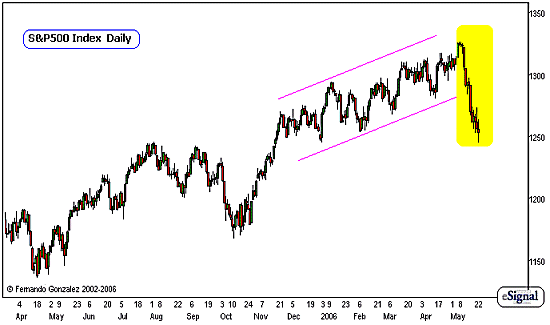
Chart Notations:
- The Daily chart of the S&P 500 above zooms-in on our previous chart, and addresses the intermediate-term timeframe.
- The market has been on a very steady climb and has fallen within the confines of a well-defined upward channel (pink lines) over the course of the last six months.
- Recently, the market has picked-up plenty of speed, and in fact this behavior we highlight in yellow is the fastest most violent move in the S&P 500 in almost four years.
- This immediately tells us a few things. First, it is very clear that the channel-behavior (pink lines) is over. This slow, steady upward grind that the market has been doing over the course of the last six months is done. There is a new behavior now, and the importance of recognizing this has a lot to do with preparing for changes in the market's patterns: the winning strategies that worked over the last six months need to be adjusted, changed, or evolved to the new environment that is likely to persist for at least a few months.
- Let's take a look at the same chart in a different way, next:
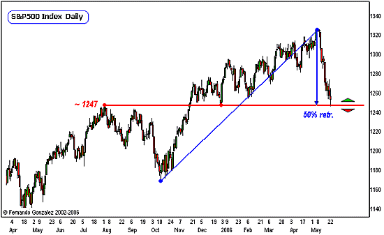
Chart Notations:
- The Daily chart of the S&P 500 above zooms-in on our previous chart, and addresses the intermediate-term timeframe. It is the same chart as the one above, except that this is a different way of looking at it.
- The red line marks former resistance at approximately the 1247 area and now what is likely to serve as support area.
- This resistance line also happens to coincide with the 50 retracement mark of the preceding rally (blue lines).
- Because this area serves as simple S/R as well as an intermediate-term degree 50% retracement, this is likely to serve as a very important pivot zone going forward.
- Let's zoom-in to the 15-min charts:
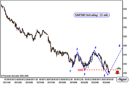
Chart Notations:
- The 15-min intraday chart of the S&P 500 above addresses the very short-term time horizon (10 TD or less)
- Notice that over the last few days, the market has stabilized the large decline, and now has developed a broadening range formation that is currently on "Point 5" of the expansion. Broadening formations are complex expanding triangles that are made of a series of high highs and lower lows at once, with proper symmetry.
- At this point , we are looking for the market to follow through on the formation, to create a new, higher-high to "Point 6." This is in play only if the market is trading above the prior low, marked as Point 3 at the 1253 level (dotted red line).
- The directional biases are marked accordingly and apply to the very short-term time horizon only (10 TD or less)
Fernando Gonzalez is in his 10th year as an active trader, technical analyst and content contributor to the active trading community and a long list of popular financial media. Online Trading Academy trading knowledge...your most valuable form of capital.


 Free Festival of Traders Videos