Most of you will remember that we've been following the dollar closely over the last few weeks, as it has hinted that the slump might finally be nearing an end. So far, though, the technical weakness has persisted, and nothing conclusively strong for the dollar has materialized. That is, until the last few days. Last week's big surge (and yesterday's too) has once again forced us to take a very careful look at this chart - we're on the brink of the reversal.....again. We've got a few charts to get through today. Plus, we've got a chart of the reason why the dollar finally has a legitimate shot at rebounding.
But first, let's look at the dollar. Our primary concern has been the exchange rate with the euro. Since mid 2002, the euro has been strengthening against the dollar, or you could also say the dollar has been weakening against the euro. In either case, it's a particularly important piece of data, as the European Union is a major trade partner with the United States. You may also recall that our chart of the euro/dollar exchange rate is actually ascending.....because it compares the euro to the dollar instead of the other way around. So, don't get confuse about the rising chart - it's rising at the dollar expense.
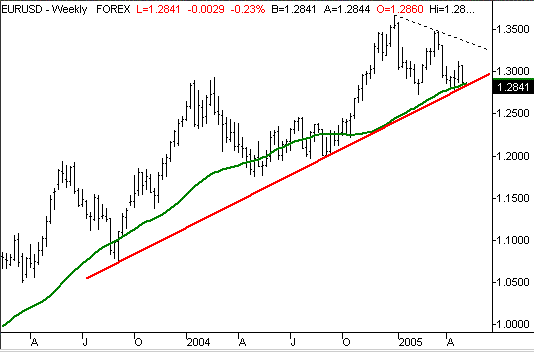
As you can see, the euro has been pressing into a long-term support line (red) for a month or so. It has yet to actually break under it, but it keeps knocking on the door. The green line is a 200 day average line. The euro/dollar has broken under this line a couple of times in the last three years, but never in a significant way. But, to see a potential breakdown of both of those support levels occur at about the same time has to lead one to think there's something big going on here. After all, we've already seen a lower high (see the falling dashed line). Take look at this weekly chart before we zoom in closer.
Euro/dollar Exchange Rate - Weekly

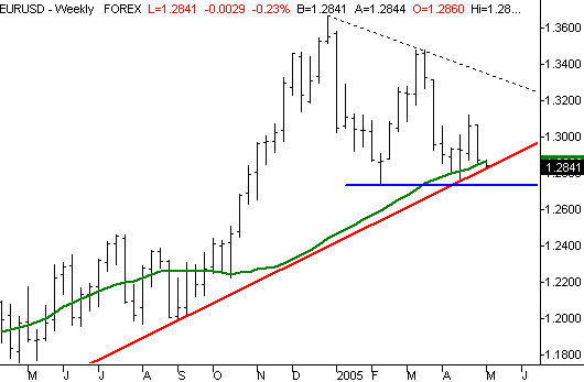
A close-up of this same chart shows just how near we are to a break under that support line. We hit it once four weeks ago, and here we are again.....and already under the 200 day average. As we said above, it hasn't actually happened yet, and it may not at all. But this is about as close as you can get to a chart breakdown. For us, the clincher will be a move under 1.243 (see the horizontal blue line). A move under that level will be that 'lower low' we need to complete the bearish pattern, now that we have a couple of lower highs.
Euro/dollar Exchange Rate - Weekly (zoomed)

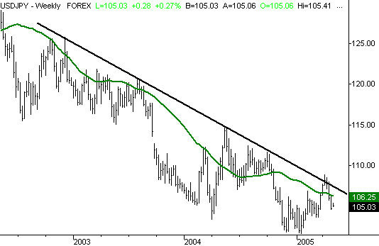
Just for the sake of confirmation, we want to show you the exchange rate with another major trade partner - Japan, and its yen. In this case, we ARE actually comparing the dollar to the yen, so this falling chart really does indicate the weakening dollar. Although not by nearly as much, we're getting a few subtle hints of upside pressure here. The dollar did manage to trade above it's long-term resistance line (black) for a brief period in April. Although it's not applying the same kind of recovery clues, it's not exactly crumbling either. The point being, these two charts are not necessarily at odds with each other; the dollar is looking a little stronger than it was.
Dollar/yen Exchange Rate - Weekly

OK, so what's the deal behind the dollar's weakness? And more importantly, when will it end? We discussed this in detail in November, but we can summarize it here in a few words - the dollar is weak because inflation (in dollars) is greater than the interest rates you can receive on dollar-denominated assets. In other words, you're losing buying power by holding cash. Remember in the late 90's when you were receiving 4% on a money market account? With inflation just above 3% at the time, there was at least some incentive to own dollar-based assets. But think about what happened when the Fed had to drop rates. Now you might get 0.5% on a money market (if you're lucky), but inflation never sunk that low. About the lowest inflation rate we saw was 1.0% (from mid-2002). It doesn't take a rocket scientist to figure out that you were losing money by accepting low yields on your money market, because the prices of.....well, everything was increasing at a greater rate. The same scenario applies U.S. government bonds, CDs, etc. Who'd want to own something that was effectively going to lose money? The demand for dollar-denominated assets dropped like a rock beginning in mid-2002, and the dollar's value dropped accordingly (the supply and demand model works for currencies too). The bottom line is simple - a dollar was a liability rather than an asset.
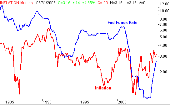
To put this into a visual form, we've plotted the Federal Funds rate (blue) against the inflation rate (red) in the chart below. It's clear that the point in time when inflation topped the Fed Funds interest rate (the rate form which all other rates are based upon) was in mid-2002, or right when the dollar's woes began. But now, we're seeing a slight change here. Notice how the gap between the inflation rate and the Fed Funds rate is being closed. It's still a gap, but it's visibly smaller than it was a year ago. This closure - not surprisingly - coincides with the point in time when the dollar started to at least drop hints of a reversal. We're not there yet, but the progress is clear. If interest rates scoot a little higher while inflation stays level, the dollar could finally start to recover. And with the Fed genuinely concerned about a slowing economy, a slow down in inflation can't be far behind. We shall see.
Fed Funds Rate Versus Inflation - Monthly

Price Headley is the founder and chief analyst of BigTrends.com.