It's hard to believe that the markets have been rising straight for almost 4 years now, without any meaningful correction. Although this long-term degree uptrend has been remarkably consistent, rarely ever was it characterized by strong, impulsive upside movement. Rather, the uptrend was a very slow, grinding and (speaking from a shorter-term trader's point of view) miserable progress. It's hard to imagine anyone who has been immune to having gotten accustomed to this type of price behavior. It's quite an eerie feeling now to see the market suddenly wake up out of an almost-4-year coma with such force, as the S&P 500 and Dow, in the blink of an eye, lose about 9% of its value. While the Nasdaq, the most "dormant" of the 3 major indices, loses a whopping 15%.
Some would wonder what caused this sudden loss of Bids, and most would attribute it to "inflation fears." I don't buy it. There was plenty of inflation fear throughout the last few years as the Fed has increased rates a dozen times, so this reasoning is really nothing novel. Regardless of what the exact reason is, the recent sell-off is just the force of a larger trend - a "child," so to speak, of the big decline that occurred from 2000 to 2002, where the S&P 500 lost 50%, and the Nasdaq lost 84% of its value. Some would say the "big old bear" is back from hibernation - and it's hungry.
Regardless of how it would be described by one participant or another, the charts speak for themselves: this is definitely something new. We should be looking forward to more of this volatility over the coming months. Since the market began its steep decline over the last month, I have been wary to think that it has topped-off for the Intermediate-Term, as the 4-year trend has been quite intact. This has changed over the last several days, and I do feel now, more and more, that the market has achieved a high-point, at least for the Intermediate-Term, or the remainder of 2006. I do however, reserve the right to change my mind at any time, not because I am a man who does not stick to my word, but rather because it's my job as a trader to maintain that delicate balance between sticking to my guns, but yielding when I must. Calling tops and bottoms is a risky business.
This week, we will look at some very compelling technical evidence that we are in for more volatility over the coming months, and that the risks to the downside still exceed the upside risk: something I have believed for many months now, since about September of last year, to be exact. It took 8 months for the S&P 500 to go to a high point since that time, and less than one month to give it all back, and a little more. Let's take a look at the charts, beginning with the long-range S&P 500:
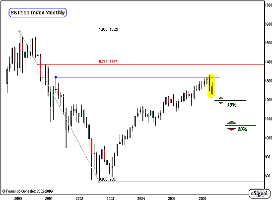
Chart Notations:
The monthly chart of the S&P 500 going back to it's all-time high in year 2000 addresses the Intermediate and long-term markets. Although our marks are very simple (as we usually like them to be) there's a lot going on in this chart, let's take a look one by one:
First, note that the recent decline (yellow) is the fastest, most violent decline the market has seen in almost four years, since its low point in 2002.
This decline is a reaction to an important resistance point from back in 2001 (blue). That high-point was an important one, as it was the last major high before the 9/11 event. It is here where we are once again feeling the power of the big bear market - one that we have 'almost' forgotten about, it has been so long. This decline is most likely only a warm-up phase for a larger decline later.
Next, note that the market is fast approaching the 10% correction mark (green). In long-range time frames, it is important to watch exactly how much a market "corrects" not in Fibonacci-terms as we usually measure, but rather in absolute terms. The first green line is 10% reduction in value from the most recent high. Many money managers look to enter and deploy long-term investment money here, as a "standard" reloading point. The 10% correction level sits at 1193 in the S&P 500 - let's look for a reaction there.
I have also marked-off the 20% correction point - this area is where I feel this decline is going to culminate over the intermediate-term (approximately 6-9 months). This level sits at the 1060 mark.
For the upside, I have marked-off the 78.6% retracement to the all-time high. The bull market in the S&P 500 is not "technically" back, until this level is exceeded. Above this, we look for a full 100% retracement of the all-time high, and beyond! Needless to say, this is far from being in-play.
Let's take a look at smaller time-scales:
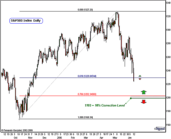
Chart Notations:
We zoom-in to a smaller time frame of the S&P 500 here. This daily chart addresses the short-term time frame
What we have done here first is to apply a Fib retracement of the rally that began in October of 2005 and culminated with the high about one month ago.
The current "correction" of that rally is a very fast one indeed and is indicative of the power of this downtrend. What took the better part of 7 months to build was erased in about a month.
The extent of the decline has taken the market quickly to the 62% Fib retracement (blue).
The market is likely to give us some reaction here, but this will likely be very temporary (in reference to this time-frame), as it is more likely to find a greater degree of support at the 78% retracement (red). Note that the 78% retrace sits just a few points above that 10% correction mark (green, as referenced on the previous monthly chart). This is where the first leg of a larger decline is likely to culminate. Let's look for a stronger reaction there.
Our last chart this week, is a very compelling one, from the Nasdaq:
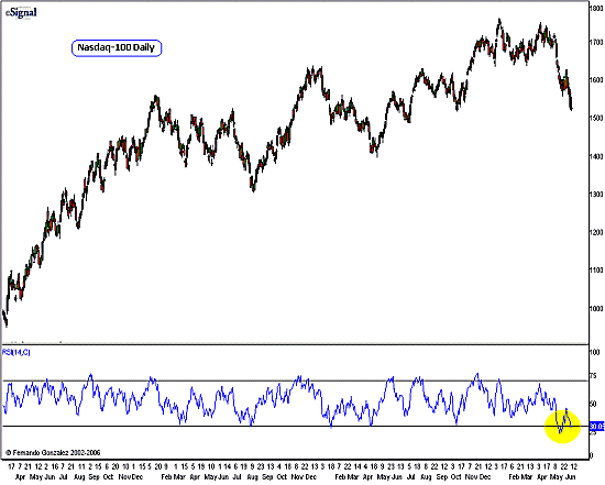
Chart Notations:
We have a daily chart of the Nasdaq-100 above addressing the intermediate-term time frame. The purpose of this chart is to illustrate a confirmatory signal that indeed we have "something new" going-on, and solidifies the argument that the Nasdaq has perhaps seen its high-point for the remainder of the year.
I came across this chart during an exercise with some students in my most recent Broad Market Analysis class. We had a group of some very sharp-minded students in the class, and it was with them that this chart came-up. So I thank them for this "not-so-little" technical discovery.
Normally, I would not use so many bars in the daily chart so as to go back greater than even one year. In this case, however, it is important to extend beyond one year, and in fact go all the way back to over 3 years. This is because if you notice the RSI reading on the bottom has yielded the lowest reading we have since in at least this amount of time - which is very close to the Nasdaq's bear-market low point.
We are interpreting the RSI here not in face-value, as indication of "oversold" condition but rather in another, more intuitive way: That this "record" oversold reading (for this time frame) is technical confirmation of "Change in Character/Behavior/Trend" in this market, and is indication of greater oversold conditions to come. This makes a lot of sense, since it has been very evident to us for a long-time now that the Nasdaq is the most ill of all the major measures of the market. We should therefore treat this as in important sign of "more to come."
Fernando Gonzalez is in his 10th year as an active trader, technical analyst and content contributor to the active trading community and a long list of popular financial media. Online Trading Academy trading knowledge...your most valuable form of capital.


 Free Festival of Traders Videos