We've been talking about it for weeks now, but as of last Friday, it became a reality. We're talking about the U.S dollar. For years it had been weakening in relation to other major currencies, like the euro and the yen. But after last week's rally for the dollar, the technical trend looks like it may have finally turned the corner.
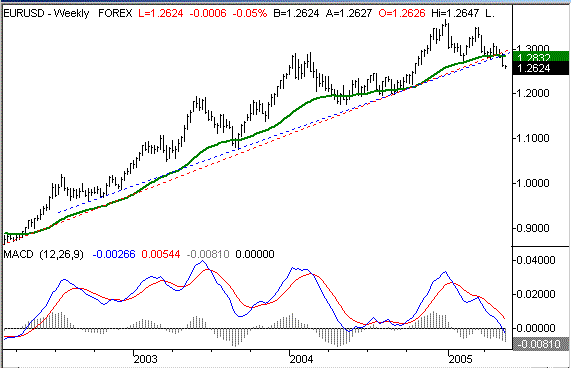
This is the same chart we looked at just a few days ago, but in case you missed it then, we're looking at the chart of the euro/dollar exchange rate. It's moving higher because the euro has been getting stronger relative to the dollar (thus, the dollar was still weakening) since 2001.
What we had seen between 2001 and now was a series of higher highs and higher lows. Those higher lows make up a couple of applicable support lines (dashed). It was a pretty jagged long-term chart, but the bigger trend remained intact. The euro/dollar stayed above those support lines, and went even higher each time that support was retested. That is, until now. This support line was broken last week for the first time in years, and this chart kept pushing lower on Monday as well. This is a pretty big deal, especially when considering that the chart is also well under its 200 day average (green) now. Take a look at the distant view chart immediately below, then read on as we look at a close-up chart.
Euro/Dollar Exchange Rate - Weekly

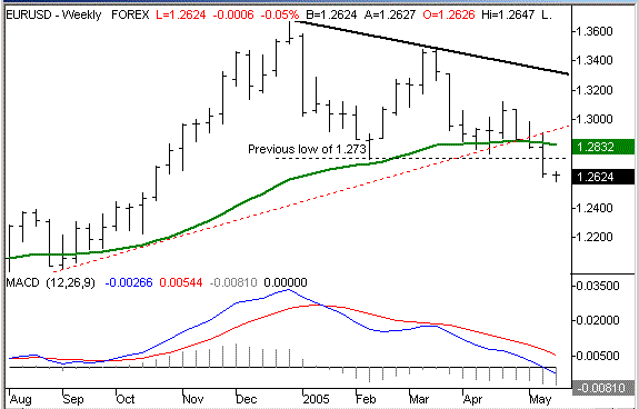
The confirmation comes in the form of lower lows and lower highs. We had already made a lower high, with December's peak at 1.366, and March's peak of only 1.348 (see the broad black line). But, we still hadn't seen a low under February's low of 1.273. All that changed last week though, when we hit a new six-month low of 1.26. Yesterday, we even traded as low 1.258. So, the direction of the current trading channel is quite different than the one we were in just a few weeks ago.
Euro/Dollar Exchange Rate - Weekly (close up)

That's not to say that the dollar is going to make a straight-line recovery now that it's managed to break out of its slump. In fact, it's possible that we'll see the euro strengthen and the dollar weaken again, undoing this chart completely. However, with interest rates still on the rise and inflation being mostly tamed, the global economic conditions favor the dollar's recovery.
We expect the dollar to be just as volatile in this new trend as it was in the previous channel lines. Be sure to keep that in mind when it looks like this chart is pointed higher again.
And on a related note...
The easing of inflation is the key reason why the dollar is starting to perk up again. It doesn't hurt that interest rates are on the rise either. But with inflation easing off, the need for a hedge against inflation isn't quite as strong. What's the typical inflation hedge? Gold. We looked at this weakening commodity in the sector spotlight a few weeks ago, but it's the correlation here is an important one (and not surprising). With inflation being less of a worry every day, we can see that the demand for gold is slowing as well. That means lower prices (remember supply and demand?) for the precious metal that a frightening number of pundits are practically begging investors to own.
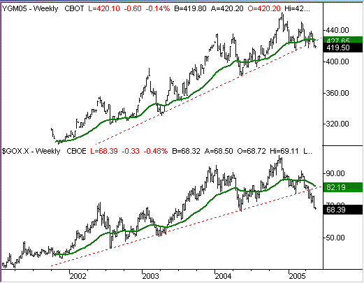
The actual gold futures aren't quite showing the same weakness as the gold stock indexes, but there are some key similarities. Just for the sake of seeing the whole picture, we'll plot the June gold futures contracts (CBOT) on top, and the CBOE Gold Index on the bottom of our chart below. Looks a lot like the dollar, doesn't it. The two generally move in tandem, so if you've got a position in one, it may not hurt to watch the other.
CBOT June '05 gold futures contracts (top), CBOE Gold Index (bottom)

Price Headley is the founder and chief analyst of BigTrends.com.