Today's article is a simple statistical study into what effect price movements in a set period of time have on future movements of the S&P 500 (SPX). To do this, data from January 2, 1990 to August 28, 2006 was used. A spreadsheet was set up that returns a percentage number between 0 and 100 to show where the SPX closed relative to the last 21 closing prices. For example, if the number for a certain day is 0%, that means the SPX closed lower than any point in the last 20 days. This is very similar to how the Williams %R or Stochastics indicators work, but not exactly the same.
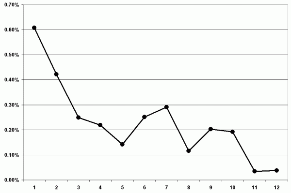
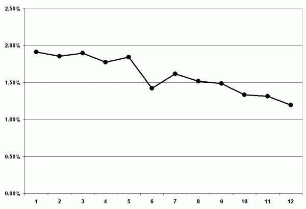
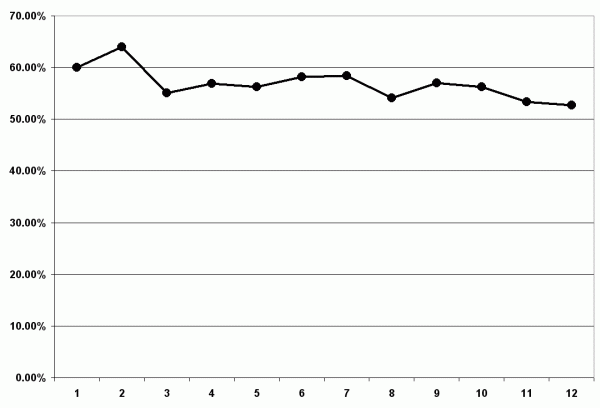
The following charts show the results of the study, but you first need to know how the information is presented. Each graph will have numbers 1 through 12 at the bottom. This is what the numbers mean:
#1 - column for instances of a relative position of 0%
#2 - column for instances of a relative position greater then 0% and less than 10%
#3 - column for instances of a relative position greater then 10% and less than 20%
#4 - column for instances of a relative position greater then 20% and less than 30%
#5 - column for instances of a relative position greater then 30% and less than 40%
#6 - column for instances of a relative position greater then 40% and less than 50%
#7 - column for instances of a relative position greater then 50% and less than 60%
#8 - column for instances of a relative position greater then 60% and less than 70%
#9 - column for instances of a relative position greater then 70% and less than 80%
#10 - column for instances of a relative position greater then 80% and less than 90%
#11 - column for instances of a relative position greater then 90% and less than 100%
#12 - column for instances of a relative position of 100%
This first chart shows the average movement of the SPX for 5 days after each instance that it generated one of the positions listed above (movements outside of 3 standard deviations were removed). You can see that the average is always positive, but the gains are much larger for the lower ratings. So this shows that when the SPX is at its lowest point for the pervious 21 closes, this is, in the long term, a good buying opportunity.

The next chart shows basically the same thing, except these are the averages of the movement's absolute value. This shows that the lower the SPX is relative to its recent movement, the more likely it is to make large movements.

The next chart shows the Gain % for each level. Just as the first chart did, this always shows that the best place to buy is when the SPX is at its lowest relative levels. If the rating is anywhere below 10%, you have a greater than 60% chance of seeing a gain in the next 5 days while any other level only gives you a change in the mid-50's.

So what can we learn from this? The main lesson is that when prices are at a relative low, movements are more volatile and most often trying to move higher. At relatively high prices, movement is uncertain and relatively calm. This can help with timing for your trades in a couple different ways . For example, if you are looking for large, fast movements, wait until a downtrend. If you are trading options and trying to take advantage of time decay, wait until prices are high.
Price Headley is the founder and chief analyst of BigTrends.com.