Back on the 19th we took a close look at what then looked like a high-quality bullish breakout. The volume was bullish, and the advance/decline ratio was equally bullish. That was a significant transition for both pieces of data, as they had both been bearish for most of the year. But one of the things we cautioned about looks like it may have come to fruition. The market had moved so quickly, by that point, that stocks were ripe for a pullback (if only to cool off before the next leg higher). Although stocks have indeed moved higher since then, the quality of the trend still leaves something to be desired. Maybe the problem will be solved, or maybe not - it all remains to be seen. But one thing we do know is that the bulls are on borrowed time based on the current NYSE volume trend. Something's got to give soon.
The quality (and therefore the longevity) of a market trend can be measured in two ways. The first way is to look at the number of advancing stock issues in comparison to the number of declining issues. Volume isn't really a factor in this analysis - all we're looking at is how many of the total publicly traded stocks made gains on any given day, and how many fell on that same day. If the majority of them are higher, that's bullish. This could be considered the 'breadth' of the market rally. The second way to examine the quality of the trend has everything to do with volume, and nothing to do with breadth. What we want to know here is the total combined volume for all the advancing stocks, as we compare that to the total volume for all the falling stocks. If the majority of the volume is bullish, then so too should be the trend. Think of this as 'depth'. To put this data into a useful form, we plot the moving averages of it - the daily data is just too erratic and trendless. We've found the 14 day moving averages to be the most useful, so that's what you'll see below. (To keep things simple, we've limited our advance/decline and volume study the New York Stock Exchange listings, but you can apply the same idea to NASDAQ and AMEX stocks.)
Wouldn't depth and breadth go hand in hand? They should, in a typical bull as well as a typical bear market. But sometimes, the depth and breadth are not in sync. In fact, they can be at odds with each other, and when they are, you should at least question why. So here we are today, to do just that.
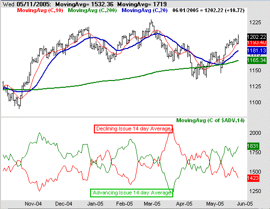
On the chart below, we can see that the 14 day moving averages of the advancers and decliners (NYSE) do indeed signal a shift towards bullishness, when the advancer moving average (green) crosses over the decliner moving average (red) several days ago. A quick glance over the last few months will illustrate how this can be a pretty useful tool. Take a look at the chart, then keep reading below.
NYSE Advancing/Declining Issues - 14 day moving averages (with S&P 500)

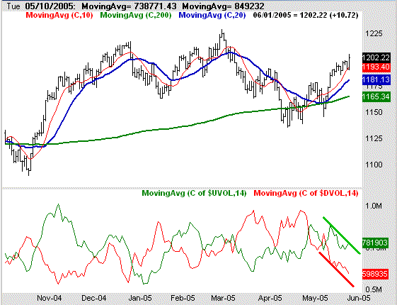
So far so good, right? But we noticed something a little concerning about the moving averages of the volume data. The bearish moving average (declining volume) was falling as you'd expect it too. However, the moving average of the bullish volume (green) has also been declining, even as stocks were moving higher over the last two weeks. This moving average started to curl a little higher yesterday, but it's very interesting to see such a chart this early on on a bullish move. We have to give the market a little wiggle room, but this has been the trend for a couple of weeks now. What's so alarming is that this volume data is looking a lot like what we saw near the end of last year. It wasn't a case where the bullish volume was overwhelming the bearish volume. Instead, it was just a case where there was little to no bearish volume at all, and the bulls were completely unchallenged.....but only for a while. Now we've got a similar scenario.
NYSE Advancing/Declining Volume - 14 day moving averages (with S&P 500)

We're not saying this is doomsday, because the fact of the matter is that the market is more than capable of turning this around. Plus, we're actually not seeing this problem to the same degree with the NASDAQ stock, where it really counts (see below). What we're saying is that the market may run out of buyers before anybody expects it to. This is something that we'll definitely be watching over the next few days as we work through this vulnerability. The buyers need to step up to the plate soon, or the sellers could soon outnumber them.
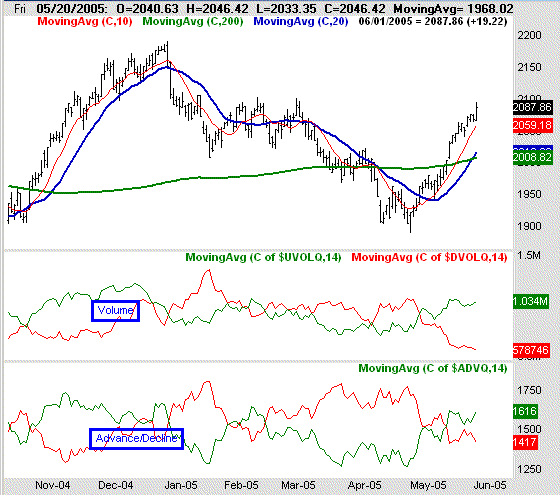
Now, for the sake of argument, we'll also include the NASDAQ's chart of the same volume analysis and advance/decline study. This is where it gets interesting. While the problems are clear for the NYSE, the NASDAQ is faring much better. That's not to say that bullish volume is growing, because it isn't. But it's not shrinking either. So while we'd rather see growing bullosh volume across the board, this is at least mildly reassuring. Why? Because the NASDAQ leads the market - both up and down. Seeing semi-sustained interest in these mostly speculative and technology names hints that investors are still willing to take risks, and that's ultimately bullish. But still, caution is advised until we can get all this data pointed in the same direction.
NASDAQ Advancing/Declining Volume - 14 day moving averages (with COMPX)

Price Headley is the founder and chief analyst of BigTrends.com.