Today, we'd like to illustrate an important point that all traders should know. In fact, it's an idea we've discussed before. It's just that today, we're going to use the all-powerful chart to drive the point home.
There are probably dozens of ways to analyze your trading. Today's is going to be a visual one. What we're going to do is apply a statistical term called a bell curve. It's not a ground-breaking tool, but it's definitely worth doing. It's called a bell curve because the shape of the chart literally looks like a bell - most results occur in the middle of the possible range, while there are few results at the extreme ends of the possibilities. Confused? Don't be - it will all be clear when you see the chart below.
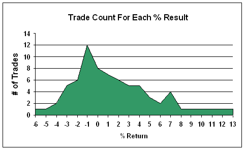
To generate some sample trades for us to study, we're going to use a mechanical trading system. We'll just program a MACD buy-system (long only) with a trailing-stop exit. Even though it's been 'optimized', there are still going to be a wide variety of results, with even a few losers. The results of the system are plotted below. The total number of trades within each percentage return are 'stacked' in the appropriate column. As you can see, most of the trades were near the breakeven mark - that's why the center of the curve is bulged upward. There are very few trades at the extreme ends of the possible results, which is why the sides of the curve are so much lower. The result is something that is roughly shaped like a bell.
Distribution Curve of Trading System

As you can see, most of the trades resulted in gains of around 0% (among 37 winners and 35 losers), yet the system was very profitable. Why? The average winner was twice as big as the average loser. Over the last 10 years, trading this system would have resulted in a net return on the account of 718% (keep that figure in your back pocket for a couple of seconds). However, the bigger each trade return got, the less frequent you saw that kind of result.
So here's point number one: MOST OF YOUR TRADES ARE GOING TO BE MEDIOCRE AT BEST. The huge homeruns are few and far between. But, you'll have enough of them over time to generate some big profits. Your results will mostly likely look a whole lot like the distribution curve above. However, most traders tend to get down on themselves when their results are not overloaded on the far right side of this kind of chart. Folks, here's just a dose of reality. It ain't gonna' happen. If you can't accept that, then your ego is set up for a catastrophic crushing. Here's the other thing: trying to make your bell curve overloaded on the right side will actually end up causing you to push them all over to the left side - the losing side. I'll just leave it at this - if you're trading results do not look something like this, your probably doing something wrong.
Although your results should statistically look like this, what if you could chop off a large chunk of the losing side of this curve, leaving out the worst few trades? If you would limit your maximum loss to 3%, instead of suffering those nine trades that lost more than 3%, the positive results would be major. Rather than 718%, your total results would be 848%. Not too shabby, huh?
Which brings us to point number two. YOU CAN'T CONTROL WHAT KIND OF GAIN YOU'RE GOING TO GET ON ANY GIVEN TRADE. Once you're in a trade, you're subject to whatever the market is willing to give you. So your job should be to maximize whatever profits you can. However, you can control your losses. By pro-actively working to keep your bell curve away from the extreme left side of the distribution, you can seriously enhance your bottom line.
Is this type of analysis easy to do? Not exactly, but it is worth it. It can really drive home a painful but beneficial reality, if you need to hear it. I encourage you to do something like this every once in a while, if only as a reality check. Just to make sure you're bell curve looks the way it should.
Price Headley is the founder and chief analyst of BigTrends.com.