NASDAQ Commentary
The NASDAQ Composite is trading 0.23% lower today (-5.32 points), last seen at 2310.11. That's still 10.12 points higher than Friday's close though, leaving the index up by 0.44% for the week. Clearly the first half of this week has been mildly bullish, but there's also a stark difference between then and now: the buying effort has really tapered off.
As we mentioned in the Weekly Market Outlook, the NASDAQ has been 'ranging', albeit bullishly, since July. On our chart, the bullish channel is framed by broad red and green lines. Like we discussed, the fact that the composite was slowing down at the upper edge of that range suggested we were due for a short-term pause, and perhaps even a slight pullback.
Although the index is up for the week, we still contend that this is likely. After all, the upper side of the trading range has indeed contained the NASDAQ's bars, and we're seeing a heck of a lot less bullishness now than we did last week. The lower edge of the channel is currently at 2261, and rising rapidly. It could be anywhere from 2270 to 2280 by the time the index actually could fall back that far. When and if it does, then you may want to keep a very watchful eye for what happens next. It may be a different result than the bounces we had been getting.
If you're tired of hearing about the VXN, you're not alone - we're tired of telling the same story too. However, the story is finally giving us at least a small hint that the page will be turned. On our VXN chart, we overlay a 10 day (red, dashed) and 50 day (purple, dashed) moving average, mostly just to see how quickly and far the VXN travels - when it actually does. Secondarily, though, we can use crossovers as indications of significant change in investor sentiment. Notice anything interesting about these tow averages now?
For the first time since May, it looks like the 10 day line could cross above the 50 day line. This has bearish implications, as the June/July correction can illustrate. Although from day to day it seems like the VXN's low trading level has been mostly benign for the market, in the bigger picture, we can see it's actually drifting higher. If we do finally get that VXN moving crossover, we expect it to be a substantial drag on stocks.
Simultaneously, note the narrowing support and resistance zone (converging red and green lines) for the VXN. Soon, on one side or the other, the VXN is going to have to 'pop' out of that triangle. If it pops out of the upper resistance line (red), that too would be a bearish event. At that point - and if the NASDAQ support line also breaks - we'll also start establishing some potential bottoms for the market's correction. It would probably occur around 2200.
NASDAQ Chart

S&P 500 Commentary
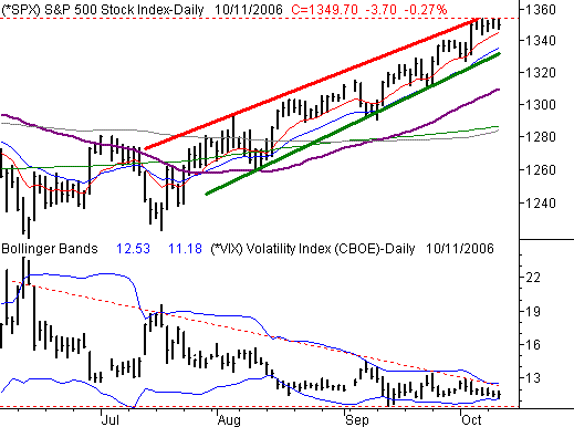
The S&P 500's 3.7 point dip into the red ink today leaves it at 1349.70, down 0.27%. For the week so far, though, it's right at a breakeven; maybe the second half of this week will be a little more interesting. However, no matter what happens over the next couple of days, we do see a resistance line taking shape that could spell out a short-term pause for the overall uptrend.
Since we went long with the NASDAQ's commentary, we'll be brief here. Besides, the analysis is almost identical - the SPX is due for some short-term weakness, primarily because it ran into the upper edge of its recent trading zone. Since July, each encounter with that red resistance line has been met with a modest pullback. We have no reason to think this instance will be any different.
The lower edge of the range is now at 1330, but would be at 1335/1340 by the time it was actually retested. If it holds as support, we'll then look for a trip back up to the top edge of the range. If instead it breaks as support - as we think it could - then we'll be looking for a revisit of the 1290 area...where the 100 and 200 day lines will soon be.
And why do we think now may finally be the time for a short-term demise? Two reasons.
First, the VIX (and yes, we're sick of talking about the VIX too) is being worked into its own wedge. The falling resistance line is currently at 12.31, while the horizontal support line is at 10.54. At its current pace, the wedge will close within a few days, forcing the VIX out on one side or the other. Like the NASDAQ's VXN, if it gets pushed above the resistance line, it presents a problem for the already-vulnerable market.
Second, there seems to be a stone wall at 1354. Four of the last five days (including today), the SPX has had a chance to top that level, yet hasn't been able to. Why horizontal resistance has been establish there in the middle of nowhere is anybody's guess, but it's been established all the same. The SPX needs to break that line soon if this uptrend is to have any hope of staying alive.
S&P 500 Chart

Dow Jones Industrial Average Commentary
The Dow Jones Industrial Average is holding up a little better than our other two indices, as it's only down 0.17% for the day. It's 20 point loss leaves it at 11,847. For the week, though, the Dow is the only index in the red - it's 3 points under last Friday's close. Yet, the Dow continues to look like the safest place to be...at least in terms of the chart.
The Dow's support line is at 11,635, and as far as we're concerned should be treated the same as the NASDAQ's and SPX's. The only thing we'll point out about the Dow's chart is the volume. Specifically, we see the bullish volume bars getting lower and lower. Perhaps it's an indication that the buyers are shrinking in number, and may be ready to yield to the bears for a while. Of course, when you're overbought for the better part of two months, it's bound to happen.
Dow Jones Industrial Average Chart

Price Headley is the founder and chief analyst of BigTrends.com.