NASDAQ Commentary
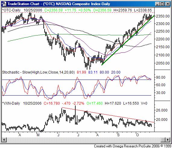
The NASDAQ tacked on 11.75 points on Friday to end the session at 2356.59. That was 0.5% higher than Tuesday's close, and 0.61% above last Friday's close. The composite has gained 14.29 points this week so far, against most odds.
Despite the gain, it's also worth noting that the composite hasn't actually made any progress since the 16th - we've stayed under that close of 2363.84 for the last seven sessions. While we haven't necessarily fallen back since then, the lack of progress is a little telling. During that time, a key technical indicator has had enough time to unwind from a bullish whirlwind and hint at a bearish signal.
The two stochastic lines, although still both above the 80 threshold, appear to be on the verge of falling under 80 - an official sell signal. When/if they both do, we'll note it here.
On the flipside, the support line (green) has been persistent. The lows over the last three days have al traced that line pretty precisely. That line will be the key to any actual downside; although we expect, we have no real evidence that now is the time for it to happen. It will be at 2341 on Thursday, and rises slightly each day. So, adjust accordingly.
Fortunately, the market is going to have to play its hand soon - one way or the other. The support line is being pressed, but so too is a key resistance line. This year's high of 2375 (hit in April) is just a few points away. Suspiciously, the uptrend came to a halt just under that level. Obviously the support and resistance lines are converging, and the index will have to move outside the closing wedge soon. Although a bullish breakout is possible, the odds still favor a downside move. But to repeat a key point, the support line is the primary indication of such a break.
NASDAQ Chart

S&P 500 Commentary
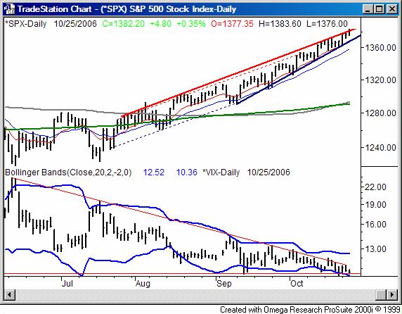
The S&P 500's 0.35% gain on Wednesday left it 4.8 points better than where it ended Tuesday, and 13.60 points higher than where it ended last week. The close at 1382.22 is almost a full percentage point above Friday's close.
Since the S&P's story is basically the same as the NASDAQ's and the Dow's below, we're not going to dwell on this chart too long. There are, however, two things we do want to highlight.
First, since early September, the pace of gain has been stepped up for the S&P 500. The current support line (solid, blue) is keeping the index aloft at a much faster rate than the previous support line (dashed, blue) was. The resistance lines (red) haven't changed that much though. The chart pattern is called a rising wedge. While they can be bullish, in the context of where we've been, the wedge has bearish implications, as it suggests the buyers are now exhausted, and this is a last gasp.
Second, just look at the VIX. It's back at those ridiculous lows. The VIX's wedge has to break sometime too. And, there hasn't been any real interest from investors in getting it any lower. Maybe it would be easier to push it higher - above the resistance line. If so, as we've said repeatedly, it'll be bearish for the market. Currently, that resistance line is at 11.30.
S&P 500 Chart

Dow Jones Industrial Average Commentary
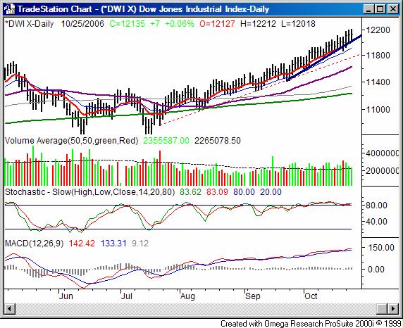
The Dow was basically flat on Wednesday, gaining a very modest 7 points (+0.06%) to end the session at 12,134.68. Still, it's the biggest winner for the week, currently 1.1% higher (+133 points) than last week's close. The Dow's bullish trend went from good to great about a month ago. The fairly-steep support line (red, dashed) was replaced by an even steeper (solid, blue) support line, pushing the Dow up to all-time highs. And, the trend has been bizarrely unwavering. That, however, is yet one more reason why we remain suspicious - this trend is unlike the vast majority of uptrends, where two or three steps forward are followed by one step back. We haven't closed under the 10 day line (solid, red) since September 22nd.
It sounds too good - or at least too bullish - to be true. And for us, that's exactly the expectation. As with the NASDAQ, until the Dow breaks its support line (currently at 12,050), any expected downtrend is just an idea. But boy-oh-boy are the stochastic lines just begging to come tumbling down, much like the MACD lines are hurting to roll over.
We just get the idea that traders are willing to walk on eggshells as long as they can keep the rally alive as long as possible. And, based on volume, we have to wonder if the end is near. The last three days were bullish, but volume shrank with each one. We've only had four losing days in the last seventeen, but all four of them were 'distribution' days, where the selling volume was greater than the previous days buying volume. And, three of the four distribution days were higher volume selloffs than the prior distribution day.
Subtle? Very. But usually, when it's least expected, is when corrections happen. In any case, we see the underpinnings of bullishness fading.
Dow Jones Industrial Average Chart

Price Headley is the founder and chief analyst of BigTrends.com.