Option charts incorporate the elements of time and volatility relative to the price action of the underlying stock. If a stock was dead flat over a period of weeks, which direction would the option chart be headed? DOWN! Because the option is losing time. As time is eroding and the stock is not moving, the option is becoming increasingly less valuable as it approaches its expiration.
Option charts also help you sort out the developing trends from the increasing noise in today's price action. If a stock is truly breaking out, its option chart should be breaking out as well. This shows that the stock price movement is more than overcoming the loss of time in the option. Thus, option charts can act not only as an option trading methodology, but also as a guide to pick only the best trending stocks.
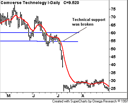
I first noticed the usefulness of options charts back in 2001. I had recommended the Comverse Technology July 60 put (CQVSL) in an aggressive options service at an average entry price of 6.90. This entry was primarily driven by technical analysis, as the stock has been showing poor Relative Strength versus the Nasdaq Composite. In addition, the stock had held resistance at its 10-day exponential moving average (EMA) beautifully, and CMVT had broken prior technical support in the 58-60 area. The option trade was recommended intraday when the stock was trading around 55, and we liked the 60 put better than the 55 put due to the 5 points of intrinsic value in the 60 put (meaning only 2 points of time value at risk in the 60 put). The stock subsequently shot down to our downside target at 45 on July 9th, leading to a 108.7% gain in our option position in only 8 trading days.
Daily Chart of Comverse Tech. with 10-Day Exponential Moving Average

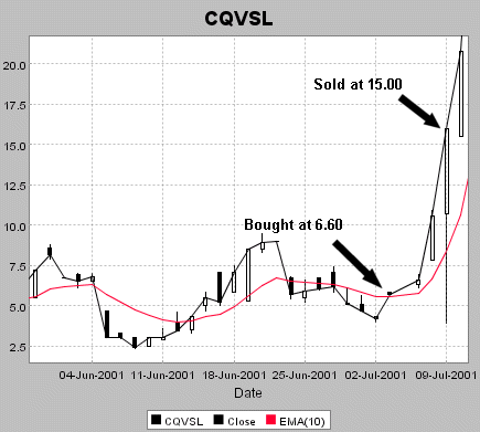
Option charts analysis shows how you can do even better by following the option chart as compared to the stock chart. The daily option chart is plotted just like a stock chart, capturing the High, Low and Close for the actual option trades in a given day (we like to look at relatively active option contracts, as if an option does not trade, it will not offer any data points to plot for that trading session). Below I have plotted a 10-day exponential moving average (EMA - the red line on the chart).
Daily Chart of Comverse Technology July 60 Put (CQVSL) with 10-Day Exponential Moving Average

As you can see from the chart, the option really takes off to the upside, or drops to the downside, once the 10-day EMA is broken. One methodology I use is to buy the option on a second straight close in a row above the 10-day EMA. For the Comverse Technology July 60 put, this occurred when the option closed at 6.60 on July 5th (since July 4th was a holiday). As you can see, the option then skyrocketed over the next three sessions to reach our initial target around 15. So the option chart actually allowed an option buyer to profit by a great amount in less than half the time that the stock chart analysis took to play out.
Clearly option charts are all about factoring in the elements of an option's price that are not related to normal stock chart analysis. The main element is time, and the other element is the change in volatility that the option will undergo during its life. After we focus on time decay in tomorrow's column, we'll follow up Friday to study the impact that volatility can have on an option's price.
Price Headley is the founder and chief analyst of BigTrends.com.