NASDAQ Commentary
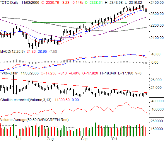
The NASDAQ composite actually held up the best on Friday, only losing 0.14%, or 3.23 points, to close out at 2330.79. That close, however, meant a 0.84% loss on a weekly basis (which wasn't the worst for that timeframe either). But, the NASDAQ's chart looks the most bearish of all, at least potentially. Why? The key support lines that have been in place since July are now starting to give ground. The bulls have some serious work to do - and soon - if they want to prevent some significant slippage.
OK, this week's chart of the NASDAQ is huge, but only because we have a lot to talk about, the last couple of weeks have really forced traders to make some critical decisions, and we're now at the crossroads. Let's just dig in, from top to bottom.
First and foremost, the key long-term support line (red, dashed) has broken. It was at 2344 on Friday, the high for that day. This above all else says the prior trend - the bullish one - has broken, especially after several failed attempts at making a new high for the year (around 2375). On top of that, the 20-day line is very close to also breaking down as support. It was at 2333 as of Friday, slightly above the composite's close. Another lower close (under 2330) will clinch that momentum-based sell signal.
Moving down, the MACD lines need no explanation. They gave their bear signal on October 20, even before the new-high level was challenged.
The VXN, ironically, has yet to actually turn bearish, but boy is it poised to pop! Its resistance line is at 18 and falling. A VXN reading this low is associated with tops, but we've been 'associated' with a top for three months now. Why is now any different? The answer is, it's not - at least not yet. We'd really like to see the VXN break above that resistance line before saying the bull trend had been broken.
The Chaikin line (and volume trend) turned officially bearish on Friday, when the Chaikin indicator fell under zero. While the last two Chaikin-based bear signals didn't pan out, the ones that occur after a prolonged period above zero (like the current scenario) tend to be more accurate.
As for possible landing spots if this potential downtrend really materializes like we think it will, look first to the 200-day moving average line (green) at 2230. The 50-day line (purple) is in between here and there, but hasn't played a significant support or resistance role for the composite lately. As for what might trump this bearish outlook, only a couple of closes above 2375 would convince us that the bulls were regaining control.
NASDAQ Chart

S&P 500 Commentary
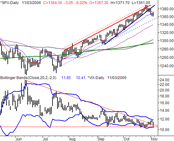
The S&P 500 gave up just a hair over 3 points on Friday, falling 0.22% to end the week at 1364.30. That was 13.05 points below the prior Friday's close, resulting in a 0.95% dip into the red for the week. However, as much as we've been blowing the bearish horn, the S&P 500 still has a support line to be breached before we can actually get on the bearish train.
There were two key floors we were eyeing for the S&P 500. The first one (solid, dark blue) was breached on Wednesday; the second one (dashed, blue) is still intact at 1353. The SPX would have to fall at least another 12 points to get under that line, which is possible with just one bad day. In the meantime, the key short-term moving average lines (the 10-day line in red, and the 20-day line in blue) have both failed as support. Friday was the first close under the 20-day line since early September, and it almost seems like the 10 day line acted as resistance on the same day.
Of course, the VIX has been just as interesting of late, using the full span of the range between its upper and lower 20-day Bollinger bands. Technically speaking, the VIX's cross above a long-term resistance line on Wednesday was bearish. However, we've also seen how the upper Bollinger band can also act as resistance, capping any surge in the VIX and coinciding with a short-term bottom for stocks. On Thursday, it looked like it might happen again, as the VIX traded higher, hit the upper band, and then closed lower (while the market made a bullish push late in the day). Well, the idea ended up being right, but was also fully played out in one day. The VIX was sent all the way back down to the lower band line on Friday, found support, then got pushed higher again, a move that coincided with a move lower for the market. Bottom line? The VIX is finding more support than resistance, which is bearish for stocks. And, we still closed above that resistance line on a weekly basis.
The potential reversal points for any downtrend here are first the 50-day line (purple) at 1339, but more likely the 200 day line (green) at 1294. Only a couple of closes above the 10-day line would unwind this bearishness.
S&P 500 Chart

Dow Jones Industrial Average Commentary
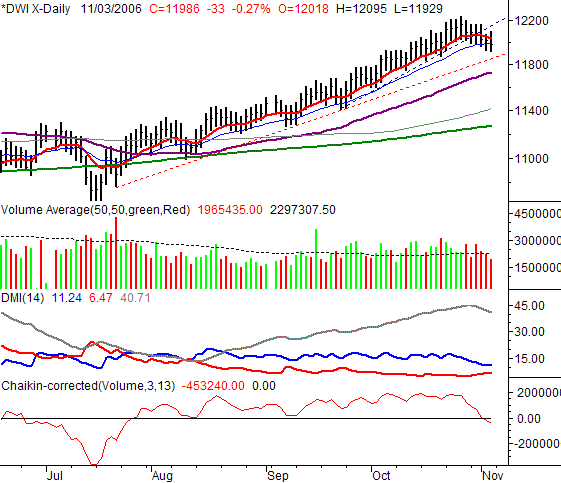
The Dow was the biggest loser on Friday, dipping 0.27%, losing 32.26 points. The close of 11,986.28 was 109.98 points below the previous Friday's close, which translates into a 0.86% loss for the week. And the Dow, which had been the most consistently resilient of all our indices, is even on the brink of a technical breakdown. However, as with the SPX, we can't quite 'go there' yet, since there's still one last support line to break.
The Dow's key support line (red, dashed) extends all the way back to July, and is currently at 11,847. The short-term support line (blue, dashed) has already given way, as has the 10-day line (red). The 20-day line was technically breached as support on Friday, but we'd still like to see another lower close to confirm that official sell signal. And, actually, only a break under the long-term support line would fully suggest the uptrend had been broken.
That being said, we wanted to follow up with the volume indicator we first mentioned last week, the Chaikin line. It has indeed fallen under zero, resulting in a sell signal for the Dow. Of course, you don't even need the Chaikin line to see the shift in volume - we've seen nothing but red bars for over a week.
One of the indicators we don't get to use too often in this space is the Directional Movement Index (or DMI) tool. Rather than based on closing prices, it gauges bullish or bearish pressure based on the change in highs and the change in lows. Since the high and low trend hasn't 'changed' for weeks, the DMI lines haven't applied. But, after a very visible shift to a series of lower highs and lower lows last week, the DMI lines started doing something worth watching the DMI- line (red) is getting positioned to cross back above the DMI+ line (blue). We don't have the crossover yet, but we're close. And, we've seen DMI analysis be a very effective 'bigger picture' indicator in the past. We'll update you here if we get such a crossover, but at this point, it seems likely.
As with the other two indices, the Dow's downtrend is apt to be halted at the 50-day line or the 200-day line.
Dow Jones Industrial Average Chart

Price Headley is the founder and chief analyst of BigTrends.com.