I get a lot of questions about various trading practices. Some of them are very basic, but many of them are more philosophical in nature. My readers seem to want to know more about my trading philosophy and attitude than about our trading system specifics. While in many ways my use of technical indicators is the same as anybody else's, there are a few nuances that I do find to be generally unique. None of these particular nuances are bizarre or earth shattering, but sometimes people are surprised to hear me explain them. Today will look at a couple of the ideas that maybe other traders don't utilize quite as often as I do.
Use Multiple Timeframes
One of the things that people seem to be most surprised about my our use of weekly charts. How in the world can weekly charts be responsive enough to when my holding periods tend to be several days? It's not that I don't use daily charts; it's just that I use them in conjunction with weekly charts. I've found that in almost all market environments, the daily charts are still too erratic to effectively spot the market's or an individual stock's true trend. However, on a weekly chart, the bigger trend has no place to hide. The daily charts are still useful in finding me the optimal entry point into the trends that are highly evident on a weekly chart.
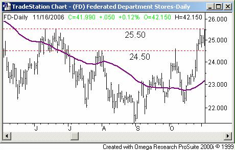
Federated Department Stores (FD) - Daily

On the six month daily chart of Federated Department Stores (FD) in the middle of 2004, you probably wouldn't have thought much about the October rise. After all, you'd seen similar crosses above the 50-day line (purple) all year long, and there was a strong chance that 24.50 would end up being resistance again. And if not there, then there was another potential resistance line at 25.50. You even stalled for a few days once 25.50 was tested in October, as the daily chart shows.
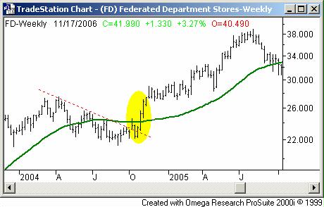
Federated Department Stores (FD) - Weekly

Had you been watching the weekly chart though, you may have seen something more compelling. By the end of October, we were back above the 200-day line (green) as well as a key resistance line (red, dashed). That close on October 29 was at 25.22. Three weeks later we saw trades as high as 29.00 - almost a 4 point (+15%) move - before the stock settled in again. That would have been a nice swing trade, huh? It would have been nearly impossible to see the set up on a daily chart though.
Volume, Volume, Volume
As a trader - especially a new one - it's easy to get so focused in on conventional indicators like MACD lines or stochastics, that you lose sight of some of the more subtle, yet telling signs. I think volume is an extremely important tool overlooked far too often. Of course, I can't say that I don't understand how it happens, because I do. Volume can have the various interpretations, none of which are black and white like MACD lines and stochastics are. However considering that volume is the key to any trend's longevity, I really want to know whether or not it's growing with the trend, or shrinking as the trend continues. If it's the latter, then I have very little faith in a continuation. If it's the former, it's much easier to justify jumping into a trend - whether it be bullish or bearish. To make this generally ambiguous information into something useful, I like to quantify it. There are two ways of going about this.
First, there's the accumulation-distribution line. Most of you may be familiar with this indicator. In essence, it's a volume-weighted momentum line. On any given day, the accumulation-distribution line is raised or lowered by the number of shares transacted during that session. A larger rally on high-volume would cause the accumulation-distribution line to move higher, as it should. A few accumulation days over a short period of time is often a sign of the beginning of a bullish trend. While the strength of the volume on a day-by-day basis may not be easy to discern, it's very easy to determine whether or not an accumulation-distribution line is rising or falling.
The downside to an accumulation-distribution line is that it's cumulative. Even though it's quantified, it's not a tool that is responsive. A stock that trades millions and millions of shares every day can have a different look than an accumulation-distribution line of a stock that only trades a few hundred thousand shares per day. So, it may not really give me a detailed picture of a chart's actual trend -- at least not one that helps me swing trade, with readings in the billions (although it's a nice tool for spotting longer-term volume trends).
As an alternative, I like the Chaikin line. Like the accumulation-distribution line, the Chaikin line is a volume and price weighted momentum line. You won't be seeing any cumulative Chaikin line readings in the billions. Instead, Chaikin line readings are expected to be just a little above or just a little below zero. Not only does this make it easier to manage, but also makes it easier to use as a true swing trade trigger. Let's see an example.
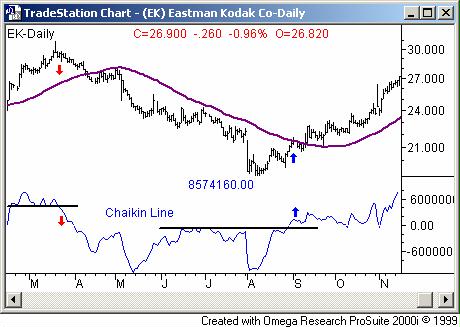
On the daily chart of Eastman-Kodak (EK) below, I plotted a Chaikin line in blue. In March, the Chaikin line started making lower lows well before shares were in any real trouble. But, it was an outstanding indication of the impending pullback (see the red arrows). In September, the Chaikin line started moving higher, confirming the bullish 50-day line crossover (purple) before it actually happened. Again, it was a very powerful buy signal.
Eastman-Kodak (EK) - Daily

Like I said, there's nothing earth shattering about these two ideas. However, I've observed in my career how the little things can make a much bigger difference than the things that are perceived to be big things. While your trading style will ultimately dictate whether or not either of these ideas will help you, at the very least I hope it illustrates that complex strategies are not required to be a top trader. Instead, a simple yet disciplined, methodical approach can be the critical difference between good and great.
Price Headley is the founder and chief analyst of BigTrends.com.