NASDAQ Commentary
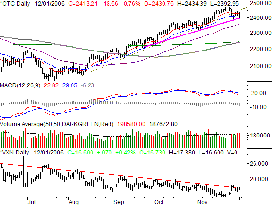
The NASDAQ Composite led the tumble on Friday, losing 0.76% to end the session at 2413.21. That was 18.56 points under Thursday's closing level, and 47.05 points under the previous Friday's close. For the week, the composite lost 1.91%, the worst single-week loss since July, which has to make us wonder if this is finally the end for the road for this incredible four-month uptrend.
On our chart, check out the transition from the old support line (green, dashed) to the new one (solid, bright purple). Clearly the rate of gain is slowing. Less obvious is the close under the 10-day line (red)and the close right at the 20 day line (blue), another subtle sign that the momentum is starting to crumble. The clincher, though, was the high-volume selling (tall volume bars); that's just a lot of selling activity as we ended one month and began another.
But, as a more objective/less subjective indication, we don't need to look any further than the MACD lines. On the 28th, we saw our second crossunder in a little over a month. In itself it's not a big deal, but to see it occur at the same time we're seeing these technical support lines break down makes a MACD crossunder a little more meaningful. It's at 2394 right now, but will be at 2397 on Monday.
As for the VXN, it's a pretty good mirror image of the NASDAQ right now. It's pressing into a resistance line at 17.25. If that line breaks simultaneously with the NASDAQ's support line, we'd be hard-pressed to stay bullish. If such a breakdown gets traction, a dip all the way back to 2242 (where the 100- and 200-day lines are) is a possibility.
NASDAQ Chart - Daily

S&P 500 Commentary
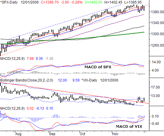
The S&P 500 gave up 3.95 points on Friday, or 0.28%, to end the day at 1396.70. That day was indeed the difference for the week, as the index had been basically flat through Thursday's close -- the SPX lost 0.3% (or 4.25 points) for the week. Bigger than that, however, was the close under the long-term support line that had kept this rally going since July.
The story here is simple. As we mentioned above, the key support lines are breaking down much more so than usual. And, the long-term support line (red, dashed) has indeed broken down. And it looks like this time, the MACD crossunder has a good shot at getting some traction. Now, just to be on the safe side, we'd recommend using the 20 day line as on of the deciding factors. It's currently at 1390, six points above the S&P's close.
At the same time, our tone is turning a little more bearish based on the VIX's wild but persistent move into an uptrend. The jump (gap) from a couple weeks ago looked like it might be a fluke, but Friday's move from 10.91 to 11.66 puts the VIX easily above the resistance we've been watching from months.
To draw the VIX's true upward momentum picture, we've plotted a MACD chart of the VIX itself (look below) the VIX chart. It indeed verifies that the momentum is to the upside in the short run. But, as both of the MACD lines approach the zero line for the first time in months, we can see the 'normal range' is changing for the VIX too. Given that it seems aching to finally move higher, it does not bode well for stocks.
But as we said above, the 20-day line is the critical line to watch for the time being.
S&P 500 Chart - Daily

Dow Jones Industrial Average Commentary
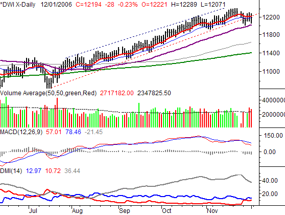
The Dow's 28 point dip on Friday (-0.23%) led it to its close of 12,194. That was 86 points under the prior Friday's close, locking in a modest 0.70% loss on a weekly basis. Although the loss was relatively minor, it was the second losing week on a row, and inflicted enough damage to push the Dow under its key support line, with the last two days of that ten day period coming on particularly strong selling volume. So, the complexion has really changed here - for the worst.
Pretty much everything we said above also applies to the Dow's chart. The support line is broken, MACD crossunders, etc. So, we're not going to repeat it here.
Instead we're going to focus in on the DMU indicator. For the first time in a long time, we're close to what may be a switch from bullish to bearish. The technical sell signal will be a cross of the DMI- line (red) over the DMI+ line (blue). Rather than a sign of the momentum of the closing price, this illustrates that the daily change in highs and lows is transitioning from bullish to bearish. We'll be keeping an eye on this chart for you.
In the meantime, the 50-day line (purple) is likely to be the last line of defense for the bulls. Currently at 12,022, a break of that line could seal the bearish deal.
Dow Jones Industrial Average Chart

Price Headley is the founder and chief analyst of BigTrends.com.