The volatility over the last week or so has obscured any new sector trends, and for that matter, has obscured some of the pre-existing ones. So in the absence of any definitive bullish or bearish chart, we're going to use the opportunity today to look at relative sector strength, and how it's been changing recently. From this bigger-picture analysis, we may be able to figure out which sectors are stronger, and which are weaker.
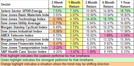
What we're looking for is one of two possibilities for each sector. Either a trend is consistent and persistent, or a trend is likely to be reversing (or at least ending). To easily compare the 'then and now' for each sector, we've simply listed - on a grid - the total returns of each sector for various timeframes spanning 2 weeks to one year.

If the trend is still in place, the short-term returns should mirror their long-term counterpart. If the trend is falling apart, the short-term returns should be inconsistent with longer-term trends.
On the chart, we've ranked the sectors by their one-month return (the column in yellow). While all the data is important, we think the one-month timeframe is the optimal view for measuring what the true trend is, and how each sector stacks up against the others. Take a look.
Sector Performance, Ranked by One Month

Overall, we don't necessarily see a lot of 'rotation' per se. We do, however, see some persistence in a handful of sectors. Take energy for instance. It's the leader in 3 of the 5 timeframes listed above, and places 3rd (of 11) in the other two timeframes. And perhaps more importantly, it's the leader in the more recent timeframes. That sort of ongoing trend is what intermediate-term (and longer-term) oil stock owners want to look for.
On the flipside, healthcare has been a pretty reliable laggard lately. The weakest performer for each timeframe is highlighted in pink; healthcare took those dis-honors in the 1-month and 3-month timeframes, and didn't do much better in the 2-week timeframe. The telecom stocks had lagged pretty badly earlier in the year, and haven't improved that situation very much in recent weeks (although other telecom indices other than the AMEX Telecom Index have actually shown some pretty good strength -- maybe the AMEX is weighted in a non-advantageous manner).
The only potential rotation we see right now - which is subject to change at any time - is highlighted in orange. The utility stocks had a hot run in the middle of the year, but it looked like they were ready to cool off a few weeks ago. However, they ended up being the 3rd-best performer in the most recent two-week period, and 4th in the 1-month period. That's a significant change from the 3-month return, so maybe these stocks are falling back into favor again.
The transportation sector isn't highlighted in orange for the last two weeks, but only because it's highlighted in pink as the worst performer for that timeframe. These stocks were on fire in the first half of the year, but have gotten progressively weaker in just the last few weeks - to the point of losing ground now.
One caveat: just because a sector or index is relatively stronger or weaker than another doesn't necessarily mean it's going to go higher or lower. It just means it's likely to outperform or underperform in comparison to other indices. We still encourage you to use charts in conjunction with any of these ideas.
Price Headley is the founder and chief analyst of BigTrends.com.