NASDAQ Commentary
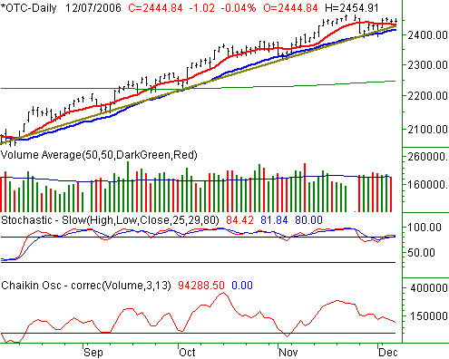
The NASDAQ Composite tumbled by 0.27% on Wednesday, losing 6.52 points to end the session at 2445.86. That's still 1.35% above last Friday's close, meaning the index is holding onto a 32.65 point gain for the week so far. You've got Monday to thank for that, mostly.
More of the same for the NASDAQ, really. The long-term support line (brown) is still intact, despite the unlikeliness of it. However, as of today (Thursday), we're seeing some slumping in very subtle ways. Take for instance the 10- and 20-day moving average lines (red and blue, respectively). The 20-day average is under that support line, while the 10-day line looks like it could also slip under the support line with only a little more weakness. In the same vein, the two stochastic lines are both back into 'overbought' territory, but didn't make it back up to their prior levels (near 100) before starting to taper off.

Does that mean anything yet? Technically, no. That's a subjective observation; we prefer objective chart patterns that have a quantifiable history of results. As it stands right now, the NASDAQ is finding support, so that's going to remain at the heart of our stance. We're bullish until the last of the support lines - currently the 20-day average at 2418 - is breached.
That being said, the falling Chaikin line may be on track to yield a sell signal soon, as volume has actually been bearish even if stocks have drifted higher. the actual sell signal is a Chaikin line cross under zero. On the other hand, the last few times the Chaikin line has approached its zero line, the bulls stepped back in pretty quickly. So, we'll only be using the Chaikin line as a supporting indicator - not a primary one.
NASDAQ Chart

S&P 500 Commentary
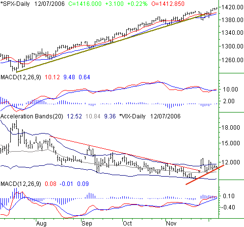
Off by only 1.85 points on Wednesday, the S&P 500 lost 0.13% to close at 1412.90. On a weekly basis, the SPX is 16.2 points, or 1.16%. All in all, the market still seems content with this general pattern of stair-step bullishness, despite the big dip from a week ago.
Today's chart is largely intended to show the dynamic between the SPX and the CBOE S&P 500 Volatility Index (VIX). We've plotted each, and also plotted MACD lines for each. In general, you'd expect the short-term trends of each would run counter to one another (not so in the long term). So, when we started seeing some rather decisive indications that the VIX has started to trend higher, we knew it was a potential pitfall for the bulls.
In late November, the VIX surged past a key resistance level, and so far has been content to stay above it. Although it has settled back in some since then (back under the upper band line), the long-term resistance line remains breached. In the meantime, we may have seen the VIX define a short-term support line. As of right now, the VIX's pennant shape is fairly un-telling in terms of a direction it may take once the wedge closes up completely. However, it seems as if the floor is much stronger than the ceiling.
At the same time however, this SPX chart is like an Energizer bunny; it just keeps going, and going, and going. It's key support line is at 1408, but even a dip under that wouldn't be a sell signal. We'd say wait for a couple of consecutively lower closes under the 20-day line before flinching. A clear move higher for the VIX should accompany that kind of dip for the S&P 500.
S&P 500 Chart

Dow Jones Industrial Average Commentary
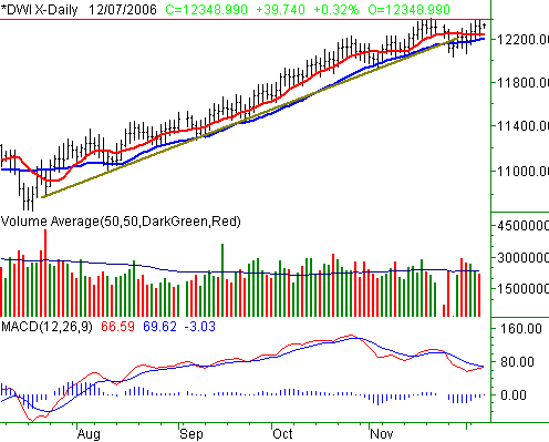
The 22.35 point loss taken by the Dow Jones Industrial Average on Wednesday translated into a slide of -0.18%. For the week though, the blue-chip index remains in the black by 115.12 points, or +0.94%. Wednesday's close was at 12,309.25 after a particularly uninteresting session.
There's nothing new to add here for the Dow...last week's shake-up may present an opportunity for the bulls to yield for the bears, but for now it appears as if the buying interest is still strong. The only thing we'll point out here is that the November high of 12,400 ended up also being resistance earlier this week. A close above that mark would re-confirm any bullish opinion, so watch for that. The only true bearish outlook would stem from a couple of closes under the 20-day line, presently at 12,213.
Dow Jones Industrial Average Chart

Russell 2000 Commentary
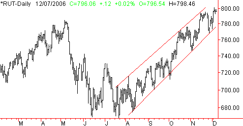
No big deal here - we just thought it was a chart worth a look, since small caps have pretty much been leading the way recently. The Russell 2000's bullish zone is framed by a support line currently at 776, and a resistance line currently at 810. Both are rising, obviously. You can incorporate the data or not, but if you were wondering whether or not small caps were currently offering a premium relative to their unique risk, this chart says they are. We may look at this chart more in the future.
Russell 2000 Chart

Price Headley is the founder and chief analyst of BigTrends.com.