It has now been two weeks since both the Nasdaq and Dow topped. Some might recall the powerful selling that met the market just after the Thanksgiving weekend. The Nasdaq, in particular has been struggling to hold its footing ever since. With the exception of a rally that lasted a total of only three trading hours, the Nasdaq has been dominated by the bears during this time. The Dow on the other hand, has been quite the roller coaster. Now, what has got most market participants amazed, myself included, is the ever-resilient and mighty S&P 500, whose upward trend since the July lows has been nearly flawless - the only real "crack" in the design was that trading day after Thanksgiving weekend, November 27, where no one was spared.
One might wonder why, over the last couple of weeks, the S&P 500, which really "summarizes" the action of the speculative market (Nasdaq) and the Blue Chip market (Dow), is out in the northern part of the charts on its own, while the other two measures are huffing and behind it. Well, aside from being the main barometer knowledgeable short-term traders (market makers included) utilize to establish directional posture, let us not forget that the S&P 500 is also the main barometer that is used to measure performance across a multitude of equity funds that invest for larger time horizons. As the year draws to a close, funds that are not performing at least in-line with the S&P 500 are running behind, and thus this "pressure to perform" would drive much of the inflow of money into instruments that would greatly affect this index. This is particularly so in today's "new" stock market, where the Index and Exchange Traded Funds (ETF's) continue to rise in popularity.
This creates quite an "interesting" environment where a lot of the cash that's moving into the stock market is being deployed by both investors and fund managers into the actual barometer itself: the S&P 500. I say now "interesting" because the S&P 500 is not just on a near-flawless uptrend since the July lows, but if you really want to talk big, it also happens to be 4-years deep into an even larger near-flawless uptrend. In my view, the strength of the S&P 500 this deep into the game, is driven by the "congregation of the late." Well, we all know what happens when the majority are buying the same thing at the same time: the market ends up with a whole lot of sellers - at the same time. If it's your belief that fund managers are not subject to serious timing errors, it's time to think again.
Despite this "slightly" bearish viewpoint for larger time frames (in this case, the intermediate-term time horizon), let us not confuse it with trends of the smaller time horizon. While the Nasdaq and Dow did top-off two weeks ago, we must maintain a high degree of respect to the mighty S&P 500, as its trends across multiple time horizons are still dominated solidly by the bulls. Since we have already been tracking the markets' larger time horizons in recent articles, let's take a look at the situation in the smaller time horizons, using the hourly charts:

Chart Notations:
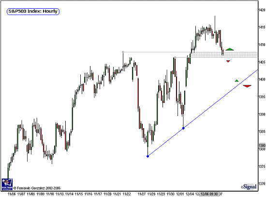
- The hourly chart of the S&P 500 above addresses the short-term time horizon
- Note that over the last few days, the S&P 500 broke to new highs, despite a violent shock to the Downside on November 27, which was the worst selling the S&P 500 has seen since July.
- That "shock" on the 27 is a characteristic of left-shoulder, as-in Head and Shoulder reversal formation. Well, perhaps, but just to ensure that we are not looking at that chart with bear goggles, let us note that the series of higher-highs and higher-lows (thus, uptrend) is still intact. We must therefore respect that trend!
- What we need to look-out for is movement below the gray area, which represents prior resistance, and now support zone. The bulls still maintain control above that area.
- Trading below the gray zone puts a move into the trendline (blue) into play. Note the arrows, and size of the arrows, for directional/magnitude guide.

Chart Notations:
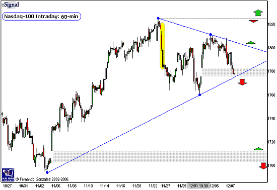
- The hourly chart of the Nasdaq-100 above addresses the short-term time horizon.
- Note the Nasdaq has a different and weaker design than our previous chart on the S&P 500 of the same time window. The Nasdaq has been contained below the downward "shock" on the 27 (yellow). At this point we have a triangle forming, which is just the result of two trendlines (blue) that are in-play for the next few trading days. Note the arrows, and size of arrows for short-term directional/magnitude guide.
- Note that the market currently sits at an open gap from a few days ago (gray area). We mark this as a short-term neutral zone. Movement below the gap also breaks the trendline, and would put into play a larger move down to another open gap underneath the market (in gray, at the bottom of the chart).
- Although this Nasdaq chart can stand well on its own, particularly on very short-range time horizons, it would be wise for us to pay attention to the S&P 500's trend design as well, as it still remains the undisputed leader of the market.
Fernando Gonzalez is in his 10th year as an active trader, technical analyst and content contributor to the active trading community and a long list of popular financial media. Online Trading Academy trading knowledge...your most valuable form of capital.