NASDAQ Commentary
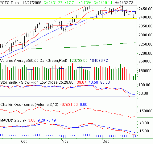
The NASDAQ Composite bounced 17.71 points yesterday to end the session at 2431.22. The 0.73% gain followed Tuesday's gain of 12.33 points, leaving the index 1.25% above last Friday's close.
In our most recent update, we plotted a key support line that would essentially be a make or break point for any bearish stance. Apparently the market was reading, as the support line at 2394 (plotted in yellow) was indeed Monday's rally point, after Tuesday's lower opening just 3 points above that line, the composite bounced - and hasn't stopped since.
Of course, it hasn't been challenged either. While the week has been bullish thus far, the NASDAQ hasn't had any barriers put in front of it. Or, maybe it has.

The 10- and 20-day moving averages (red and blue, respectively) are at 2430 and 2433 (also respectively). Remember, the composite closed at 2461.22 on Wednesday after hitting a high of 2432.73. Coincidence? Possibly, but we're not interested in tossing a coin here. We really need to see whether or not the index can work past that line or not before saying there's no need to consider a correction.
That being said, even if 2433 is breached by a rally, there remains a bigger barrier. The NASDAQ has made two distinct attempts to get past 2470 (gray). Maybe the third time will be the charm, but the way we see it, there's an awful lot of risk in trying to preemptively forecast breakout moves. Simultaneously (and this is why we were hesitant at the end of last week), we need to see a break under 2394 before really expecting anymore downside. In the meantime, the composite appears trapped in a sideways zone, as it has been for six weeks.
NASDAQ Chart
S&P 500 Commentary
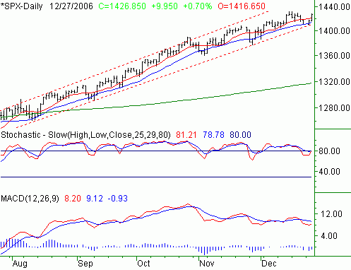
On Wednesday, the S&P 500 gained 9.95 points, or 0.7%, to close out at 1426.85. On a weekly basis, the large cap index is only 1.14% (+16.10 points) above the previous week's close, and is the laggard among the three indices we watch here on a regular basis.
In a nutshell, the 'potential' support at the 20-day moving average line became a reality on Friday and Tuesday. Friday's low of 1410.30 was almost exactly where the 20-day line (blue) was that same day. Although we opened under the 20-day line on Tuesday, the rally quickly pushed the SPX back above it, and back above the support line (red, dashed) we've been honing in on for months now.
Discipline says we have to "call 'em like we see 'em", so this chart remains bullish - even if a little surprisingly. That long-term support line is now at 1414. As long as it holds, so too will our bullish stance.
Take a look at the daily chart, them keep reading for our special commentary.
S&P 500 Chart
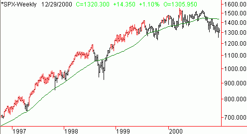
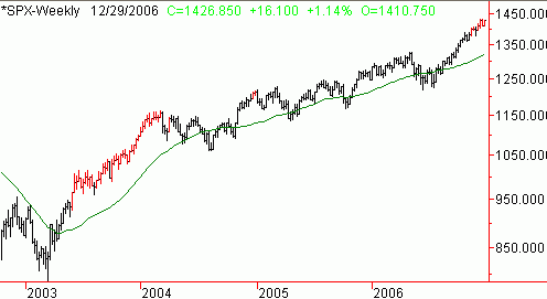
That being said, while it may be extremely rare for the SPX to venture beyond 6% past the 200 day line, when it does, it's usually part of major rally....like the kind we had in 1999 and 2003. But still, being that far over-extended eventually presents bigger problems than benefits. On the two weekly charts below, the points in time where the SPX is 7% or more above the 200 day average (green), the price bars are 'painted' red. For most of the late 90's, getting to that point and beyond wasn't a big deal, as evidenced by several long strings of red bars. Same story in 2003 - stocks didn't even flinch when they got over-extended.
However, we see a few instances where once the 7% threshold was met, a major corrective move soon followed. This is what the bulls should be worried about right now. So, the question is, is 2006 (almost 2007) like the late 90's. Or, is it more like the early 2000's where the market was more apt to fall once we got to that point? Just something to think about.
S&P 500, 1997 - 2000 - Weekly (with 7% or > above 200 day average painted in red)
S&P 500, 2003 - 2006 - Weekly (with 7% or > above 200 day average painted in red)
Dow Jones Industrials Commentary
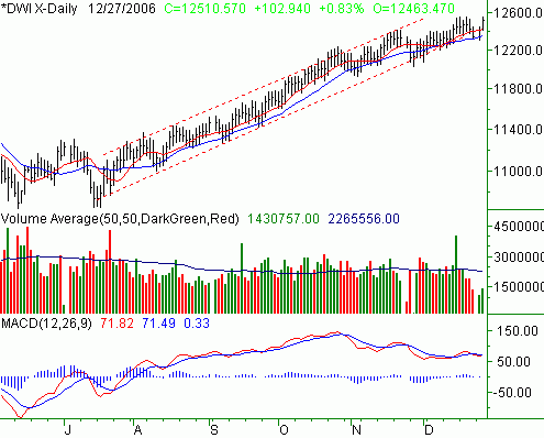
Once again, the Dow Jones Industrials marched into never-charted territory by hitting an all-time high of 12,549.65 on Wednesday. The close at 12,510.57 was also a new high close, thanks to a gain of 102.94 points (+0.83%) yesterday. For the week, the Dow is ahead by 167.35 points, or up 1.36%. And yes, it was the Dow's 10 and 20 day lines spurring the rebound.
While stocks have done pretty well this week, keep in mind the "Santa Claus" rally may be holding them up artificially. We wouldn't read too much into what we've seen so far, as the new calendar year is also a whole new ballgame as far as investor mentality is concerned.
Dow Jones Industrials Chart
Price Headley is the founder and chief analyst of BigTrends.com.