|
Weekly Outlook in the Stock Market
NASDAQ Commentary
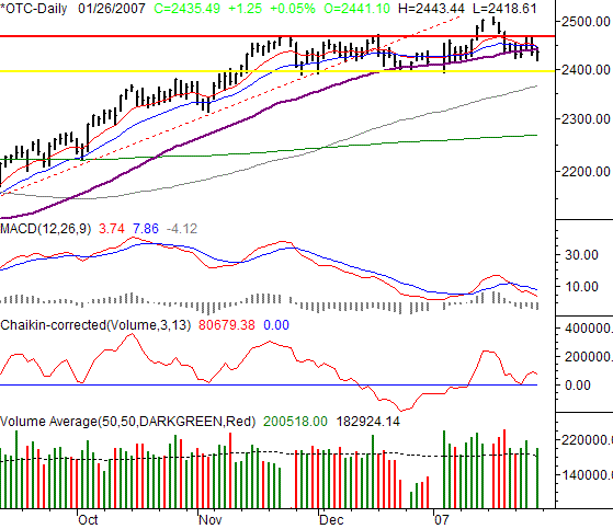
The NASDAQ Composite edged higher by only 1.25 points (+0.05%) on Friday, leaving the index at 2435.39 for the week. That was 15.82 points under (-0.65%) the previous week's closing level, and was the second losing week in a row. While the momentum is clearly gone, we still can't call it a breakdown yet.
For the first time in months, we're seeing consecutive closes under the 50 day moving average line...4 in the last five days, to be exact. In many regards, that's a completed sell (intermediate term), evidence that the momentum has indeed changed as described above. The bearish MACD crossunder from early in the week confirms the same. Adding to the same opinion is the fact that we hit resistance - again - at 2470 right before things turned south again.
The reason we can't get all the way bearish though, is that support line at 2394 (yellow). We've bounced there several times in the last month, usually unexpectedly. We're only about 40 points above there right now, so the good news is, we may see a make-or-break move in the next few days.
Our opinion? We're still reserved here, but we will point out that this trip back towards that support line is under very different circumstances than the last few were. So, the result may be different this time around.
NASDAQ Chart - Daily

S&P 500 Commentary
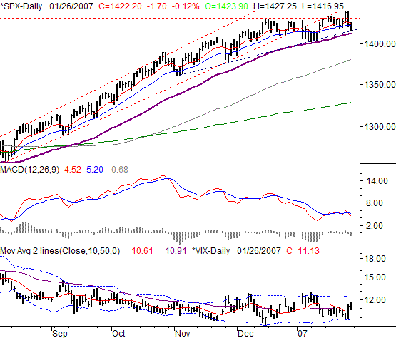
On Friday, the S&P 500 closed at 1422.2, 1.7 points below Thursday's close -- a loss of 0.12%. The weekly loss of 8.3 points (-0.58%) was only slightly more dramatic, and by the end of the day, we found the SPX has been spinning its wheel over the last couple of weeks. Oh, it's finding support from the lines you'd expect it to. The problem is, those lines are flattening a little more each day.
In the mid-week update, we pointed out that a new support line for the S&P 500 was being established. The old in is framed with red, dashed lines; the new one is marked by blue, dashed lines. Clearly the slope of the new one is much less bullish than the older one.
The reason we bring it up now is to point out that even the lower edge of this new generally-bullish channel is being tested. Friday's low of 1416.95 just brushed that line, meaning even a minor dip on Monday (or afterwards) could break yet another support level, and force us to redraw those frames even less bullishly.
Simultaneously, notice how the support line is running parallel with the 50-day moving average (purple). In fact, the two are almost on top of each other. Much like the NASDAQ's chart, the 50-day line is being challenged as support for the first time in months, though we did find support there in early January. The point is, the overall bullishness is slowly faltering. If we don't get a recharge soon (as in the coming week), what little bullishness there is may be deflated.
The 50-day line is at 1413.57. A couple of closes under that level will put us on the bearish side of the fence.
In the meantime, the VIX remains stuck in a range between 10.0 and 12.5, pretty much where each of the Bollinger bands is right now. Recently, the VIX's relative peaks and bottoms have occurred at the band lines. And as you can see, there's still some room for the VIX to rise before 12.5 is seen again. That margin is the wiggle room the bulls have before we turn bearish based on the VIX. A close above 12.5 would probably occur at the same time as the SPX fell under the 50-day line, a double confirmation of a bigger bearish move. If instead 12.5 acts as a ceiling - and if the 50-day line support the SPX - the bulls will stay alive.
S&P 500 Chart - Daily

Dow Jones Industrial Average Commentary
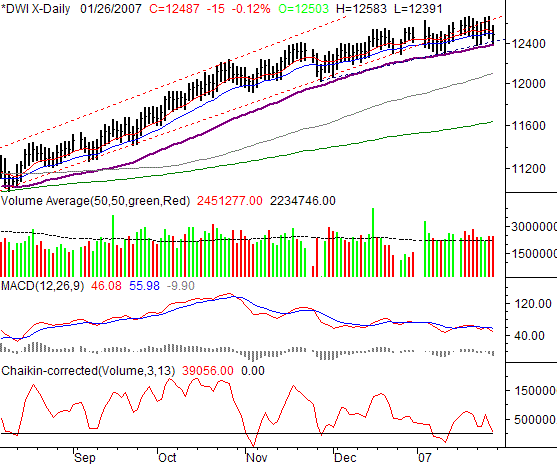
The Dow Jones Industrial Average matched the S&P 500 on Friday with a 0.12% loss of its own. For the Dow, that meant a 14.98 point dip, which parked the index at 12487.02 by the end of the session. For the week, the similarities to the SPX were sustained. The Dow lost 0.62% (-78.15) points over the last five sessions. Like we pointed out in the mid-week update, the overall trend is still pointing the chart higher, but it looks like the bulls are falling asleep.
So, you probably won't find it hard to believe the Dow's chart is largely mirroring the SPX's. The less-bullish support line (blue, dashed) is being tested, as is the 50-day average line (purple). If the DJIA falls under 12,391, that support will be broken as well. And just so you know, the Dow hit low of 12,391 on Friday.
Less objectively, note how the selling volume got heavy - and frequent - in the last couple of weeks. It's been the strongest span of distribution we've seen since late October. To see it coincide with a break in momentum is a major red flag.
Dow Jones Industrial Average Chart

Price Headley is the founder and chief analyst of BigTrends.com.
|