On Tuesday, the Commerce Department reported that May's factory orders had increased by a 2.9 percent. This was well covered by "the press," as it was to be a positive influence on "the market" (yes, the quotes are intentional.....you'll see why). And quite frankly, I can understand the enthusiasm - the $394 billion in orders of manufactured goods is the highest level we've ever seen since the current calculation method was adopted. Although we're contrarians, we'll still completely acknowledge that this was (and is) a clue that the economy is on a solid footing. However, also being technical analysts, we've seen too many times that there's a disconnect between what 'should' be the result of a piece of economic data, and what actually occurs. Folks, the economy isn't the market. You can't buy shares in factory orders......you can only buy (or sell) stocks. Regardless of how strong or weak the economy is, you only make money if you buy low and sell high. So with that, we put together a study of some of the economic indicators that are treated as if they affect stocks, but really may not.
Gross Domestic Product
This is actually a discussion we started last Thursday, as we pointed out the fact that the most recent GDP figure of 3.8% growth was more than a little untimely. It was for the first quarter of this year, and we didn't hear it until we were starting the third quarter. That's not a poke at the Bureau of Economic Analysis - it's a huge job to gather that data, and it should take a while to calculate. I'm just saying it was a little but pointless to try and apply to your portfolio now.
That discussion, though, is really what got me wondering about whether it would even matter if we got the GDP data immediately at the end of the quarter. As you may have expected, we're going to chart that very data to look for a pattern.
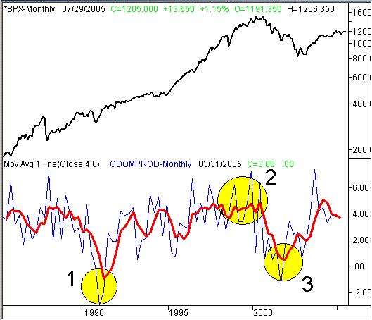
The chart below plots a monthly S&P 500 against a quarterly Gross Domestic Product growth figure. Keep in mind that we're comparing apples to oranges, at least to a small degree. The S&P index should generally go higher, while the GDP percentage growth rate should stay somewhere in between 0 and 5 percent. In other words, the two won't move in tandem. What we're trying to illustrate is the connection between good and bad economic data, and the stock market.
Take a look at the chart first, then read our thoughts immediately below that. By the way, the raw GDP figures are represented by the thin blue line. It's a little erratic, so to smooth it out, we've applied a 4 period (one year) moving average of the quarterly GDP figure - that's the red line.
S&P 500 (monthly) versus Gross Domestic Product change (quarterly)

Generally speaking, the GDP figure was a pretty lousy tool, if you were using it to forecast stock market growth. In area 1, we see a major economic contraction in the early 90's. We saw the S&P 500 pull back by about 50 points during that period, although the dip actually occurred before the GDP news was released. Interestingly, that 'horrible' GDP figure led to a full market recovery, and then another 50 point rally before the uptrend was even tested. In area 2, a GDP that topped 6 percent in late 1999/early 2000 was going to usher in the new era of stock gains, right? Wrong! Stocks got crushed a few days later....and kept getting crushed for more than a year. In area 3, the fallout from the bear market meant a negative growth rate by the end of 2001. That could persist for years, right? Wrong again. The market hit a bottom just after that, and we're well off the lows that occurred in the shadow of that economic contraction.
The point is, just because the media says something doesn't make it true. It might matter for a few minutes, which is great for scalpers. But I'd hesitate to say that it even matters in terms of days, and it certainly can't matter for long-term charts. If anything, the GDP figure could be used as a contrarian indicator.....at least when it hits its extremes. This is why more and more folks are abandoning traditional logic when it comes to their portfolios. Being a technical analyst (a chart watcher) is not without its flaws, but technical analysis would have gotten you out of the market in early 2000, and back into the market in 2003. The ultimate economic indicator (GDP) would have been well behind the market trend in most cases.
Unemployment
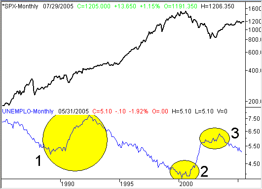
Let's look at another well covered economic indicator......unemployment. This data is released monthly, instead of quarterly. But like the GDP data, it's a percentage that will fluctuate (between 3 and 8). Again, we're not going to look for the market to mirror the unemployment figure. We just want to see if there's a correlation between employment and the stock market. Like above, the S&P 500 appears above, while the unemployment rate is in blue. Take a look, then read below for our thoughts here.
S&P 500 (monthly) versus Unemployment rate (monthly)

See anything familiar? Employment was at it strongest in area 2, right before stocks nose-dived. Employment was at its recent worst in area 3, right as the market ended the bear market. I highlighted a high and low unemployment range in area 1, only because neither seemed to affect the market during that period. Like the GDP figure, unemployment data is almost better suited to be a contrarian indicator. There is one thing worth mentioning, though, that I noticed about this chart. While the unemployment rates at the 'extreme' ends of spectrum was often a sign of a reversal, I do see a nice correlation between the direction of the unemployment line and the direction of the market. The two typically move in opposite directions, regardless of what the current unemployment level is. In that sense, logic has at least a small role.
Bottom Line
OK, so maybe you're wondering why a sentiment analyst (and a contrarian, and a technical analyst) is looking at economic data in the first place. The answer is, simply to highlight the reality that the economy isn't the market. I see too many traders who assume there's a cause-and-effect relationship between one and the other. There's a relationship, but it's usually not the one that seems most reasonable. Hopefully the graphs above have helped make that point. That's why we focus so much on charts, and are increasingly hesitant to incorporate economic data (and all the appropriate assumptions) into our stock trading. Just something to think about when we get the unemployment data on Friday
Price Headley is the founder and chief analyst of BigTrends.com.