|
A Mid-Week Look at the Markets
NASDAQ Commentary
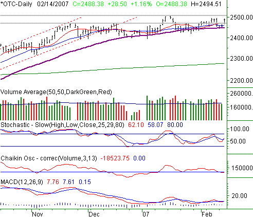
The NASDAQ rallied 1.16% on Wednesday, closing 28.50 points higher to end the session at 2488.38. Wednesday's gains means we're up about 1.16% for the week as well (+28.56 points, to be exact). The pop pushed the composite above that key resistance line at 2470, but as we said in the Weekly Market Outlook, we're not going to get too excited until we see the NASDAQ hit a new multi-year high. That line in the sand is at 2508.93.
As you'll also read of the other indices, the NASDAQ is still a bit tangled up in itself, moving sideways as a result. The entwined moving averages tell that story pretty well, and where they don't, all the other indicators do. However, those moving average lines are where we're really focusing now.
And what do they say? We're not overlooking the fact that the 50-day line (purple) has been support through the best and the worst recently. Though the 10- and 20-day averages (red and blue, respectively) have reflected the go-nowhere market recently - and come close to falling under the 50-day average as a result - the fact is, they're all still bullish in however you interpret them. So, maybe the eight week lull was just a refueling period. We won't (can't?) really say until we start to clearly break out of this recent range. To make any kind of supposition from here, though, we think may be the equivalent to a coin toss. Be patient, and pick your spots.
NASDAQ Chart

S&P 500 Commentary
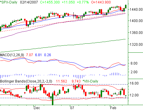
After a 0.77% (11.05 point) gain on Wednesday, the S&P 500 closed out at 1455.30. On a weekly basis, the chart is higher by 1.2% (17.25 points). A new high of 1457.65 was hit on the road to today's gains, but the move was accompanied by a disturbing drop for the VIX. Perhaps we could chalk it all up to being in the midst of option expiration week, but it doesn't mean we won't have to answer for it later.
In all fairness, higher highs are higher highs no matter what part of the world you live in. So, when we see the SPX on the rise, we have to be bullish based on the sheer momentum. Besides, the flat period between mid-December and mid-January we were calling a consolidation? When you take a step back, you could sure make a strong case that the SPX was breaking out of any consolidation and renewing its uptrend.
The killer is the VIX. It hit 9.7 today, and then proceeded to recover a lot of ground. We'd be the first to concede that expiration week may have played a role in the VIX's swing, but we're not so sure it matters. The 9.8 area has been a floor for the VIX since December, and it's also coincided with short-term market tops. The reason for concern is obvious. However, we've yet to get a giant breakdown -- only small pullbacks. So, the term "concern" is all relative. All the same, we went to a short-term bearish opinion for our service subscribers today. Unless we see the S&P 500 fall under support at 1428, we're not going to get too worried.
S&P 500 Chart

Dow Jones Industrials Commentary
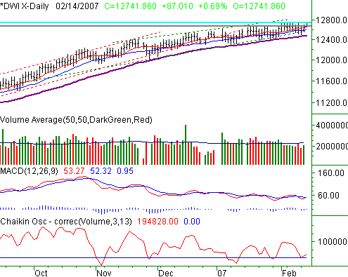
The Dow's high of 12,755.48 on Friday was indeed a new multi-year high. And, the index actually did a pretty good job at hanging onto most of it, ending the session at 12,741.86, up 87.01 points (+0.69%). For the week, the Dow is ahead by 1.28%, or 161.03 points. On a percentage basis, that's better than the other indices.
Yet, when we look at this chart, we think the word 'grinding' may still overestimate the way gains are being tacked on. The Dow is up 0.95% so far for the month, but (assuming nothing changes between now and the end of February) we're on track to see five consecutive month's worth of gains small than the previous month's gain. If you're bullish it sure beats losing ground. But, it's definitely the hard way of doing things.
The most visible moving average line on our Dow chart is the 50-day line (purple). Notice how it's arched, steep on the left, then flattening as you move to the right. It's something like a rainbow. That's the problem - rainbows run into the ground again, eventually. Though the S&P 500 isn't quite taking the same shape, the arc is pretty apparent for the Dow.
The MACD and Chaikin lines are also both basically flat, confirming the lack of traction.
That being said, there's still the possibility the Dow is working (by rocking) its way out of a consolidation phase. A couple more closes above 12,675 - and ideally, 12,740 - would convince us that the Dow was in decent shape as far as the bulls are concerned.
On the other side of the chart, only a close under support at 12487, or the 50-day line, would put us on the bearish side of the equation. In the meantime, we seem to be stuck in uneventful-land.
Dow Jones Industrials Chart

Price Headley is the founder and chief analyst of BigTrends.com.
|