Professional trader Price Headley provides a look at the stock market for the week of February 19.
NASDAQ Commentary
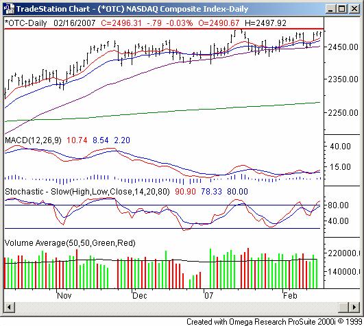
The NASDAQ Composite may as well have not come in to work on Friday - it closed 0.03% lower (-0.79 points) -- basically flat enough for us to call even. It got most of its work done earlier in the week, ending ahead of last week's close by 1.48% (or 2496.31). The last trade was 2496.31 - a little shy of January's peak of 2508.93. So, we applaud the bullish effort, but we're not fully convinced that the bulls are back in charge.
In our last look we mentioned how the NASDAQ might be coming out of a sideways/consolidation phase by breaking out. The way the moving averages are diverging now still leads us to think it's possible.
On the other hand, this up-and-down stuff has meant very little net progress. If the composite can get past 2508.93, then we'll feel better about getting all the way on the bullish side of the camp. Till then, we remain hesitant. On the other side of the chart, support is still being made around the 50-day average (purple), currently at 2451.
Be patient here; if it really is a bullish breakout, we're apt to find out in the coming week.
NASDAQ Chart - Daily ![]()

S&P 500 Commentary
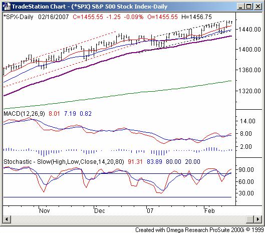
The S&P 500 closed only 1.25 points lower on Friday (-0.09%), ending expiration week ahead of the prior week's close by 17.50 points (or +1.22%). Friday's close of 1455.55 was just a hair under the new multi-year high of 1457.65 reached on Wednesday. All in all it was modestly bullish...typical of an expiration. But, it wasn't like we finally saw a decent follow through. If history holds true this time around, the upward move near the end of last week is probably going to lead to a small move lower in the coming week, as the 10 and 20 day lines reel the index in once again.
One thing to know right off the bat is the stochastic and MACD lines have been a complete mess lately. In fact, the only reason we bring it up is to let you know it's not even a factor right now - just too erratic to use.
However, we will point out that there's a new bullish channel established, framed by the dark dashed lines. (They replaced the older channel framed by red dashed lines.) This range is even more narrow than the previous one was - a testament to just how choppy things have been. The upper edge is around 1460, though we bumped into when it was at 1457 on Wednesday. That resistance is why we sort of expect a small dip in the coming week - the lower edge of the zone is currently at 1437 and rising.
By the way, the SPX is now 8.6% above its 200-day average (green) - a very unusual situation. Either we're back into the same mode we were in during 1999, or we're getting set up for a big fall.
The one thing we are willing to say is that knowing periods of high volatility are followed by period of low volatility (the last few months have been very involatile), we're expecting stronger movement - one direction or the other - very soon. A lot of people think the transition into spring time is likely to be tame, as usual. We would caution against making that assumption. We're due for some bigger swings, regardless of what the calendar says. Point being, take charts at face value when the time comes.
S&P 500 Chart - Daily 
Dow Jones Industrial Average Commentary
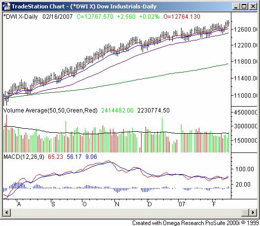
Like the other two indices, the Dow Jones Industrial Average's results on Friday were basically flat -- +0.02% to be exact. The 2.56 point gain left the Dow at 12,764.57. Still, it was 186.74 points higher for the week, up 1.48%. Like the S&P 500 as well as the NASDAQ, the Dow is likely to continue taking two tiny steps forward, and one tiny step back (last week was the two tiny steps forward).
While the bulls should be content to see the DJIA still finding support at the 10-day moving average line (red) and 20 day line (blue), at this point, it may also be exhausting to see it do so inconsistently. Unlike July through October - when the 10- and 20-day lines acted like an escalator - the Dow has recently been dancing on both sides of those lines. It's still pointed higher, but it's an incredibly inefficient way of making progress.
It's the 50-day line (purple) that's been doing most of the heavy lifting, supporting the index a handful of times in the last three months when the 20 day line didn't. It's currently at 12,507. If that line fails to act as support, then we'll get really worried. Anything else is just more of the same chop.
Dow Jones Industrial Average Chart - Daily 
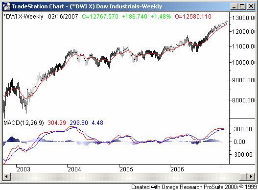
While the daily chart might make a decent bullish argument, the weekly chart reveals a few problems - namely, a serious turn in momentum. Though still inching higher, take a look at the MACD lines on the weekly chart. This run is starting to look an awful lot like the one from early 2003 to early 2004, in terms of time as well as size and even in the height of the MACD lines. And, we haven't had a major correction in a while.
What's interesting about the 2003/2004 rally, however is that we hit a weak spot (let's call it a lull) for about a month, and then ended the bullish leg with a major - almost explosive - runup at the very end. It wouldnt be unfair to describe it as a long-term blow-off top. If the current chart is indeed a repeat of that one, we may actually be due for one last hurrah'. Of course, that's a big if.
Dow Jones Industrial Average Chart - Weekly 
Price Headley is the founder and chief analyst of BigTrends.com.