| Another Look if the Volatility Index (VIX) Still Works |
| By Price Headley |
Published
02/23/2007
|
Futures , Options , Stocks
|
Unrated
|
|
|
|
Another Look if the Volatility Index (VIX) Still Works
About a month or so ago, we took an updated look at the VIX - the CBOE Volatility Index - and its usefulness as a market indicator. Over the past several years, the VIX has been under a little fire as some watchers say it's lost its effectiveness in spotting tops and bottoms. We understood the argument, but instead came to the conclusion that it was still useful if your interpretation was appropriately adjusted to reflect how the VIX is trading differently now than it was in the last 90's.
That key difference now, just so you know, is simply how the VIX has been under 17 for the better part of the last three years. Between 1997 and 2003, it spent almost all of time above 17. So, some new norms would need to be applied to effectively spot what was an extreme high (a market bottom), or extreme low (market top).
But what else can we learn from difference between the VIX now and the VIX then. It's a question we can somewhat answer today, if we go back to its roots - when it was designed to actually be a volatility index rather than a sentiment gauge.
It's true! The VIX's original purpose was to reasonably guess how volatile the market would be over the next 30 days, without necessarily predicting any particular direction. (The fear gauge aspect wasn't popularized until after it was noticed it reached extreme readings right before the market was ready to make a big reversal.)
But what if the VIX was also still interpreted as a volatility predictor? Based on some look-backs we did recently, we can say, had investors been interpreting the volatility predictions at face value, they may have done much better. How? By understanding the environment in which they were trying to trade. Clearly things have been different over the last couple of years than they were before 2004.
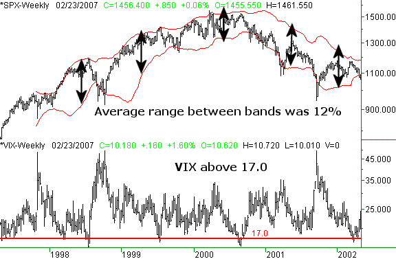
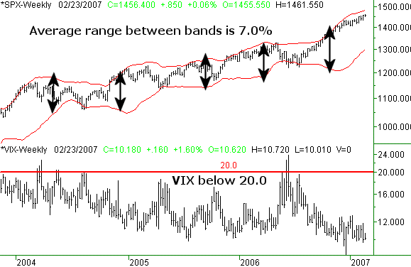
To make simple illustrations of this point, we're going to use a couple of weekly charts of the S&P 500 compared to the VIX. The first chart looks at the VIX between 1998 and 2002. The second chart examines the VIX between 2004 and now. See if you spot the obvious (after the fact) that the VIX actually warned you about ahead of time.
On the 1998-2002 chart of the S&P 500 and the VIX, you'll see we've also plotted Bollinger Bands around the SPX. The VIX was between 17 and 45 practically the entire period. Though these bands are plotted based on a standard deviation above and below a moving average of the S&P's trading level, we manually calculated the average distance between the upper and lower band to be about 12% of the index's closing level. That leaves a pretty wide range within which the index can move before finding a ceiling or floor.
S&P 500 with VIX, 1998 through 2002 (weekly)

For what it's worth, it sure looked like the market made nearly full use of that 12% range. Wait a minute. Is that another way of saying it was volatile? Maybe. Let's look at a comparison.
A lot of people have described the recent market as 'volatile', in that we seemed to take only two steps forward and then one step back. Overall it's been bullish, but it was also painfully inefficient. Other people have called it 'choppy', generally meaning the same thing. However, I think a term better used to describe the market condition is a 'vibrating' market rather than a choppy market. I know a 'vibrating' market is a new one to all of us - including me - but I use that word to illustrate the relative difference between then and now. (If there's a better word to describe what I mean, feel free to let us know.)
Take a look at the difference between the recent chart and the previous one. On the 2004-Current chart, we applied the same analysis. We were looking for the average degree of separation between the upper and lower Bollinger Band. Note that for nearly the entire period, the VIX was under 20 - what was supposed to be a low volatility period.
S&P 500 with VIX, 2004 through Current (weekly)

Sure enough, the average distance between the two band lines here shrank to only a 7% range -- almost half the berth used by the market between 1998 and 2002. From our perspective the message is clear - the VIX is indeed still a volatility predictor.
Maybe you're wondering what that means to traders. We're glad to tell you what we think it means, since this is the key point we're trying to drive home.
More than anything else, expectations tend to drive trading methods. In the late 90's and early 2000's, volatility was the norm, and the market gave you big, wild swings - both bullish and bearish.
Over the last three years though, the market has given you neither quick nor prolonged moves. Instead, reversals were the norm once any kind of ceiling or floor were reached. In other words, volatility has been low since 2004, compared to the mode before that. That's why I think a vibrating market is a better description than a volatile market. It was a whole lotta' shakin', but not a lotta' (net) movement - or not much movement that allowed for enormously big trends. In fact, the rally that began back in July is the biggest move we've had in years, and it's getting to the point of being statistically unusual.
The only take-away is this: the VIX is still a powerful indicator or volatility. Based on it, we all should have adjusted our expectations - and possibly our trading technique - to reflect a lower volatility environment. One specific is, we probaby should have been using more oscillator indicators and fewer momentum indicators.
And what's next for the VIX? As stunning as it is to us, the VIX seems content to remain at low levels, so we have to assume any big future trend will still be relatively docile.
Just something to think about.
Price Headley is the founder and chief analyst of BigTrends.com.
|