|
Weekly Outlook in the Stock Market
Rather than repeat the same basic idea three times for all three indices, we'll just preface our entire analysis with this theme: the market's best shot at a quick recovery is now in the past.
On Wednesday, there was still the chance that the giant selloff on Tuesday could have just been dismissed as a one-off. And, with Wednesday's tepid gains, that possibility seemed almost likely. When we had no upside follow-through on Thursday though, it certainly didn't inspire any bullishness. And then by Friday, what little hope there was turned into a lot of despair.
This does not bode well for the bulls. We think it's a hint that the majority of the market is more worried than optimistic.
That being said, there is still one last chance for the bulls to quickly end this thing, but it has to happen soon as in on Monday. After having a weekend to cleanse the palette, a solid rebound might convince enough buyers that the dip was strictly temporary -- though there would still be other confirming signals we'd need to see as well. But, if stocks get off to a bad start in this coming week, that could just be enough to turn this cough into a full-blown epidemic.
NASDAQ Commentary
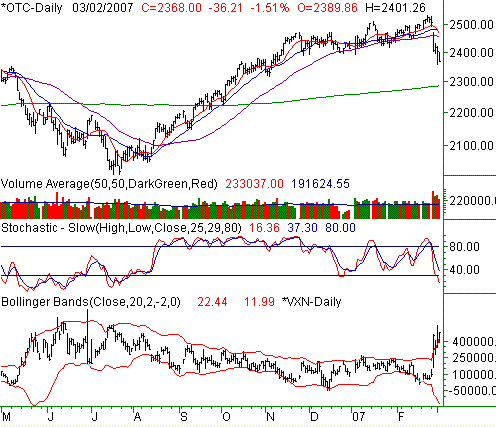
It was an ugly end to an ugly week on Friday. The NASDAQ fell another 1.51% (or -36.21 points) to end at 2368. That was 147.10 points lower than the previous Friday's close. The 5.85% beating we took for the week was one of the worst showings in many years.
We've devoted most of today's write-up to the other two indices, but we still want to take a quick look at the NASDAQ's chart.
The VXN is on the rise, and the composite is under fire. The NASDAQ fell under the 50-day line (purple) on Tuesday, and hast' looked back since. From a momentum perspective, that's bearish.
However, this is a volatile market, so we won't be shocked to see a pocket of strength. At this point, only a cross back above the nearly-combined 10-, 20-, and 50-day lines would really convince us that the bulls were back on track. That line in the sand will be roughly at 2460 by the time it could happen. As oversold as we are, a slight bounce is a distinct possibility. We just don't think one should read too much into it after the degree of damage we've seen inflicted this past week. This is not the same environment we were in just a few weeks ago. So, seeing charts for how they really are may be the best advice we can provide.
By the way, don't assume the 200-day line (green) will automatically be a support line, ending any downtrend. It wasn't even close to being support the last time around in mid-2006.
NASDAQ Chart - Daily

S&P 500 Commentary
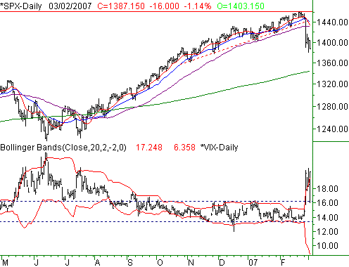
The 1.14% loss suffered by the S&P 500 on Friday - a 16 point dip - left the index at 1387.15 by the time the closing bell rang. That translated into a weekly loss of 4.41%, thanks to a 64.05 point slide under the prior week's close.
Previously, I discussed in detail how the S&P 500 had gotten a little too far past the 200-day moving average line (green). It's still an important analysis, so we've included the 200-day line on today's chart. Just for the record, the SPX is still 3.1% above the line.
On the flipside, the S&P 500 is 5.0% under its recent peak of 1461.55. A trip all the way back to the 200-day line would indeed be an 8.1% dip. The thing is, that's still not what most consider a good, normal correction. While we always tend to look at the 200-day line as potential support, if the bears keep getting traction, don't be surprised if we actually fall a little under it (like we did in May and June of last year).
Also, we'd be amiss if we didn't look at the VIX chart; it's telling an amazing story too. Thinking it too was over-extended and due for a pullback after Tuesday, we entertained the possibility that a falling VIX would be bullish for stocks. Well it was for a couple of hours. After retreating all the way back to 12.48 on Friday (which was a previous resistance level), the VIX more than rebounded, surghing all the way back to 18.61 by the close. That was the highest close of the week, and certainly suggests that the trend here is an upward one and bearish for stocks.
And even when you put the technical aspects of the S&P 500 and VIX aside for a second and just look at he chart , even a newcomer can see that things are very different now that they were for most of the last several months.
This is not to say we're for-sure headed lower. However, like we said above, it's a huge concern at this point. Don't be fooled by a little strength, as we saw the bulls fight back slightly in May of 2006 only to get run over when the bear train got started again. The current chart looks a lot like that one did. Just food for thought.
S&P 500 Chart - Daily

Dow Jones Industrial Average Commentary
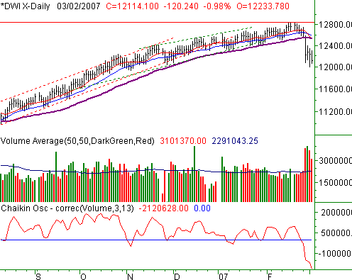
The Dow Jones Industrial Average wasn't immune to the weakness - it lost 0.98% on Friday, or 120.24 points. For the week, we saw a 4.22% loss here, with the blue-chip index closing 533.38 points lower than the prior week's closing level.
The cross back under the 50-day average (purple) has so far gone unchallenged. Every day since then we've seen lower highs, and the selling volume has stayed pretty strong. And even on a pure 'eye-balling' basis, it's obvious the previous uptrend has been broken. All in all it's pretty close to being a textbook case of a breakdown.
We can only add this to our conclusions that the 10-day average(red) is under the 50-day line for the first time since July of last year. There has to be a reason for that. And, we might be seeing a bearish wedge shape. The top edge - the falling part - is pretty clear, but the bottom line isn't quite is precise. Wed' say the lower, horizontal portion of the wedge should be around 12064, or Friday's low,. If that line breaks, we could see some strong selling and essentially make the index jump to the next lower level, as is often the case with wedges.
Dow Jones Industrial Average Chart - Daily

Bottom Line
Assume nothing, and don't try to predict what the market should be doing. Tough to do, as we're all trying to pinpoint the exact bottom (and that includes us). The risk right now is disbelief, not believing that that market could fall any more, or not believing that it could recover in an instant. While the charts may be obscuring what's next, we think sentiment clues like the VIX may do a better job at helping to spot any true bottom. Better to be right than to be first.
Price Headley is the founder and chief analyst of BigTrends.com.
|